All Prompts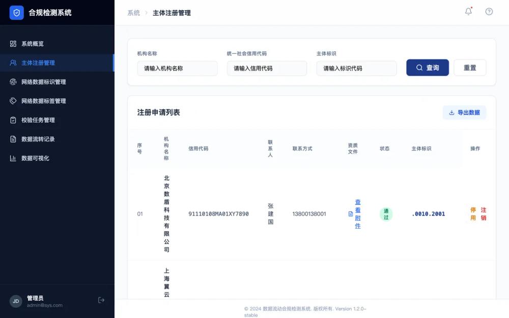 All Prompts
主体注册管理 - 名称修改
Модуль управления регистрацией субъектов: изменение названия. SaaS-решение для корпоративных платформ управления и комплаенса. Помогает в администрировании данных.
by haoma niLive Preview
Prompt
# 主体注册管理 - 名称修改

{
  "summary": "A modern, high-fidelity administrative dashboard for enterprise data management. The UI follows a professional 'Blue & Slate' theme, featuring a high-density table layout, advanced search filters, and a persistent navigation sidebar designed for complex workflow tracking.",
  "style": {
    "description": "Enterprise-grade professional style focusing on clarity and data density. Typography uses 'Plus Jakarta Sans' for a modern feel. The color palette centers on Slate-900 for navigation and Blue-900/Blue-600 for interactions. Components use a mix of subtle 1px borders (#e2e8f0), soft shadows, and glassmorphism effects for the header.",
    "prompt": "Create a professional dashboard UI with the following specs: Colors: Background #f8fafc, Sidebar #0f172a (Slate-900), Sidebar Header #020617, Primary Button #1e3a8a (Blue-900), Borders #e2e8f0. Typography: Body text 'Plus Jakarta Sans', 14px size, weight 400; Section Titles 18px weight 700; Table Headers 12px weight 700 uppercase tracking-wider #64748b. Spacing: 32px (p-8) for main containers, 24px (p-6) for internal cards. Animations: 0.2s ease-in-out transitions on hover. Borders: 8px or 12px border-radius for cards and inputs. Shadows: 0 2px 4px rgba(30, 58, 138, 0.1) for primary buttons. Special Effect: Header uses backdrop-filter: blur(12px) with 85% opacity white background."
  },
  "layout_and_structure": {
    "description": "A classic two-column dashboard layout with a fixed sidebar (288px) and a flexible main content area that contains a breadcrumb header, a scrollable multi-section container, and a compact footer.",
    "prompts": [
      {
        "part": "Navigation Sidebar",
        "prompt": "Design a 288px wide sidebar using #0f172a background. Header should be 64px tall with #020617 background, containing a 36px blue logo box (#2563eb) and white bold title. Navigation links: 48px height, Slate-300 text, 24px horizontal padding, with a #3b82f6 vertical border-right (4px) and 10% blue background for the active state. Include a user profile section at the bottom with a circular avatar and logout icon."
      },
      {
        "part": "Glass Header",
        "prompt": "Top header: 64px height, background rgba(255, 255, 255, 0.85) with 12px backdrop blur. Include breadcrumbs on the left (Slate-400 for parents, Slate-800 font-semibold for current page). Right side contains notification bell with a red dot indicator and a help icon."
      },
      {
        "part": "Search and Filter Card",
        "prompt": "A white card (#ffffff) with 24px padding and 1px border (#e2e8f0). Use a 4-column grid for inputs. Each field has a 12px uppercase label in Slate-500 and a 40px tall input with #f8fafc background. Primary 'Search' button should be Blue-900 with a search icon."
      },
      {
        "part": "Data Management Table",
        "prompt": "Table container: white card, rounded-xl, overflow-hidden. Headers: Slate-50 background, 16px vertical padding, bold text. Rows: 1px bottom border #f1f5f9, hover state #f1f5f9 transition. Action column: sticky right-aligned with a white-to-transparent gradient shadow (-8px blur) to indicate scroll depth. Font for codes/IDs should be monospaced."
      }
    ]
  },
  "special_ui_components": [
    {
      "component": "Sticky Action Column",
      "description": "A table column fixed to the right side that stays visible during horizontal scrolling.",
      "prompt": "Implement a sticky right column with `position: sticky; right: 0;`. Background must be white (95% opacity) with a `backdrop-blur` effect. Apply a subtle left-oriented shadow `box-shadow: -8px 0 12px -4px rgba(0,0,0,0.05)` to create a visual 'floating' effect over the table data as it scrolls."
    },
    {
      "component": "Semantic Status Badge",
      "description": "Rounded badges for state representation.",
      "prompt": "Create compact badges with `display: inline-flex; padding: 2px 10px; border-radius: 9999px; font-size: 12px; font-weight: 500;`. Approved: bg-emerald-100, text-emerald-700. Pending: bg-amber-100, text-amber-700. Rejected: bg-rose-100, text-rose-700. Disabled: bg-slate-200, text-slate-500."
    }
  ],
  "special_notes": "MUST: Use monospaced fonts for numerical codes and IDs (e.g., 91110108MA...). MUST: Ensure status badges have a 10% opacity background of their text color (Emerald-100/700, Rose-100/700). DO NOT: Use heavy shadows; stick to subtle borders for card definition. DO NOT: Use pure black for text; use Slate-800 for primary and Slate-500 for secondary information."
}