All Prompts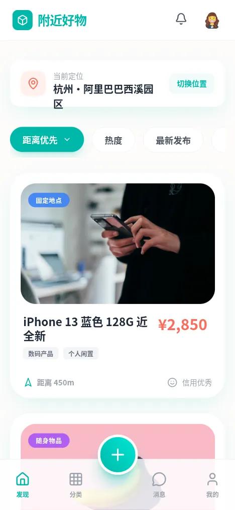 All Prompts
附近好物 - 活力本地交易小程序
UI Kit для местного маркетплейса: Gen Z, яркие цвета, стекломорфизм. Идеально для e-commerce, сообществ, C2C.
Prompt
# 附近好物 - 活力本地交易小程序

{
  "summary": "A modern, high-contrast mobile interface for local item trading. It combines 'Plus Jakarta Sans' typography with playful UI elements like squircle-shaped buttons, translucent glass panels, and animated product cards. The design prioritize location-based data and visual hierarchy through bold pricing and status badges.",
  "style": {
    "description": "Youthful and energetic with a focus on 'squircle' geometry and vibrant accents. Uses Teal (#00B8A9) for brand identity and Coral (#FF6B5B) for transactional highlights like price. Typography is bold and wide. Shadows are soft and tinted with the primary brand color to avoid a muddy look.",
    "prompt": "Style Guide: \n- **Color Palette**: Primary Teal (#00B8A9), Secondary Coral (#FF6B5B), Warm White Background (#FDFCFB), Neutral Greys (Text: #111827, Muted: #9CA3AF).\n- **Typography**: Primary font 'Plus Jakarta Sans'. Headings use ExtraBold (800) for brand and Bold (700) for item titles. Body text uses Medium (500) for readability. Smallest labels (10px) use Bold for clarity.\n- **Geometry**: Border-radius of 32px (2rem) for main cards, 24px (1.5rem) for inner images, and 12px for smaller UI components like badges.\n- **Effects**: Glassmorphism panels (rgba(255, 255, 255, 0.85), 12px blur). Soft brand-colored shadow: `0 10px 30px -5px rgba(0, 184, 169, 0.15)`.\n- **Animations**: Cards use a 'pop' scale effect on click (scale: 0.96). Entrance animation: `fadeInUp` (20px travel, 0.6s duration). Hover state for images: `scale(1.05)`."
  },
  "layout_and_structure": {
    "description": "A mobile-first vertical stack starting with a glass-morphic header, followed by a floating location picker, sticky horizontal filter chips, and a list of high-detail product cards. A specialized bottom navigation bar features a prominent center Floating Action Button (FAB).",
    "prompts": [
      {
        "part": "Header & Location",
        "prompt": "Top navigation: Height 64px, background glass-white with 1px border-b (#F3F4F6). Left-aligned logo with a 32x32px teal box icon. Right-aligned profile avatar (32px circle) and notification bell. Below this, a 'Floating Location Picker' card: 16px padding, 20px bottom margin, featuring a Coral (#FF6B5B) pin icon and 'Change Location' text button in Teal."
      },
      {
        "part": "Sticky Filter Bar",
        "prompt": "Horizontal scrolling container (hide-scrollbar) at top 80px. Primary filter: Pill-shaped Teal (#00B8A9) background, white text, 40px height. Secondary filters: White background, 1px grey border, dark grey text. Include a right-most 'Filter' button with a horizontal slider icon."
      },
      {
        "part": "Product Card Feed",
        "prompt": "Vertical list of cards. Each card: Background white, 32px corner radius, 16px padding. Image: 100% width, 192px height, 24px corner radius. Badges: Absolute-positioned on image (top-left), semi-transparent colored backgrounds (Blue for 'Fixed', Purple for 'Mobile'). Card content: Item title (18px Bold) alongside Price (24px Black, Coral color). Footer of card: Distance indicator with a Teal navigation icon and credit status indicator."
      },
      {
        "part": "Bottom Navigation",
        "prompt": "Height 80px, fixed bottom, glass-effect. Four text+icon buttons (Discovery, Category, Message, Profile) in grey/teal. Center element: Floating Action Button (FAB) offset -40px vertically. FAB specs: 64x64px, gradient background (#00B8A9 to #00E5D4), white plus icon, 32px corner radius, 4px white border, heavy teal-tinted shadow."
      }
    ]
  },
  "special_ui_components": [
    {
      "component": "Real-time Status Badge",
      "description": "A glassmorphism badge that indicates live updates on an item's location/availability.",
      "prompt": "A small overlay component on image bottom-right: `background: rgba(255, 255, 255, 0.2); backdrop-filter: blur(12px); border: 1px solid rgba(255, 255, 255, 0.3); border-radius: 8px; padding: 4px 8px; display: flex; align-items: center; gap: 4px`. Inside: A 6x6px solid Green (#4ADE80) dot with a 1.5s infinite pulse animation and text 'LIVE UPDATE' in 10px Bold White."
    },
    {
      "component": "Tilt-Shift FAB",
      "description": "The central publish button with a playful rotation interaction.",
      "prompt": "A squircle button (32px radius). On hover/active, apply `transform: rotate(12deg) scale(1.1)`. The background must be a linear gradient at 45 degrees from #00B8A9 to #00E5D4. Shadow: `0 20px 25px -5px rgba(0, 184, 169, 0.4)`."
    }
  ],
  "special_notes": "Must use 'Plus Jakarta Sans' for the editorial feel. All primary call-to-actions should use the teal gradient. Distance indicators must be visually distinct, using the primary teal to signify 'reachability'. Do not use harsh black (#000) for text; use Deep Grey (#111827). Ensure all cards have a subtle white 1px border to enhance the glassmorphism look on light backgrounds."
}