All Prompts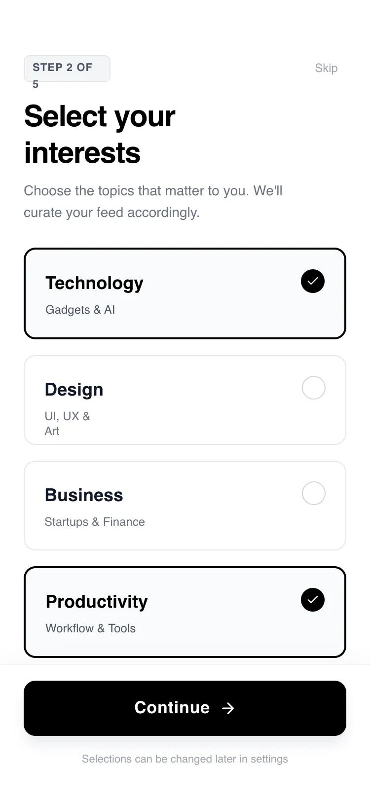 All Prompts
mobile applayoutaccount setupmultistep workflow
Account Setup Flow — Goals / Interests (Card-Based)
UI-компонент: карточный онбординг для настройки аккаунта. Минималистичный, интерактивный, 4 шага. Оптимизирован для мобильных приложений.
by Shirley LouLive Preview
Prompt
# Account Setup Flow — Goals / Interests (Card-Based)

{
  "summary": "A minimalist, high-contrast 4-step onboarding interface with fluid motion transitions, bold 'General Sans' typography, and interactive selection cards. The design focuses on clarity, using a monochrome palette with subtle gray accents to guide users through goals, interests, profile setup, and system permissions.",
  "style": {
    "description": "Modern minimalist aesthetic utilizing 'General Sans' for a clean, editorial look. Palette is strictly monochrome: Pure White (#FFFFFF), Deep Black (#000000), and a range of functional grays (#F3F4F6 for backgrounds, #9CA3AF for secondary text). Animations use the View Transitions API with custom slide-up keyframes and cubic-bezier(0.16, 1, 0.3, 1) easing for a 'snappy' but smooth feel.",
    "prompt": "Create a design system with a monochrome high-contrast theme. \n- **Typography**: Use 'General Sans'. Headings should be font-weight: 700 (Bold) with tracking: -0.025em. Body text should be font-weight: 400 or 500 (Medium). Labels should be uppercase with tracking: 0.05em.\n- **Colors**: Primary Background: #FFFFFF; Primary Action: #000000; Secondary Background: #F3F4F6; Border: #E5E7EB; Secondary Text: #6B7280; Subtitle: #9CA3AF.\n- **Interactions**: Buttons and cards should have a scale-down effect on click (scale: 0.95 or 0.98). Transitions between steps must use a slide-up animation (20px to 0px) with opacity fade (0 to 1) over 500ms using cubic-bezier(0.16, 1, 0.3, 1).\n- **Shadows**: Use a subtle upward shadow for the footer: shadow-[0_-4px_20px_rgba(0,0,0,0.03)]. Primary CTA button should have a drop shadow: shadow-lg shadow-gray-200."
  },
  "layout_and_structure": {
    "description": "A vertically stacked mobile layout consisting of a persistent progress bar at the very top, a fixed header with contextual titles, a scrollable main content area for user input, and a fixed footer with the primary action button.",
    "prompts": [
      {
        "part": "Progress Bar",
        "prompt": "An absolute-positioned bar at the top (height: 6px) with a light gray background (#F3F4F6). A black fill indicator (#000000) that transitions its width smoothly (duration: 700ms, ease-out) based on the current step percentage."
      },
      {
        "part": "Header Section",
        "prompt": "Padding-top: 56px, horizontal padding: 24px. Includes a top row with a small, rounded badge showing 'Step X of Y' (BG: #F3F4F6, Text: #4B5563, font-size: 11px) and a 'Skip' button. Below that, a large H1 heading (text-3xl, font-bold) with a tight line-height and a small descriptive paragraph (text-sm, color: #6B7280)."
      },
      {
        "part": "Interactive Content Area",
        "prompt": "A scrollable central container (px-6, pb-8). For selection steps, use a single-column grid with 16px gaps. Selection cards should have 20px padding, a 1px border (#E5E7EB), and 12px border-radius. Active states change the border to 2px black and add a circular checkmark icon in the corner."
      },
      {
        "part": "Persistent Footer",
        "prompt": "Fixed at the bottom with a white background and top border (#F9FAFB). Contains a large primary button (height: 56px, width: full, rounded: 12px, BG: #000000, color: #FFFFFF) with an arrow icon. Below the button, a small centered text label (font-size: 11px, color: #9CA3AF) repeating the current step progress."
      }
    ]
  },
  "special_ui_components": [
    {
      "component": "Selection Card",
      "description": "An interactive card that serves as a single or multiple choice input.",
      "prompt": "A container with padding: 20px, border-radius: 12px, border: 1px solid #E5E7EB. On click, it scales to 0.98. If selected: border-width: 2px, border-color: #000000, background: #F9FAFB. Includes a 24px circular indicator on the right side that fills black and displays a white checkmark icon when selected."
    },
    {
      "component": "Toggle Switch",
      "description": "A custom push-notification style toggle.",
      "prompt": "A pill-shaped container (width: 48px, height: 24px). Background: #E5E7EB (disabled) or #000000 (enabled). A 16px white circle knob inside that translates 24px from left to right. Easing: cubic-bezier(0.4, 0, 0.2, 1), duration: 300ms."
    }
  ],
  "special_notes": "MUST maintain the high-contrast ratio for accessibility. DO NOT use rounded-full for the main CTA; use rounded-xl (12px) for a more modern 'app' feel. Transitions MUST be synchronized so that the progress bar, header text, and main content animate together using the View Transitions API or equivalent motion library. MUST include an active scale effect on all clickable elements to provide tactile feedback."
}