All Prompts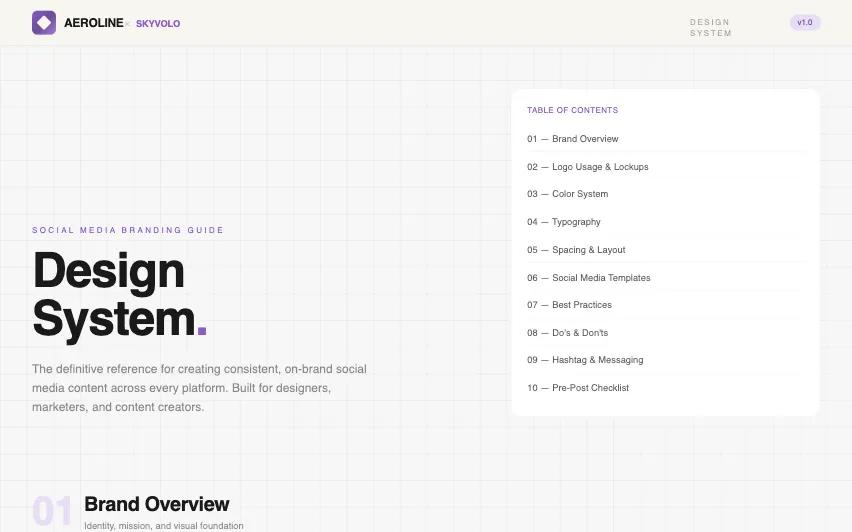 All Prompts
AEROLINE × SKYVOLO Social Media Design System
Дизайн-система соцсетей AEROLINE × SKYVOLO. Фирменный стиль с фиолетово-золотой палитрой, текстурой бумаги и типографикой Clash Grotesk/Inter. Для премиум-брендинга.
by Tamir LevLive Preview
Prompt
# AEROLINE × SKYVOLO Social Media Design System

{
  "summary": "A sophisticated, high-contrast branding documentation system designed for social media consistency. It features a tactile 'paper' background, a structural 40px grid overlay, and a multi-shade purple color hierarchy accented by gold. The design emphasizes precision, forward motion, and geometric elegance.",
  "style": {
    "description": "The style is defined by its 'Paper & Ink' foundation (#f7f5f0 / #1a1a1a) paired with a deep purple gradient system. Typography uses Clash Grotesk for high-impact display and Inter for utility. Visuals include subtle noise textures, repeating linear-gradient 'don't' stripes, and smooth scale/lift hover interactions.",
    "prompt": "Create a design with a background color of #f7f5f0 featuring a subtle noise texture (opacity 0.03) and a 40px grid overlay in #1a1a1a at 0.04 opacity. Use a typography system consisting of Clash Grotesk for headlines (weights 400, 600, 700) and Inter for body text (300-600). Colors: Deep Purple (#6b4c9a), Royal Purple (#8b5dc9), Light Purple (#a67cd6), Pale Purple (#c5a3e5), Purple Wash (#e8ddf5), and Gold (#c9a66b). UI components should feature 16px to 24px border radii and subtle 1px borders in #1a1a1a at 0.05 opacity. Use cubic-bezier(0.4, 0, 0.2, 1) for all transitions. Implement a 'don't' state using a repeating-linear-gradient at 45deg with rgba(239, 68, 68, 0.08) stripes."
  },
  "layout_and_structure": {
    "description": "A modular, sectioned layout with a sticky header and a bento-grid inspired content structure. Sections are demarcated by large numerical markers and border-top separations.",
    "prompts": [
      {
        "part": "Sticky Header",
        "prompt": "Create a sticky navigation bar with background #f7f5f0 and a bottom border of 1px #1a1a1a (5% opacity). Include a logo lockup on the left: a gradient square (#6b4c9a to #a67cd6) with a rotated 45-degree paper-colored square inside. Pair it with bold Clash Grotesk text. On the right, include a pill-shaped version tag in #e8ddf5 with #6b4c9a text."
      },
      {
        "part": "Hero Section",
        "prompt": "A two-column hero area. Left side: Large-scale headline in Clash Grotesk Bold, sizes 48px to 72px, with a colored period accent. Right side: A table of contents card with a 1px border, containing numbered navigation links that have a padding-left hover effect."
      },
      {
        "part": "Bento Feature Cards",
        "prompt": "Grid-based cards using white backgrounds (#ffffff), 24px padding, and 16px border radii. Use icons inside 40x40px rounded-xl background containers (#f3eefa). Implement hover states that lift the card (translateY -2px) and add a soft shadow (rgba(107, 76, 154, 0.08))."
      },
      {
        "part": "Color Palette Grid",
        "prompt": "Display color chips as horizontal bars for primary colors and a 2x2 grid for accents. Each chip should show the color name, hex code in a monospaced font, and a brief usage description. Include an 'Accessibility Check' section showing contrast ratios for text/background pairings."
      },
      {
        "part": "Social Template Wireframes",
        "prompt": "A 5-column grid of social media templates (Feed, Story, LinkedIn, X, TikTok). Use aspect-ratio containers (4:5, 9:16, 1.91:1) with dashed white borders (opacity 0.2) over brand gradients to represent safe zones and placement rules."
      },
      {
        "part": "Dos and Don'ts Section",
        "prompt": "A two-column layout. 'Dos' use green-themed containers (#f0fdf4 bg, #166534 text) with check icons. 'Don'ts' use red-themed containers with a 'don't-stripe' repeating gradient background and 'X' icons. Each item should have a bold label and secondary description."
      }
    ]
  },
  "special_ui_components": [
    {
      "component": "Interactive Color Chip",
      "description": "Detailed color display with hover-scale effect and utility info.",
      "prompt": "Create a card containing a 56x56px rounded-xl color swatch. To the right, display the color name in Clash Grotesk Semibold (14px) and the Hex code in a small grey code block. Include a 12px font-size description of intended usage (e.g., 'Primary brand · Headlines')."
    },
    {
      "component": "The Don't Stripe",
      "description": "Visual indicator for prohibited design practices.",
      "prompt": "Apply a pseudo-element overlay to a card using `background: repeating-linear-gradient(45deg, transparent, transparent 8px, rgba(239, 68, 68, 0.08) 8px, rgba(239, 68, 68, 0.08) 16px);`. This should be placed behind the text but over the card background to signify error/prohibition."
    },
    {
      "component": "Platform Wireframe",
      "description": "Simplified abstract representations of social media layouts.",
      "prompt": "Create a container with a fixed aspect ratio (e.g., 9:16 for Story). Use a gradient background (#6b4c9a to #8b5dc9). Inside, place a dashed-border inner container to represent safe zones. Add abstract pill shapes (opacity 0.2) to represent text and buttons."
    }
  ],
  "special_notes": "MUST: Maintain a 1x logo height clear space in all compositions. MUST: Use only Clash Grotesk and Inter fonts. MUST: Ensure a 4.5:1 contrast ratio for all text. DON'T: Use drop shadows or glow effects on the logo. DON'T: Stretch or rotate logo assets. DON'T: Use non-brand gradients or neon colors."
}