
Все промпты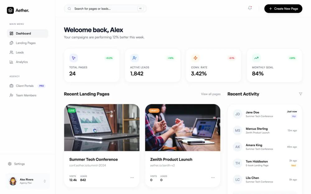 Все промпты
Aether: SaaS дашборд с элементами стекломорфизма
Готовый UI-кит для SaaS-платформ: фиксированный сайдбар, липкий хедер, сетка статистики и лента активности. Минималистичный стиль с акцентными цветами и скруглениями 32px.
Автор: Florian VanhaesebrouckeЖивое превью
Зачем вайб-кодеру
Этот промпт экономит время при сборке админки для управления контентом, лендингами или CRM. Ты получаешь чистый интерфейс, где внимание пользователя сфокусировано на данных, а не на визуальном шуме. Внутри уже продуманы важные мелочи: поиск с горячими клавишами, индикаторы уведомлений и карточки с hover-эффектами.
Используй этот конфиг в Lovable или v0, чтобы быстро набросать скелет проекта. Просто скопируй структуру компонентов в свой инструмент и привяжи к ним реальные данные из базы. Если бренд требует другой палитры, замени индиго и изумруд на свои фирменные цвета — архитектура карточек и сетка останутся рабочими.
Prompt
# Aether Landing Page SaaS Dashboard

{
  "summary": "A sophisticated SaaS dashboard design using a fixed glassmorphism sidebar, a sticky header with search and notification functions, and a multi-column main workspace. The aesthetic is defined by large border radii (32px), subtle shadows, and a neutral background with vibrant accent colors for data visualization.",
  "style": {
    "description": "The style is 'Modern Professional Minimalist'. It relies on high-quality sans-serif typography (General Sans for headers, Satoshi for UI), a background of #FCFCFC, and black (#000000) for primary actions. Animations include smooth scale-ups on hover and micro-interactions for buttons.",
    "prompt": "Create a modern SaaS UI style with the following specs: Background: #FCFCFC. Surfaces: Pure white #FFFFFF cards with 32px border-radius and soft shadow (0 4px 20px -4px rgba(0,0,0,0.03)). Typography: Headers in 'General Sans' (semi-bold, tracking-tight), Body in 'Satoshi'. Colors: Black #000000 primary, Neutral grays #F3F4F6 for backgrounds, and high-saturation accents (Indigo #6366F1, Emerald #10B981, Orange #FB923C). Sidebar: Glassmorphism effect (rgba(255, 255, 255, 0.8) with 12px blur, 1px border-right rgba(0,0,0,0.05)). Buttons: Fully rounded, black background for primary, white/gray for secondary. Transitions: 300ms ease-in-out for all hover states and 95% scale-down on click."
  },
  "layout_and_structure": {
    "description": "A classic dashboard layout with a fixed 256px sidebar and a fluid main content area. The content is organized in a 12-column grid, with an 8-column main gallery and a 4-column activity sidebar.",
    "prompts": [
      {
        "part": "Fixed Sidebar",
        "prompt": "Design a 256px wide fixed sidebar with a glassmorphism background. Include a brand logo section (32px icon + text), a 'Main Menu' category with icons (Dashboard, Pages, Leads, Analytics), and an 'Agency' category. Footer of sidebar should include a user profile card with a 40px circular avatar, name, and plan type on a #F9FAFB background."
      },
      {
        "part": "Sticky Header",
        "prompt": "Header: 80px height, sticky at top, white background with backdrop-blur. Left side: Search bar with 384px width, #F9FAFB fill, rounded-full, containing a search icon and 'CMD+K' keyboard shortcut indicator. Right side: Bell notification icon with a red dot indicator and a primary black button 'Create New Page' (rounded-full, text-sm, white text)."
      },
      {
        "part": "Stats Grid",
        "prompt": "A 4-column grid of stat cards. Each card: 24px padding, 32px border-radius, white background. Top left: 40px rounded icon container with colored background (Indigo, Blue, Orange, Green). Top right: Small pill badge showing percentage change (+/-). Bottom: Uppercase text-xs label in gray #9CA3AF and a 24px bold numerical value."
      },
      {
        "part": "Landing Page Gallery",
        "prompt": "A 2-column grid (within an 8-col span) of content cards. Aspect ratio 16:10 for images. Features: Image zoom on hover (scale 1.05), black overlay on hover with 'view' and 'edit' circular buttons. Below image: Title (18px semi-bold), URL subtext (14px gray), and a footer row showing 'Visits' and 'Leads' metrics separated by a border-top line."
      },
      {
        "part": "Activity Feed Sidebar",
        "prompt": "A 4-column width vertical feed. Title 'Recent Activity' with a filter icon. List items: 11px font for timestamps, 44px circular initial avatars (JD, MS, etc.) that turn black on hover. Include status badges (Hot, Med) in small indigo/amber pills. Bottom button: 'Show all activity' in #F9FAFB gray block."
      }
    ]
  },
  "special_ui_components": [
    {
      "component": "Upgrade Card",
      "description": "High-contrast promotional card in the dashboard sidebar.",
      "prompt": "Design a 32px rounded card with Indigo #4F46E1 background. Add a large 'sparkle' icon absolute-positioned in the corner at 10% opacity. Text: White bold heading, light-indigo subtext. Button: White, text-indigo, rounded-full, with high shadow (shadow-black/10)."
    },
    {
      "component": "Hover Overlay Action",
      "description": "Micro-interaction for image-based cards.",
      "prompt": "When hovering over a card image, transition a black semi-transparent overlay (40% opacity) from 0 to 1 opacity. Center two white 40px circular buttons with black icons. Icons should scale slightly (1.1x) when hovered individually."
    }
  ]
}