All Prompts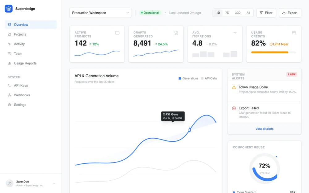 All Prompts
dashboardanalytics dashboardneutralblue accentclean palettestripe inspiredminimalistgrid basedsassdata visualisationenterprise softwaresidebar navigationcard
Analytics dashboard
Professional SaaS analytics dashboard design featuring a clean, enterprise-grade aesthetic. Utilizing a refined blue brand palette (#3B82F6), high-contrast gray scales, and dual-font pairing (Inter for UI, JetBrains Mono for data logs). The layout employs a classic sidebar-and-main-content structure with bento-style metric cards, interactive grouped bar charts, and technical event streams. Ideal for fintech, developer tools, cloud infrastructure monitoring, and complex data-driven enterprise platforms.
by Shirley LouLive Preview
Prompt
# Analytics dashboard

{
  "summary": "A modern, high-density analytics dashboard for enterprise SaaS platforms. It emphasizes clarity through a light-themed interface with subtle borders, soft shadows, and a strong hierarchical structure using a sophisticated blue-based color system and professional typography.",
  "style": {
    "description": "The style is 'Modern Professional Enterprise'. It uses a light gray background (#F8F9FA) to make white cards (#FFFFFF) pop. Typography pairs Inter (Sans) for UI controls with JetBrains Mono (Monospace) for technical logs. Key colors include Brand Blue (#3B82F6), Success Green (#22C55E), and Warning Amber (#F59E0B). UI elements feature 8px corner radii, 1px borders (#E9ECEF), and soft 'card' shadows (0 1px 3px 0 rgba(0,0,0,0.1)).",
    "prompt": "Create a professional SaaS dashboard style. \n\n**Colors:** \n- Background: #F8F9FA\n- Surface/Cards: #FFFFFF\n- Primary: #3B82F6 (Hover: #2563EB)\n- Text: #212529 (Secondary: #868E96)\n- Border: #E9ECEF\n- Status: Success (#10B981), Warning (#F59E0B), Danger (#EF4444)\n\n**Typography:**\n- UI Font: 'Inter', sans-serif; weights 400 (regular), 500 (medium), 600 (semibold).\n- Data/Log Font: 'JetBrains Mono', monospace; weight 400.\n- Headings: 14px Semibold tracking-tight.\n- Body: 13px Regular.\n- Technical Logs: 12px Mono.\n\n**Effects:**\n- Border Radius: 8px (standard), 6px (buttons/inputs).\n- Shadows: 'card' (0 1px 3px rgba(0,0,0,0.1)), 'input' (0 1px 2px rgba(0,0,0,0.05)).\n- Transitions: 200ms ease-in-out for hover states.\n- Chart Grids: Dash-array 4, Color #E9ECEF."
  },
  "layout_and_structure": {
    "description": "A responsive two-column layout with a fixed-width left sidebar (256px) and a fluid main content area. Content is structured into a global header, high-level metrics grid, split chart/panel area, and a data table/event stream footer.",
    "prompts": [
      {
        "part": "Sidebar Navigation",
        "prompt": "Left sidebar (width: 256px), white background, right-border (#E9ECEF). Top section includes a brand logo (32x32px rounded-lg brand blue) and navigation links. Active link: #3B82F6 text on #EFF6FF background. Footer section includes a user profile card with an avatar, name, and role."
      },
      {
        "part": "Global Header",
        "prompt": "Horizontal header with a workspace selector (styled dropdown), an 'Operational' status badge (green pill), and a time-range toggle (1D, 7D, 30D, All) styled as a segmented control. Action buttons for 'Filter' and 'Export' with 1px gray borders and icons."
      },
      {
        "part": "Metrics Grid",
        "prompt": "A 4-column grid of cards. Each card contains: a title in uppercase 10px bold gray text, a primary metric (30px semibold), a trend indicator (e.g., +12%), and a mini-sparkline or progress bar. Sparklines use #3B82F6 with a stroke-width of 2."
      },
      {
        "part": "Analytics Section",
        "prompt": "A two-column layout (2/3 width chart, 1/3 width side panels). The chart is a 'Grouped Bar Chart' with vertical bars (width: 12px, radius: 2px) comparing API calls (Gray) and Generations (Blue). The right column contains a 'System Alerts' feed and a 'Component Reuse' Donut Chart."
      },
      {
        "part": "Projects Table",
        "prompt": "A full-width data table inside a white card. Headers: 12px uppercase gray text. Rows feature project name with sub-text metadata, a status badge (pill style), and a progress-bar based 'Efficiency' score. Hover state: Light gray background shift."
      },
      {
        "part": "Event Stream Log",
        "prompt": "A code-inspired technical log. Monospace font, light gray background (#F8F9FA), vertical alignment of columns (Timestamp, Method, Path, Request ID). Uses brand blue for successful methods (POST/GET) and red for errors."
      }
    ]
  },
  "special_ui_components": [
    {
      "component": "Grouped Bar Chart",
      "description": "Double-column vertical bar chart for comparison",
      "prompt": "Render an SVG grouped bar chart. Each group contains two vertical bars: Left bar (API Calls) #E5E7EB, Right bar (Generations) #3B82F6. Bar width: 12px. Corner radius: 2px on top only. Hover effect: Increase color saturation. Background: Dashed horizontal grid lines #E9ECEF."
    },
    {
      "component": "Analytics Donut Chart",
      "description": "Minimalist donut chart with centered summary",
      "prompt": "A circular donut chart with a stroke width of 12px. Background track: #F1F3F5. Active segment: #3B82F6. Center text: Large bold percentage (e.g., 72%) with a sub-label (SYSTEM) in 10px uppercase gray."
    },
    {
      "component": "Segmented Control",
      "description": "Time range selection toggle",
      "prompt": "A container with 1px border #D1D5DB, padding 2px. Buttons inside have no border. The 'active' button has a light gray background #F1F3F5 and a subtle shadow. Non-active buttons have gray text #6B7280 and hover-transition to #111827."
    }
  ],
  "special_notes": "Must maintain consistent spacing (24px gutter between cards). Must use Lucide-style line icons. Must ensure charts have a 'dashed line' background grid at regular Y-intervals. Do not use overly rounded 'pill' corners for cards—keep them at 8px for a professional feel."
}