
Все промпты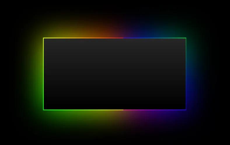 Все промпты
skill
CSS-градиентная рамка для карточек и кнопок
Готовый CSS-код для создания светящихся или полупрозрачных границ вокруг элементов. Инструмент позволяет гибко настраивать толщину, радиус скругления и углы градиента.
Автор: Zhou Jason
Зачем вайб-кодеру
Этот компонент пригодится, когда нужно выделить карточку тарифа или кнопку действия без использования тяжелых графических ассетов. Он работает через псевдоэлемент, поэтому контент внутри блока остается полностью интерактивным. Вставь этот код в свой CSS-файл или Tailwind-конфиг, чтобы добавить глубины интерфейсу.
Используй этот промпт в Cursor или v0, когда хочешь быстро подправить визуальный стиль UI. Просто укажи AI нужные цвета и радиус скругления, ориентируясь на подсказки в конфиге. Не забудь убрать стандартные границы элемента, иначе они будут конфликтовать с новым градиентом.
Prompt
# Animation / CSS Border Gradient

# CSS Border Gradient Skill

## Workflow
1. Confirm environment (plain CSS vs Tailwind) and gather missing specs (border radius, thickness, angle, colors).
2. Provide the baseline snippet and a short usage checklist.
3. Offer focused tweaks only (change angle, colors, thickness, radius) and avoid redesigning the component.

## Baseline snippet
```css
.border-gradient {
  position: relative;
}

.border-gradient::before {
  content: "";
  position: absolute;
  inset: 0;
  border-radius: 10px;
  padding: 1px;
  -webkit-mask: linear-gradient(#fff 0 0) content-box,
    linear-gradient(#fff 0 0);
  -webkit-mask-composite: xor;
  mask-composite: exclude;
  background: linear-gradient(225deg,
    rgba(255, 255, 255, 0.0) 0%,
    rgba(255, 255, 255, 0.2) 50%,
    rgba(255, 255, 255, 0.0) 100%);
  pointer-events: none;
}
```

## Usage checklist
- Insert the snippet in global CSS or the page `<head>`.
- Add `border-gradient` to the element.
- Remove any existing `border` styles.
- Match the element radius to the pseudo-element radius.

## Tailwind example
```html
<div class="border-gradient rounded-lg before:rounded-lg">
  ...
</div>
```

If a project uses Tailwind layers, wrap the class in `@layer utilities`.

## Customization knobs
- Thickness: change `padding` (for example `2px`).
- Radius: change `border-radius` or the `before:rounded-*` class.
- Angle: change the `linear-gradient(225deg, ...)` angle.
- Colors: adjust the `rgba(...)` stops to fit the theme.

## Common pitfalls
- Mismatched radius between the element and pseudo-element.
- Leaving an existing border on the element (double border).
- Tailwind purge removing the class because it is not referenced in content files.

## Questions to ask when specs are missing
- What border radius and thickness do you want?
- What gradient angle and colors should it use?
- Is this for light, dark, or both themes?