
Все промпты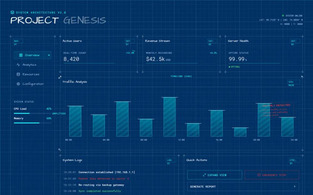 Все промпты
style
Стиль дашборда Architectural Blueprint
Технический UI-стиль с эстетикой чертежа. Использует глубокий синий фон, сетки, размерные линии и пометки «красным карандашом» для визуализации данных.
Автор: Zhou JasonЖивое превью
Зачем вайб-кодеру
Этот промпт превращает обычный дашборд в инженерный план. Он подходит для SaaS-продуктов в сфере аналитики, управления проектами или AI-инструментов, где важно подчеркнуть «внутреннюю кухню» и точность вычислений. Пользователь сразу видит, что работает с серьезным инструментом, а не с очередной оберткой над API.
Вставляй этот конфиг в v0 или Lovable, чтобы задать визуальный тон всему приложению. Главное — не перегружай интерфейс деталями. Оставь акцент на сетке и координатах, а «красные пометки» используй только для выделения критических ошибок или важных кнопок действия. Это создаст ощущение живого, работающего в реальном времени прототипа.
Prompt
# Architectural Blueprint

<design-system>

# Design Style: Architectural Blueprint (The "Master Plan" Aesthetic)

## Design Philosophy

**Core Concept: Precision in Progress** This style treats the UI as a technical drawing or a floor plan in the drafting stage. It’s not a finished product; it’s the *logic* behind the product. It’s about measurements, grid math, and the beauty of structural planning.

**Core Tenets:**

1. **The "Cyanotype" Logic**: Traditionally, blueprints are white lines on a deep blue background. This high-contrast, inverted look suggests technical authority.

2. **Measurement Markers**: Every element should have visible "dimension lines" (arrows indicating width/height) or coordinate labels (e.g., `x:140, y:220`).

3. **Drafting Notations**: Use hand-written "redline" notes, circles around "errors," and margin comments to make the UI feel like a living document.

4. **Wireframe Transparency**: Elements are not solid; they are transparent wireframes where you can see the "skeleton" of the layers beneath.

5. **The Master Grid**: A prominent 10px / 50px grid is the foundation. Every element must align strictly to the intersections.

**The Vibe:**

- **Analytical & Calculated**: It feels like an engineering feat.

- **Work-in-Progress**: Suggests the AI is "building" the design in real-time.

- **Structural**: Focuses on the "bones" of the interface.

---

## Design Token System (The DNA)

### Colors (The "Cyanotype" Palette)

- **Background (Blueprint Blue)**: #003366 (Deep, matte technical blue).

- **Lines (Drafting White)**: #FFFFFF at 80% opacity (Clean, sharp lines).

- **Accents (Redline)**: #FF3333 (For "corrections" and critical CTAs).

- **Measurements (Cyan)**: #00FFFF (For coordinates and dimension lines).

### Typography

- **Font Family**: **"Architects Daughter"** (Google Fonts) for notes, or **"Roboto Mono"** for technical data.

- **Style**: Headings are in Block Caps. Labels are tiny, monospaced, and accompanied by a serial number.

### Textures & Patterns

- **Grid**: A repeating CSS background grid of 20px squares.

- **Paper Texture**: A subtle "vellum" or "blueprint paper" grain to give the blue background depth.

---

## Component Stylings

- **Cards**: Defined by thin white outlines with "crosshair" intersections at the corners.

- **Buttons**: Look like technical stamps or "Approved" boxes.

- **Dividers**: Lines with dimension arrows at each end (e.g., `<--- 1200px --->`).

## Animation

- **Drafting Reveal**: Sections "draw" themselves line-by-line using `stroke-dashoffset` animations.

- **Cursor Coordinate**: A small "crosshair" follows the cursor, showing its current X/Y coordinates in real-time.

</design-system>