All Prompts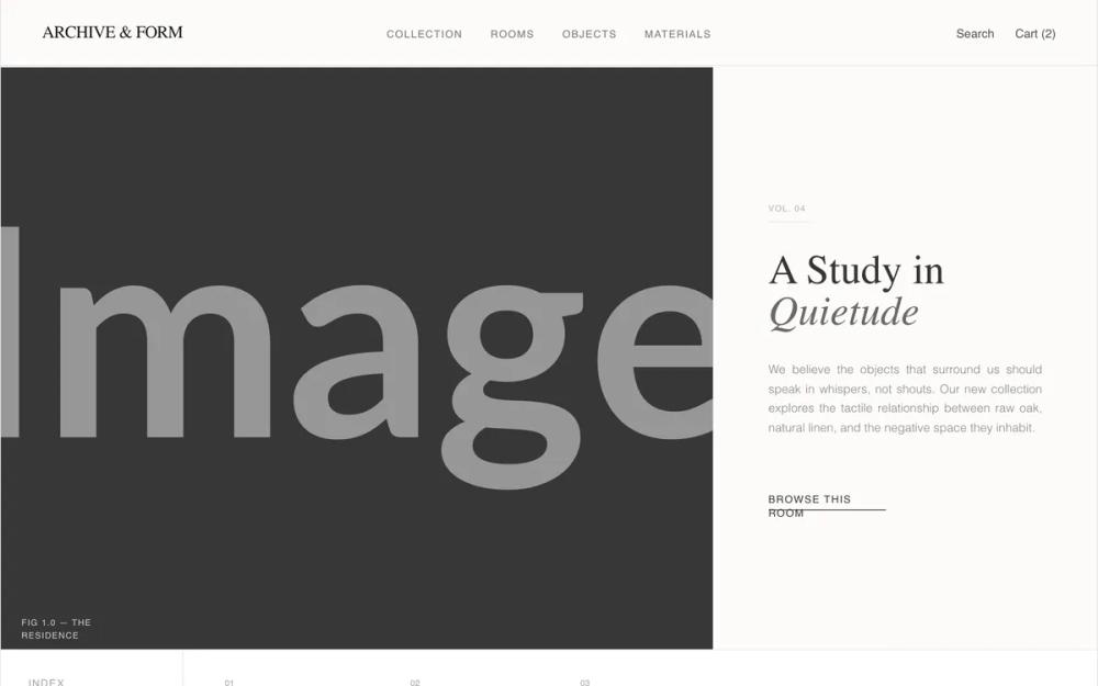 All Prompts
shopifyecommercelayoutlanding page
Archive & Form - Updated Hero Image
UI-кит для каталога мебели в стиле 'Archive & Form'. Минималистичный дизайн, типографика, интерактивные элементы. Идеально для люксовой мебели, архитектуры, e-commerce.
by Shirley LouLive Preview
Prompt
# Archive & Form - Updated Hero Image

{
  "summary": "A sophisticated, catalog-driven UI design system inspired by high-end architectural magazines. It emphasizes tactile materials, quiet typography, and a structured, grid-based layout that prioritizes high-quality imagery and editorial flow over loud CTAs.",
  "style": {
    "description": "The style is 'Quiet Luxury'—minimalist, tactile, and measured. It uses a cream-based off-white background (#Fdfbf9) instead of pure white to create warmth and physical texture. Typography pairs a light-weight, expressive serif (Zodiak) for headlines with a clean, functional sans-serif (General Sans) for UI elements. Elements are contained within a subtle border-grid system (neutral-200) that reinforces the 'archival' feel. Animations are slow, intentional, and atmospheric (1.2s fades, 2s image scales).",
    "prompt": "Create a design system with an architectural, editorial aesthetic. Background color: #Fdfbf9. Text colors: #1a1a1a for primary, #737373 for secondary. Borders: 1px solid #e5e5e5 (neutral-200). Typography: Primary Serif (Zodiak or similar) in weights 300 and 400; Secondary Sans (General Sans or similar) in weights 300, 400, 500, and 600. Headings should use font-serif, 36px-64px, with specific words in italics for emphasis. UI labels: 10px, uppercase, tracking-widest (0.1em to 0.2em). Buttons: text-only with a simple 1px underline transition. Imagery: Slight grayscale (10-20%) to unify different sources. Animations: Fade-in translateY(10px) with 1.2s duration; image hover scale: scale(1.01) with 2s duration cubic-bezier(0.2, 0.8, 0.2, 1)."
  },
  "layout_and_structure": {
    "description": "The layout uses a magazine-spread logic, featuring high-contrast asymmetric splits and a vertical container border. The structure moves from an 'Opening Spread' (Hero) to a 'Table of Contents' (Index), followed by alternating 'Room' sections that mix large-scale photography with detailed product listings.",
    "prompts": [
      {
        "part": "Main Container",
        "prompt": "The entire site is contained within a max-width of 1440px, centered with vertical borders (1px solid neutral-200) on the left and right sides to create a 'page' effect. Background: #Fdfbf9."
      },
      {
        "part": "Header",
        "prompt": "Sticky header with 95% opacity backdrop-blur-sm. Three-column layout: Left column contains the logo in serif caps; Middle column contains navigation links in 10px uppercase tracking-widest sans-serif; Right column contains utility links like 'Search' and 'Cart (0)'. 1px border-bottom."
      },
      {
        "part": "Hero Section (Opening Spread)",
        "prompt": "Split layout (65% image, 35% text). Left side: full-height architectural image with a 'Fig 1.0' label in the corner. Right side: Centered text block with a 'Vol. 04' tag, a large serif heading ('A Study in Quietude'), a justified-text paragraph, and a simple underlined CTA. Use 1px vertical border between the split."
      },
      {
        "part": "Room Index",
        "prompt": "A horizontal 'Table of Contents' bar. Left 25% is an 'Index' label. Right 75% contains a list of rooms with numerical prefixes (e.g., 01, 02) and serif titles. Titles switch to italics on hover. Border-bottom separation."
      },
      {
        "part": "Product/Room Sections",
        "prompt": "Alternating layouts. Layout A: 70% image left, 30% sticky product list right. Layout B: 40% text and product list left, 60% image right. Product lists use small 16x16 aspect-ratio thumbnails, reference numbers (Ref. 882), and technical specs (materials/dimensions)."
      },
      {
        "part": "Material Grid",
        "prompt": "A 'Close Inspection' section featuring a 4-column grid of material close-ups (wood grain, linen, etc.). On hover, a white-overlay slide-up reveals the material name and finish details in uppercase 10px type."
      },
      {
        "part": "Footer",
        "prompt": "Four-column archival footer. Column 1: Logo and address. Column 2: Catalog links. Column 3: Journal links. Column 4: Newsletter signup with a minimal bottom-border input field. Includes a copyright and legal bar at the very bottom."
      }
    ]
  },
  "special_ui_components": [
    {
      "component": "Product Detail Card",
      "description": "A horizontal list item used for product catalogs within sections.",
      "prompt": "Flex row with a 64px square image placeholder. Details include a Title (14px uppercase), Ref number (12px), and a 2-column grid for specs. Includes a 10px uppercase underlined link 'View Object'. Entire component background switches to #ffffff on hover."
    },
    {
      "component": "Interactive Room Index",
      "description": "Numerical navigation bar found after the hero.",
      "prompt": "Grid-based navigation where each link shows a tiny number (01, 02) above a serif heading. Hovering over any link triggers an italic font-style transition for the heading and changes text color from neutral-400 to black."
    }
  ]
}