All Prompts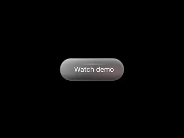 All Prompts
buttontailwindglassmorphic3danimatedinteractivegradientcta
3D Glassmorphic Gradient Button with Parallax Hover
3D кнопка с параллакс-эффектом при наведении. Стеклянные слои, градиентное свечение, анимация. Идеально для CTA, триггеров.
Prompt
<button class="inline-flex transition overflow-hidden group text-sm text-white/90 rounded-full pt-3 pr-5 pb-3 pl-5 relative gap-x-2 gap-y-2 items-center" style="--x: 65.8311322655902%; --y: 55.329221903883194%; background: linear-gradient(135deg, rgba(255, 255, 255, 0.25) 0%, rgba(255, 255, 255, 0.1) 50%, rgba(255, 255, 255, 0.05) 100%); border: 1px solid rgba(255, 255, 255, 0.3); box-shadow: rgba(0, 0, 0, 0.3) 0px 8px 32px, rgba(255, 255, 255, 0.4) 0px 2px 4px inset, rgba(0, 0, 0, 0.2) 0px -2px 4px inset, rgba(255, 255, 255, 0.1) 0px 0px 0px 1px inset; backdrop-filter: blur(20px); transform-style: preserve-3d; transition: 0.5s cubic-bezier(0.4, 0, 0.2, 1); transform: perspective(1000px) rotateX(0deg) rotateY(0deg) translateZ(15px);" onmouseover="this.style.transform='perspective(1000px) rotateX(-10deg) rotateY(8deg) translateZ(25px)'; this.style.boxShadow='0 20px 60px rgba(0,0,0,0.4), inset 0 3px 6px rgba(255,255,255,0.5), inset 0 -3px 6px rgba(0,0,0,0.3), 0 0 0 1px rgba(255,255,255,0.2) inset, 0 0 60px rgba(244,63,94,0.4)'; this.querySelector('.inner-layer-1').style.opacity='1'; this.querySelector('.inner-layer-2').style.opacity='0.8'; this.querySelector('.light-sweep').style.transform='translate(150%, -150%) rotate(45deg)'; this.querySelector('.depth-shadow').style.opacity='1';" onmouseout="this.style.transform='perspective(1000px) rotateX(0deg) rotateY(0deg) translateZ(15px)'; this.style.boxShadow='0 8px 32px rgba(0,0,0,0.3), inset 0 2px 4px rgba(255,255,255,0.4), inset 0 -2px 4px rgba(0,0,0,0.2), 0 0 0 1px rgba(255,255,255,0.1) inset'; this.querySelector('.inner-layer-1').style.opacity='0.6'; this.querySelector('.inner-layer-2').style.opacity='0.4'; this.querySelector('.light-sweep').style.transform='translate(-150%, 150%) rotate(45deg)'; this.querySelector('.depth-shadow').style.opacity='0.5';" onmousemove="const rect = this.getBoundingClientRect(); const x = event.clientX - rect.left; const y = event.clientY - rect.top; const centerX = rect.width / 2; const centerY = rect.height / 2; const rotateX = ((y - centerY) / centerY) * -15; const rotateY = ((x - centerX) / centerX) * 15; this.style.transform = `perspective(1000px) rotateX(${rotateX}deg) rotateY(${rotateY}deg) translateZ(25px)`; this.style.setProperty('--x', ((x / rect.width) * 100) + '%'); this.style.setProperty('--y', ((y / rect.height) * 100) + '%');">
            <div class="absolute inset-0 rounded-full" style="background: linear-gradient(135deg, rgba(255,255,255,0.6) 0%, rgba(255,255,255,0.2) 50%, rgba(255,255,255,0.05) 100%); pointer-events: none; z-index: 1;"></div>

            <div class="inner-layer-1 absolute inset-0 rounded-full" style="background: radial-gradient(circle at var(--x) var(--y), rgba(255,255,255,0.5) 0%, rgba(255,255,255,0.2) 40%, transparent 70%); opacity: 0.6; transition: opacity 0.5s; pointer-events: none; z-index: 2;"></div>

            <div class="inner-layer-2 absolute inset-0 rounded-full" style="background: radial-gradient(ellipse at var(--x) var(--y), rgba(244,63,94,0.4) 0%, rgba(251,113,133,0.2) 30%, transparent 60%); opacity: 0.4; transition: opacity 0.5s; pointer-events: none; filter: blur(8px); z-index: 3;"></div>

            <div class="light-sweep absolute inset-0 rounded-full" style="background: linear-gradient(135deg, transparent 0%, rgba(255, 255, 255, 0.8) 50%, transparent 100%); transform: translate(-150%, 150%) rotate(45deg); transition: transform 0.8s cubic-bezier(0.4, 0, 0.2, 1); pointer-events: none; filter: blur(6px); width: 200%; height: 200%; top: -50%; left: -50%; z-index: 4;"></div>

            <div class="absolute inset-0 rounded-full" style="background: linear-gradient(180deg, rgba(255,255,255,0.2) 0%, transparent 30%, transparent 70%, rgba(0,0,0,0.3) 100%); pointer-events: none; z-index: 5;"></div>

            <div class="absolute top-1/4 left-1/4 right-1/4 h-px rounded-full" style="background: linear-gradient(90deg, transparent, rgba(255,255,255,0.8), transparent); pointer-events: none; filter: blur(1px); z-index: 6;"></div>

            <div class="depth-shadow absolute inset-0 rounded-full" style="box-shadow: rgba(0, 0, 0, 0.3) 0px -4px 8px inset, rgba(255, 255, 255, 0.3) 0px 4px 8px inset; opacity: 0.5; transition: opacity 0.5s; pointer-events: none; z-index: 7;"></div>

            <span class="iconify text-[18px] relative z-10" data-icon="solar:video-play-bold" aria-hidden="true" style="text-shadow: 0 1px 3px rgba(0,0,0,0.4), 0 0 8px rgba(255,255,255,0.3); filter: drop-shadow(0 0 4px rgba(255,255,255,0.5));"></span>

            <span class="z-10 relative" style="text-shadow: 0 1px 3px rgba(0,0,0,0.4), 0 0 8px rgba(255,255,255,0.2)">
              Watch demo
            </span>

            <div class="absolute -inset-2 rounded-full" style="background: radial-gradient(circle at center, rgba(244,63,94,0.4) 0%, rgba(251,113,133,0.2) 40%, transparent 70%); opacity: 0; transition: opacity 0.5s ease; filter: blur(20px); pointer-events: none; z-index: -1;"></div>

            <style>
              button[data-element-id="aura-emhrz05k76ejwhhy1"]:active {
                transform: perspective(1000px) rotateX(0deg) rotateY(0deg) translateZ(8px) scale(0.97) !important;
                transition: all 0.15s ease !important;
              }
            </style>
          </button>