All Prompts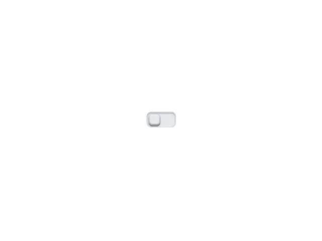 All Prompts
toggleswitch3dskeuomorphicforminteractiveanimatedbluegradient
3D Skeuomorphic Toggle Switch
3D скевоморфный переключатель. Интерактивный UI-элемент с анимацией для переключения состояний. Идеален для форм и настроек.
Prompt
<div class="toggle-wrapper relative flex justify-center items-center bg-gradient-to-b from-gray-300 to-gray-200 rounded-lg p-0.5 shadow-inner text-2xl">
  <input class="toggle-checkbox focus-visible:outline-none focus-visible:ring-2 focus-visible:ring-blue-400/60 rounded-md absolute z-10 w-full h-full opacity-0 cursor-pointer" type="checkbox" aria-label="Toggle" aria-pressed="false" style="appearance:none;border-radius:inherit;font:inherit;">
  <div class="toggle-container flex items-center relative rounded-md w-12 h-6 bg-gray-200 transition-colors duration-400" style="box-shadow:inset 0 0 1px 2px rgba(255,255,255,.2),inset 0 1px 2px rgba(0,0,0,.4);">
    <div class="toggle-button flex justify-center items-center absolute left-0.5 rounded-md w-5 h-5 bg-gray-200 transition-all duration-400" style="box-shadow:inset 0 -1px 1px 2px rgba(0,0,0,.1),inset 0 -2px 1px rgba(0,0,0,.2),inset 0 3px 1px rgba(255,255,255,.3),0 2px 2px rgba(0,0,0,.5);">
      <div class="toggle-button-circles-container grid grid-cols-3 gap-0.5 absolute mx-auto">
        <div class="toggle-button-circle rounded-full w-0.5 h-0.5 bg-gradient-radial from-gray-100 to-gray-400"></div>
        <div class="toggle-button-circle rounded-full w-0.5 h-0.5 bg-gradient-radial from-gray-100 to-gray-400"></div>
        <div class="toggle-button-circle rounded-full w-0.5 h-0.5 bg-gradient-radial from-gray-100 to-gray-400"></div>
        <div class="toggle-button-circle rounded-full w-0.5 h-0.5 bg-gradient-radial from-gray-100 to-gray-400"></div>
        <div class="toggle-button-circle rounded-full w-0.5 h-0.5 bg-gradient-radial from-gray-100 to-gray-400"></div>
        <div class="toggle-button-circle rounded-full w-0.5 h-0.5 bg-gradient-radial from-gray-100 to-gray-400"></div>
        <div class="toggle-button-circle rounded-full w-0.5 h-0.5 bg-gradient-radial from-gray-100 to-gray-400"></div>
        <div class="toggle-button-circle rounded-full w-0.5 h-0.5 bg-gradient-radial from-gray-100 to-gray-400"></div>
        <div class="toggle-button-circle rounded-full w-0.5 h-0.5 bg-gradient-radial from-gray-100 to-gray-400"></div>
        <div class="toggle-button-circle rounded-full w-0.5 h-0.5 bg-gradient-radial from-gray-100 to-gray-400"></div>
        <div class="toggle-button-circle rounded-full w-0.5 h-0.5 bg-gradient-radial from-gray-100 to-gray-400"></div>
        <div class="toggle-button-circle rounded-full w-0.5 h-0.5 bg-gradient-radial from-gray-100 to-gray-400"></div>
      </div>
    </div>
  </div>
  <script>
    const checkbox = document.querySelector('.toggle-checkbox');
  const container = document.querySelector('.toggle-container');
  const button = document.querySelector('.toggle-button');

  function applyState() {
    const checked = checkbox.checked;
    if (checked) {
      container.style.backgroundColor = '#3b82f6';
      button.style.left = '1.5rem';
    } else {
      container.style.backgroundColor = '#e5e7eb';
      button.style.left = '0.125rem';
    }
    checkbox.setAttribute('aria-pressed', checked ? 'true' : 'false');
  }

  checkbox.addEventListener('change', applyState);
  applyState();
  </script>
</div>