All Prompts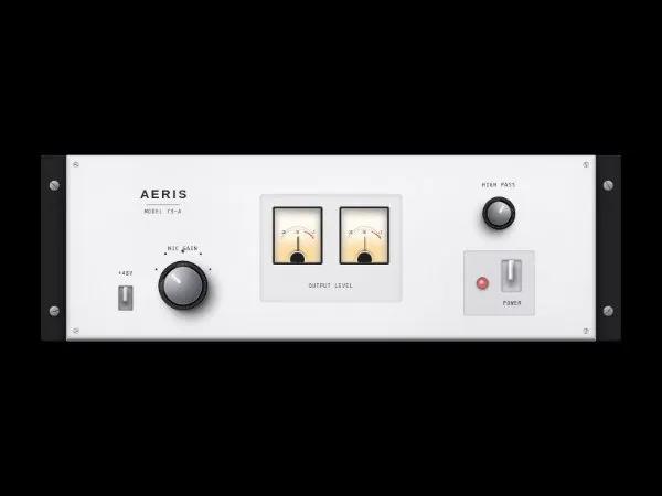 All Prompts
uiinteractiveanimatedtailwindaudiovisual
Analog Rack Preamp UI Panel
UI-панель аналогового предусилителя: тумблеры, ручки, VU-метры. Tailwind-стиль. Для аудио-интерфейсов и демонстрации UI.
Prompt
<div class="min-h-screen flex items-center justify-center bg-black">
<div class="z-10 w-full max-w-6xl relative"
data-element-locator="html > body:nth-of-type(1) > div:nth-of-type(2)">
<!-- Rack Ears (Left) -->
<div
class="absolute left-0 top-0 bottom-0 w-8 md:w-12 bg-zinc-800 rounded-l-md shadow-[inset_-2px_0_10px_rgba(0,0,0,0.5),5px_0_15px_rgba(0,0,0,0.8)] border-l border-t border-zinc-600 flex flex-col justify-between py-12 items-center z-0 translate-x-4">
<!-- Rack Screws -->
<div
class="w-4 h-4 md:w-5 md:h-5 rounded-full bg-zinc-400 shadow-[inset_0_2px_4px_rgba(255,255,255,0.6),0_2px_4px_rgba(0,0,0,0.5)] flex items-center justify-center border border-zinc-500"
style="background: linear-gradient(135deg, #d4d4d8 0%, #71717a 100%);">
<div class="w-full h-px bg-zinc-800 rotate-45 shadow-[0_1px_0_rgba(255,255,255,0.4)]"></div>
</div>
<div
class="w-4 h-4 md:w-5 md:h-5 rounded-full bg-zinc-400 shadow-[inset_0_2px_4px_rgba(255,255,255,0.6),0_2px_4px_rgba(0,0,0,0.5)] flex items-center justify-center border border-zinc-500"
style="background: linear-gradient(135deg, #d4d4d8 0%, #71717a 100%);">
<div class="w-full h-px bg-zinc-800 -rotate-12 shadow-[0_1px_0_rgba(255,255,255,0.4)]"></div>
</div>
</div>
<!-- Rack Ears (Right) -->
<div
class="absolute right-0 top-0 bottom-0 w-8 md:w-12 bg-zinc-800 rounded-r-md shadow-[inset_2px_0_10px_rgba(0,0,0,0.5),-5px_0_15px_rgba(0,0,0,0.8)] border-r border-t border-zinc-600 flex flex-col justify-between py-12 items-center z-0 -translate-x-4">
<div
class="w-4 h-4 md:w-5 md:h-5 rounded-full bg-zinc-400 shadow-[inset_0_2px_4px_rgba(255,255,255,0.6),0_2px_4px_rgba(0,0,0,0.5)] flex items-center justify-center border border-zinc-500"
style="background: linear-gradient(135deg, #d4d4d8 0%, #71717a 100%);">
<div class="w-full h-px bg-zinc-800 rotate-[60deg] shadow-[0_1px_0_rgba(255,255,255,0.4)]"></div>
</div>
<div
class="w-4 h-4 md:w-5 md:h-5 rounded-full bg-zinc-400 shadow-[inset_0_2px_4px_rgba(255,255,255,0.6),0_2px_4px_rgba(0,0,0,0.5)] flex items-center justify-center border border-zinc-500"
style="background: linear-gradient(135deg, #d4d4d8 0%, #71717a 100%);">
<div class="w-full h-px bg-zinc-800 -rotate-45 shadow-[0_1px_0_rgba(255,255,255,0.4)]"></div>
</div>
</div>
<!-- Main Aluminum Panel -->
<div
class="relative z-10 mx-6 md:mx-16 bg-zinc-300 rounded-sm shadow-[0_30px_60px_-15px_rgba(0,0,0,0.9),inset_0_2px_2px_rgba(255,255,255,0.8),inset_0_-4px_8px_rgba(0,0,0,0.4)] border border-zinc-400 overflow-hidden"
style="background-image: linear-gradient(to bottom, #e4e4e7 0%, #d4d4d8 100%), repeating-linear-gradient(to right, transparent, transparent 2px, rgba(255,255,255,0.15) 3px, rgba(0,0,0,0.03) 4px); background-blend-mode: overlay;">
<!-- Surface Dust/Wear Overlay -->
<div class="absolute inset-0 pointer-events-none opacity-40 mix-blend-multiply"
style="background-image: radial-gradient(circle at 20% 30%, rgba(0,0,0,0.05) 0%, transparent 20%), radial-gradient(circle at 80% 70%, rgba(0,0,0,0.08) 0%, transparent 30%); box-shadow: inset 0 0 100px rgba(0,0,0,0.1);">
</div>
<!-- Panel Screws (Corners) -->
<div
class="absolute top-3 left-3 w-3 h-3 rounded-full bg-zinc-200 shadow-[inset_0_1px_2px_rgba(0,0,0,0.3),0_1px_1px_rgba(255,255,255,0.8)] border border-zinc-400 flex items-center justify-center">
<div class="w-full h-px bg-zinc-600 rotate-[15deg]"></div>
</div>
<div
class="absolute top-3 right-3 w-3 h-3 rounded-full bg-zinc-200 shadow-[inset_0_1px_2px_rgba(0,0,0,0.3),0_1px_1px_rgba(255,255,255,0.8)] border border-zinc-400 flex items-center justify-center">
<div class="w-full h-px bg-zinc-600 rotate-[75deg]"></div>
</div>
<div
class="absolute bottom-3 left-3 w-3 h-3 rounded-full bg-zinc-200 shadow-[inset_0_1px_2px_rgba(0,0,0,0.3),0_1px_1px_rgba(255,255,255,0.8)] border border-zinc-400 flex items-center justify-center">
<div class="w-full h-px bg-zinc-600 -rotate-[25deg]"></div>
</div>
<div
class="absolute bottom-3 right-3 w-3 h-3 rounded-full bg-zinc-200 shadow-[inset_0_1px_2px_rgba(0,0,0,0.3),0_1px_1px_rgba(255,255,255,0.8)] border border-zinc-400 flex items-center justify-center">
<div class="w-full h-px bg-zinc-600 -rotate-[85deg]"></div>
</div>
<!-- Content Grid -->
<div class="p-8 md:p-12 grid grid-cols-1 lg:grid-cols-12 gap-12 items-center relative z-10">
<!-- Section 1: Preamp Controls (Left) -->
<div class="col-span-1 lg:col-span-4 flex flex-col items-center gap-10">
<!-- Branding & Model -->
<div class="flex flex-col items-center justify-center mb-4">
<h1 class="text-zinc-800 text-2xl font-semibold tracking-tighter uppercase"
style="text-shadow: 0 1px 1px rgba(255,255,255,0.9);">
A E R I S
</h1>
<div class="h-px w-16 bg-zinc-500 my-1 shadow-[0_1px_0_rgba(255,255,255,0.6)]"></div>
<p class="text-xs text-zinc-700 font-semibold tracking-widest uppercase"
style="font-family: 'Space Mono', monospace; text-shadow: 0 1px 0 rgba(255,255,255,0.8);">
Model 73-A
</p>
</div>
<div class="flex flex-row items-end justify-center gap-8 md:gap-12 w-full">
<!-- Toggle Switch: 48V -->
<div class="flex flex-col items-center gap-4">
<span class="text-xs text-zinc-800 font-semibold uppercase tracking-widest" style="font-family: 'Space Mono', monospace; text-shadow: 0 1px 0 rgba(255,255,255,0.8);">+48V</span>
<div
class="relative w-7 h-12 bg-zinc-400 rounded-sm shadow-[inset_0_2px_5px_rgba(0,0,0,0.6),0_1px_0_rgba(255,255,255,0.8)] border border-zinc-500 flex justify-center items-center">
<div class="absolute top-1 w-1 h-1 rounded-full bg-zinc-300 shadow-[inset_0_1px_1px_rgba(0,0,0,0.5)]">
</div>
<div
class="absolute bottom-1 w-1 h-1 rounded-full bg-zinc-300 shadow-[inset_0_1px_1px_rgba(0,0,0,0.5)]">
</div>
<!-- Switch Lever (Up) -->
<div
class="w-2.5 h-7 rounded-t-full shadow-[0_8px_10px_rgba(0,0,0,0.7),inset_0_1px_2px_rgba(255,255,255,0.9),inset_-1px_0_2px_rgba(0,0,0,0.3)] -translate-y-2 border-b border-zinc-600 relative overflow-hidden"
style="background: linear-gradient(to right, #a1a1aa, #f4f4f5 30%, #a1a1aa 70%, #71717a);">
<div class="absolute top-0 w-full h-1/2 bg-gradient-to-b from-white/40 to-transparent"></div>
</div>
</div>
</div>
<!-- Heavy Rotary Knob: Gain -->
<div class="flex flex-col items-center gap-4 relative">
<!-- Indicator dots -->
<div
class="absolute w-[120px] h-[120px] top-1/2 left-1/2 -translate-x-1/2 -translate-y-1/2 pointer-events-none rounded-full"
style="background: conic-gradient(from -135deg, transparent 0deg, transparent 270deg, transparent 360deg);">
<!-- Manual tick marks using absolute positioning for precision -->
<div
class="absolute top-[10%] left-[20%] w-1 h-1 bg-zinc-800 rounded-full shadow-[0_1px_0_rgba(255,255,255,0.7)]">
</div>
<div
class="absolute top-[5%] left-[50%] -translate-x-1/2 w-1.5 h-1.5 bg-zinc-800 rounded-full shadow-[0_1px_0_rgba(255,255,255,0.7)]">
</div>
<div
class="absolute top-[10%] right-[20%] w-1 h-1 bg-zinc-800 rounded-full shadow-[0_1px_0_rgba(255,255,255,0.7)]">
</div>
<div
class="absolute top-[35%] right-[5%] w-1 h-1 bg-zinc-800 rounded-full shadow-[0_1px_0_rgba(255,255,255,0.7)]">
</div>
<div
class="absolute top-[35%] left-[5%] w-1 h-1 bg-zinc-800 rounded-full shadow-[0_1px_0_rgba(255,255,255,0.7)]">
</div>
</div>
<span class="text-xs text-zinc-800 font-semibold uppercase tracking-widest z-10" style="font-family: 'Space Mono', monospace; text-shadow: 0 1px 0 rgba(255,255,255,0.8);">Mic Gain</span>
<!-- Knob Body -->
<div
class="relative w-24 h-24 rounded-full shadow-[0_20px_25px_-5px_rgba(0,0,0,0.7),0_8px_10px_-6px_rgba(0,0,0,0.5)] flex items-center justify-center border border-black/80 z-10"
style="background: linear-gradient(135deg, #3f3f46, #09090b); transform: rotate(-45deg);">
<!-- Textured Grip (Knurling) -->
<div class="absolute inset-[2px] rounded-full shadow-inner"
style="background: repeating-conic-gradient(from 0deg, #52525b 0deg, #18181b 2deg, #52525b 4deg);">
</div>
<!-- Inner Cap base -->
<div
class="absolute inset-[6px] rounded-full bg-zinc-900 shadow-[inset_0_5px_10px_rgba(0,0,0,1)] border border-zinc-700/50">
</div>
<!-- Aluminum Top Cap -->
<div
class="absolute inset-[10px] rounded-full shadow-[inset_0_1px_3px_rgba(255,255,255,0.6),0_2px_5px_rgba(0,0,0,0.8)] border border-zinc-500/50 flex justify-center"
style="background: radial-gradient(circle at 50% 10%, #d4d4d8 0%, #71717a 60%, #3f3f46 100%);">
<!-- Reflection highlight -->
<div class="absolute inset-0 rounded-full bg-gradient-to-b from-white/20 to-transparent w-full h-1/2">
</div>
<!-- Position Indicator Line -->
<div
class="w-1.5 h-6 bg-zinc-100 rounded-b-sm shadow-[0_0_4px_rgba(255,255,255,0.4),inset_0_1px_1px_rgba(0,0,0,0.3)] mt-1 z-10">
</div>
</div>
</div>
</div>
</div>
</div>
<!-- Section 2: VU Meters (Center) -->
<div
class="col-span-1 lg:col-span-4 flex flex-col items-center justify-center gap-6 bg-zinc-800/5 p-6 rounded-lg shadow-[inset_0_2px_10px_rgba(0,0,0,0.1)] border border-zinc-400/20">
<!-- Stereo Meters Container -->
<div class="flex gap-4 md:gap-8 w-full justify-center relative">
<!-- Top Light Source Reflection on Panel -->
<div
class="absolute -top-4 left-1/2 -translate-x-1/2 w-3/4 h-2 bg-white/20 blur-md rounded-full pointer-events-none">
</div>
<!-- Meter Left -->
<div
class="relative w-36 h-28 bg-[#fdfaf0] rounded shadow-[inset_0_6px_15px_rgba(0,0,0,0.5),0_2px_0_rgba(255,255,255,0.7)] border-4 border-zinc-800 overflow-hidden flex flex-col items-center">
<!-- Glass Glare -->
<div
class="absolute inset-0 bg-gradient-to-br from-white/30 via-white/5 to-transparent pointer-events-none z-30">
</div>
<!-- Scale Graphics -->
<svg class="w-full h-16 mt-2 opacity-90" viewBox="0 0 100 50">
<path d="M 15 45 A 40 40 0 0 1 85 45" fill="none" stroke="#27272a" stroke-width="1"
stroke-dasharray="1 3" class=""></path>
<path d="M 15 45 A 40 40 0 0 1 85 45" fill="none" stroke="#27272a" stroke-width="0.5"
stroke-dasharray="0.5 1" class=""></path>
<!-- Red Zone -->
<path d="M 65 30 A 40 40 0 0 1 85 45" fill="none" stroke="#dc2626" stroke-width="2" class=""></path>
<!-- Main arc -->
<path d="M 15 42 A 38 38 0 0 1 85 42" fill="none" stroke="#27272a" stroke-width="0.5" class=""></path>
</svg>
<!-- Numbers -->
<div
class="absolute top-[40%] flex justify-between w-[75%] text-[0.45rem] font-semibold text-zinc-800 tracking-tighter"
style="font-family: 'Space Mono', monospace;">
<span>-20</span><span>-10</span><span class="text-red-600 font-bold ml-2">+3</span>
</div>
<!-- VU Label -->
<div class="absolute bottom-4 text-[0.5rem] font-semibold text-zinc-600 tracking-widest"
style="font-family: 'Space Mono', monospace;">VU</div>
<!-- Amber LED Illumination -->
<div
class="absolute bottom-0 w-full h-10 bg-amber-500/40 blur-[12px] z-0 animate-[pulse_3s_ease-in-out_infinite]">
</div>
<div
class="absolute -bottom-4 left-1/2 -translate-x-1/2 w-12 h-6 bg-amber-400/60 blur-[8px] z-0 rounded-full">
</div>
<!-- Animated Needle -->
<div
class="absolute bottom-[-15px] left-1/2 w-[1.5px] h-[65px] bg-zinc-900 origin-bottom z-10 shadow-[2px_0_3px_rgba(0,0,0,0.3)]"
style="animation: vu-bounce-left 2.5s infinite ease-in-out;">
<!-- Needle counterweight -->
<div class="absolute bottom-0 left-1/2 -translate-x-1/2 w-1.5 h-6 bg-zinc-800 rounded-sm"></div>
</div>
<!-- Pivot point cover (Black circle at bottom) -->
<div
class="absolute bottom-[-10px] left-1/2 -translate-x-1/2 w-8 h-8 rounded-full bg-zinc-900 z-20 border-2 border-[#fdfaf0] shadow-[0_-2px_4px_rgba(0,0,0,0.4)]">
</div>
</div>
<!-- Meter Right -->
<div
class="relative w-36 h-28 bg-[#fdfaf0] rounded shadow-[inset_0_6px_15px_rgba(0,0,0,0.5),0_2px_0_rgba(255,255,255,0.7)] border-4 border-zinc-800 overflow-hidden flex flex-col items-center">
<!-- Glass Glare -->
<div
class="absolute inset-0 bg-gradient-to-br from-white/30 via-white/5 to-transparent pointer-events-none z-30">
</div>
<svg class="w-full h-16 mt-2 opacity-90" viewBox="0 0 100 50">
<path d="M 15 45 A 40 40 0 0 1 85 45" fill="none" stroke="#27272a" stroke-width="1"
stroke-dasharray="1 3" class=""></path>
<path d="M 15 45 A 40 40 0 0 1 85 45" fill="none" stroke="#27272a" stroke-width="0.5"
stroke-dasharray="0.5 1" class=""></path>
<path d="M 65 30 A 40 40 0 0 1 85 45" fill="none" stroke="#dc2626" stroke-width="2" class=""></path>
<path d="M 15 42 A 38 38 0 0 1 85 42" fill="none" stroke="#27272a" stroke-width="0.5" class=""></path>
</svg>
<div
class="absolute top-[40%] flex justify-between w-[75%] text-[0.45rem] font-semibold text-zinc-800 tracking-tighter"
style="font-family: 'Space Mono', monospace;">
<span>-20</span><span>-10</span><span class="text-red-600 font-bold ml-2">+3</span>
</div>
<div class="absolute bottom-4 text-[0.5rem] font-semibold text-zinc-600 tracking-widest"
style="font-family: 'Space Mono', monospace;">VU</div>
<!-- Amber LED Illumination -->
<div
class="absolute bottom-0 w-full h-10 bg-amber-500/40 blur-[12px] z-0 animate-[pulse_4s_ease-in-out_infinite_alternate]">
</div>
<div
class="absolute -bottom-4 left-1/2 -translate-x-1/2 w-12 h-6 bg-amber-400/60 blur-[8px] z-0 rounded-full">
</div>
<!-- Animated Needle (different timing) -->
<div
class="absolute bottom-[-15px] left-1/2 w-[1.5px] h-[65px] bg-zinc-900 origin-bottom z-10 shadow-[2px_0_3px_rgba(0,0,0,0.3)]"
style="animation: vu-bounce-right 2.8s infinite ease-in-out 0.2s;">
<div class="absolute bottom-0 left-1/2 -translate-x-1/2 w-1.5 h-6 bg-zinc-800 rounded-sm"></div>
</div>
<div
class="absolute bottom-[-10px] left-1/2 -translate-x-1/2 w-8 h-8 rounded-full bg-zinc-900 z-20 border-2 border-[#fdfaf0] shadow-[0_-2px_4px_rgba(0,0,0,0.4)]">
</div>
</div>
</div>
<span class="text-xs text-zinc-700 font-semibold uppercase tracking-widest mt-2" style="font-family: 'Space Mono', monospace; text-shadow: 0 1px 0 rgba(255,255,255,0.8);">Output Level</span>
</div>
<!-- Section 3: Output & Power (Right) -->
<div
class="col-span-1 lg:col-span-4 flex flex-row lg:flex-col items-center justify-between lg:justify-center gap-10 h-full">
<!-- Medium Rotary Knob: EQ/Filter -->
<div class="flex flex-col items-center gap-4 relative">
<span class="text-xs text-zinc-800 font-semibold uppercase tracking-widest z-10" style="font-family: 'Space Mono', monospace; text-shadow: 0 1px 0 rgba(255,255,255,0.8);">High Pass</span>
<div
class="relative w-16 h-16 rounded-full shadow-[0_15px_20px_-5px_rgba(0,0,0,0.6),0_5px_8px_-4px_rgba(0,0,0,0.5)] flex items-center justify-center border border-black/80 z-10"
style="background: linear-gradient(135deg, #3f3f46, #09090b); transform: rotate(30deg);">
<div class="absolute inset-[2px] rounded-full shadow-inner"
style="background: repeating-conic-gradient(from 0deg, #52525b 0deg, #18181b 2deg, #52525b 4deg);">
</div>
<div
class="absolute inset-[4px] rounded-full bg-zinc-900 shadow-[inset_0_4px_8px_rgba(0,0,0,1)] border border-zinc-700/50">
</div>
<div
class="absolute inset-[8px] rounded-full shadow-[inset_0_1px_2px_rgba(255,255,255,0.5),0_2px_4px_rgba(0,0,0,0.8)] border border-zinc-500/50 flex justify-center"
style="background: radial-gradient(circle at 50% 10%, #d4d4d8 0%, #71717a 60%, #3f3f46 100%);">
<div class="absolute inset-0 rounded-full bg-gradient-to-b from-white/20 to-transparent w-full h-1/2">
</div>
<div
class="w-1 h-4 bg-zinc-100 rounded-b-sm shadow-[0_0_3px_rgba(255,255,255,0.4),inset_0_1px_1px_rgba(0,0,0,0.3)] mt-1 z-10">
</div>
</div>
</div>
</div>
<!-- Power Section -->
<div
class="flex items-center gap-6 bg-zinc-400/20 px-6 py-4 rounded shadow-[inset_0_1px_3px_rgba(0,0,0,0.1),0_1px_0_rgba(255,255,255,0.5)] border border-zinc-500/30">
<!-- Power Indicator Jewel Light -->
<div
class="relative w-6 h-6 rounded-full bg-red-900 border-2 border-zinc-500 shadow-[0_2px_4px_rgba(0,0,0,0.4),inset_0_2px_4px_rgba(0,0,0,0.8)] flex items-center justify-center overflow-hidden">
<!-- Lit effect -->
<div class="absolute inset-0 bg-red-500 opacity-80 mix-blend-screen shadow-[0_0_15px_rgba(239,68,68,1)]">
</div>
<!-- Jewel facets simulation -->
<div class="absolute inset-0"
style="background: repeating-linear-gradient(45deg, transparent, transparent 2px, rgba(255,255,255,0.15) 3px, rgba(255,255,255,0.15) 4px), repeating-linear-gradient(-45deg, transparent, transparent 2px, rgba(255,255,255,0.15) 3px, rgba(255,255,255,0.15) 4px);">
</div>
<div class="absolute top-1 left-1 w-2 h-2 bg-white rounded-full blur-[1px] opacity-60"></div>
</div>
<!-- Heavy Toggle Switch: Power -->
<div class="flex flex-col items-center gap-3">
<div
class="relative w-10 h-16 bg-zinc-300 rounded shadow-[inset_0_2px_6px_rgba(0,0,0,0.5),0_1px_0_rgba(255,255,255,0.9)] border border-zinc-400 flex justify-center items-center">
<div
class="absolute top-1.5 w-1.5 h-1.5 rounded-full bg-zinc-200 shadow-[inset_0_1px_2px_rgba(0,0,0,0.4)]">
</div>
<div
class="absolute bottom-1.5 w-1.5 h-1.5 rounded-full bg-zinc-200 shadow-[inset_0_1px_2px_rgba(0,0,0,0.4)]">
</div>
<!-- Switch Lever (Up) -->
<div
class="w-3.5 h-10 rounded-t-full shadow-[0_10px_15px_rgba(0,0,0,0.7),inset_0_2px_3px_rgba(255,255,255,1),inset_-2px_0_4px_rgba(0,0,0,0.4)] -translate-y-3 border border-zinc-500 relative overflow-hidden"
style="background: linear-gradient(to right, #d4d4d8, #ffffff 30%, #a1a1aa 80%, #52525b);">
<div class="absolute top-0 w-full h-1/2 bg-gradient-to-b from-white/60 to-transparent"></div>
</div>
</div>
<span class="text-xs text-zinc-800 font-semibold uppercase tracking-widest flex items-center gap-1" style="font-family: 'Space Mono', monospace; text-shadow: 0 1px 0 rgba(255,255,255,0.8);">
<iconify-icon icon="solar:power-linear" class="text-sm"></iconify-icon> Power
</span>
</div>
</div>
</div>
</div>
<!-- Bottom edge highlight for thick slab feel -->
<div
class="absolute bottom-0 left-0 w-full h-1 bg-gradient-to-b from-zinc-400 to-zinc-600 shadow-[0_2px_2px_rgba(0,0,0,0.5)] z-20">
</div>
</div>
</div>