All Prompts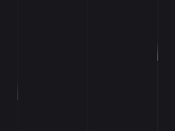 All Prompts
backgroundanimationtailwindcssdecorativeeffectlanding page
Animated Falling Lines Background (Tailwind)
Анимированный фон из падающих вертикальных линий на CSS. Реализован с помощью Tailwind CSS. Идеален для заголовков hero, лендингов.
Prompt
<!-- Animated Lines Background -->
<div class="lines absolute inset-0 h-full m-auto pointer-events-none z-0 bg-[#17171c] min-h-screen">
  <div class="line line-anim line-1 absolute w-px h-full top-0 left-1/2"
    style="margin-left: -22.5vw; background: rgba(255,255,255,0.1);"></div>
  <div class="line line-anim line-2 absolute w-px h-full top-0 left-1/2" style="background: rgba(255,255,255,0.1);">
  </div>
  <div class="line line-anim line-3 absolute w-px h-full top-0 left-1/2"
    style="margin-left: 22.5vw; background: rgba(255,255,255,0.1);"></div>
  <style>
    *,
    *::before,
    *::after {
      margin: 0;
      padding: 0;
      box-sizing: border-box !important;
    }

    html,
    body {
      height: 100%;
    }

    @keyframes drop {
      0% {
        top: -50%;
      }

      100% {
        top: 110%;
      }
    }

    .line-anim::after {
      content: '';
      display: block;
      position: absolute;
      height: 15vh;
      width: 100%;
      top: -50%;
      left: 0;
      background: linear-gradient(to bottom, rgba(255, 255, 255, 0) 0%, #fff 75%, #fff 100%);
      animation: drop 7s 0s infinite;
      animation-fill-mode: forwards;
      animation-timing-function: cubic-bezier(0.4, 0.26, 0, 0.97);
    }

    .line-1::after {
      animation-delay: 2s;
    }

    .line-3::after {
      animation-delay: 2.5s;
    }
  </style>
</div>