All Prompts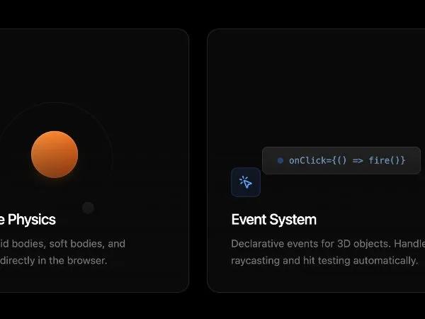 All Prompts
cardtailwindanimatedresponsiveinteractivegridmarketing
Animated Feature Cards Grid
Адаптивная сетка карточек с анимацией. Отображает функции, интерактивность с Tailwind CSS. Идеально для маркетинга и документации.
Prompt
<div class="grid grid-cols-1 md:grid-cols-3 gap-6 w-full gap-x-6 gap-y-6 justify-center">
<!-- Physics Card -->
<div
class="group overflow-hidden hover:border-orange-500/40 transition-all duration-500 hover:shadow-[0_0_40px_-10px_rgba(249,115,22,0.2)] animate-on-scroll bg-neutral-900/40 h-[360px] border-white/10 border rounded-2xl relative"
style="animation-delay: 100ms">
<div
class="absolute inset-0 bg-[radial-gradient(circle_at_50%_0%,rgba(249,115,22,0.1),transparent_70%)] opacity-0 group-hover:opacity-100 transition-opacity duration-700">
</div>
<!-- Physics Visual -->
<div class="overflow-hidden absolute top-0 right-0 bottom-0 left-0">
<div class="flex w-full h-full absolute top-0 left-0 items-center justify-center">
<!-- Bouncing Sphere -->
<div
class="w-16 h-16 rounded-full bg-gradient-to-br from-orange-400 to-orange-600 shadow-lg shadow-orange-500/20 animate-[bounce_2s_infinite] relative z-10">
<div class="absolute inset-0 rounded-full border border-white/20"></div>
</div>
<!-- Orbiting Element -->
<div class="absolute w-40 h-40 border border-white/5 rounded-full animate-[spin_8s_linear_infinite]">
<div
class="absolute top-0 left-1/2 -translate-x-1/2 -translate-y-1/2 w-4 h-4 bg-neutral-700 rounded-full border border-white/10">
</div>
</div>
<!-- Floor -->
<div class="absolute bottom-24 w-full h-px bg-gradient-to-r from-transparent via-white/10 to-transparent"></div>
</div>
</div>
<div
class="z-20 bg-gradient-to-t from-neutral-950 via-neutral-950/80 to-transparent w-full pt-12 pr-8 pb-8 pl-8 absolute bottom-0 left-0">
<div
class="w-10 h-10 rounded-lg bg-orange-500/10 border border-orange-500/20 flex items-center justify-center mb-4 text-orange-400 group-hover:bg-orange-500/20 transition-colors">
<svg xmlns="http://www.w3.org/2000/svg" width="20" height="20" viewBox="0 0 24 24" fill="none"
stroke="currentColor" stroke-width="2" stroke-linecap="round" stroke-linejoin="round"
class="lucide lucide-zap">
<polygon points="13 2 3 14 12 14 11 22 21 10 12 10 13 2" class=""></polygon>
</svg>
</div>
<h3 class="text-xl font-medium text-white mb-2 tracking-tight">
Real-time Physics
</h3>
<p class="text-neutral-500 text-sm leading-relaxed">
Simulate rigid bodies, soft bodies, and constraints directly
in the browser.
</p>
</div>
</div>
<!-- Event System Card -->
<div
class="group relative h-[360px] bg-neutral-900/40 border border-white/10 rounded-2xl overflow-hidden hover:border-blue-500/40 transition-all duration-500 hover:shadow-[0_0_40px_-10px_rgba(59,130,246,0.2)] animate-on-scroll"
style="animation-delay: 200ms;">
<div
class="absolute inset-0 bg-[radial-gradient(circle_at_50%_0%,rgba(59,130,246,0.1),transparent_70%)] opacity-0 group-hover:opacity-100 transition-opacity duration-700">
</div>
<!-- Interaction Visual -->
<div class="absolute inset-0 flex items-center justify-center">
<div class="relative">
<!-- Interactive Button Mockup -->
<div
class="px-5 py-2.5 rounded-lg bg-neutral-800 border border-white/10 text-xs font-mono text-blue-300 flex items-center gap-2 group-hover:scale-105 group-hover:bg-blue-500/10 group-hover:border-blue-500/30 transition-all duration-300 shadow-xl cursor-pointer">
<span class="w-2 h-2 rounded-full bg-blue-500 animate-pulse"></span>
onClick={() => fire()}
</div>
<!-- Floating Event Badges -->
<div
class="absolute -top-10 -right-10 px-2 py-1 bg-neutral-800/90 backdrop-blur border border-white/10 rounded text-[10px] text-neutral-400 animate-[bounce_3s_infinite_1s] opacity-0 group-hover:opacity-100 transition-opacity delay-100">
onHover
</div>
<div
class="absolute -bottom-10 -left-6 px-2 py-1 bg-neutral-800/90 backdrop-blur border border-white/10 rounded text-[10px] text-neutral-400 animate-[bounce_2.5s_infinite_0.5s] opacity-0 group-hover:opacity-100 transition-opacity delay-200">
onFocus
</div>
<!-- Cursor Icon -->
<svg
class="absolute -bottom-8 -right-8 w-5 h-5 text-white drop-shadow-lg opacity-0 group-hover:opacity-100 group-hover:-translate-x-6 group-hover:-translate-y-6 transition-all duration-700 ease-out"
viewBox="0 0 24 24" fill="currentColor">
<path
d="M5.5 3.21l10.8 5.4a1 1 0 0 1 .16 1.7l-4.2 2.1 2.1 4.2a1 1 0 0 1-1.8.9l-2.1-4.2-4.2 2.1a1 1 0 0 1-1.45-1.09l1.69-11.11z"
class=""></path>
</svg>
</div>
</div>
<div
class="absolute bottom-0 left-0 w-full p-8 z-20 bg-gradient-to-t from-neutral-950 via-neutral-950/80 to-transparent pt-12">
<div
class="w-10 h-10 rounded-lg bg-blue-500/10 border border-blue-500/20 flex items-center justify-center mb-4 text-blue-400 group-hover:bg-blue-500/20 transition-colors">
<svg xmlns="http://www.w3.org/2000/svg" width="20" height="20" viewBox="0 0 24 24" fill="none"
stroke="currentColor" stroke-width="2" stroke-linecap="round" stroke-linejoin="round"
class="lucide lucide-mouse-pointer-click">
<path d="M14 4.1 12 6" class=""></path>
<path d="m5.1 8-2.9-.8" class=""></path>
<path d="m6 12-1.9 2" class=""></path>
<path d="M7.2 2.2 8 5.1" class=""></path>
<path
d="M9.037 9.69a.498.498 0 0 1 .653-.653l11 4.5a.5.5 0 0 1-.074.949l-4.349 1.041a1 1 0 0 0-.74.739l-1.04 4.35a.5.5 0 0 1-.95.074z"
class=""></path>
</svg>
</div>
<h3 class="text-xl font-medium text-white mb-2 tracking-tight">
Event System
</h3>
<p class="text-neutral-500 text-sm leading-relaxed">
Declarative events for 3D objects. Handles raycasting and hit
testing automatically.
</p>
</div>
</div>
</div>