All Prompts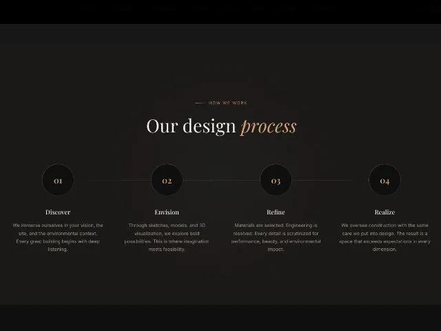 All Prompts
featuresectionanimatedresponsiveworkflowstepscss
Animated Four-Step Process Section
Анимированный блок из 4 шагов с нумерованными кругами и линией. Идеален для демонстрации услуг и методологий на сайтах агентств.
Prompt
<!DOCTYPE html>
<html lang="en">

<head>
  <meta charset="UTF-8">
  <meta name="viewport" content="width=device-width, initial-scale=1.0">
  <title>Process - Verd Architecture</title>
  <link rel="preconnect" href="https://fonts.googleapis.com">
  <link rel="preconnect" href="https://fonts.gstatic.com" crossorigin>
  <link
    href="https://fonts.googleapis.com/css2?family=Inter:wght@300;400;500;600&family=Playfair+Display:ital,wght@0,400;0,500;0,600;0,700;1,400;1,500&display=swap"
    rel="stylesheet">
  <style>
    *,
    *::before,
    *::after {
      margin: 0;
      padding: 0;
      box-sizing: border-box
    }

    html {
      -webkit-font-smoothing: antialiased;
      -moz-osx-font-smoothing: grayscale
    }

    body {
      font-family: var(--font-body);
      background: var(--color-bg);
      color: var(--color-text);
      line-height: 1.6;
      min-height: 100vh;
      display: flex;
      flex-direction: column;
      justify-content: center
    }

    :root {
      --color-bg: #0F0F0E;
      --color-bg-elevated: #1A1917;
      --color-bg-card: #22211E;
      --color-surface: #2C2B27;
      --color-copper: #C17F59;
      --color-copper-light: #D4A07A;
      --color-copper-bright: #E8B894;
      --color-terracotta: #C4704E;
      --color-gold: #C9A96E;
      --color-gold-light: #DFC08A;
      --color-sage: #8A9A7B;
      --color-cream: #F5F0EB;
      --color-cream-muted: #D9D2CA;
      --color-text: #F5F0EB;
      --color-text-muted: #9C9789;
      --color-text-subtle: #6B675E;
      --font-display: 'Playfair Display', Georgia, serif;
      --font-body: 'Inter', system-ui, -apple-system, sans-serif;
      --ease-out-expo: cubic-bezier(0.16, 1, 0.3, 1);
    }

    .container {
      max-width: 1320px;
      margin: 0 auto;
      padding: 0 clamp(1.5rem, 4vw, 3rem)
    }

    .section {
      padding: clamp(5rem, 12vh, 9rem) 0;
      position: relative
    }

    .section-label {
      display: inline-flex;
      align-items: center;
      gap: 0.5rem;
      font-size: 0.7rem;
      letter-spacing: 0.18em;
      text-transform: uppercase;
      color: var(--color-copper);
      margin-bottom: 1.5rem;
    }

    .section-label::before {
      content: '';
      width: 30px;
      height: 1px;
      background: linear-gradient(90deg, var(--color-copper), transparent);
    }

    .section-title {
      font-family: var(--font-display);
      font-size: clamp(2rem, 4vw, 3.2rem);
      font-weight: 400;
      line-height: 1.15;
      color: var(--color-cream);
    }

    .section-title em {
      font-style: italic;
      color: var(--color-copper-light);
    }

    /* Reveal */
    .reveal {
      opacity: 0;
      transform: translateY(40px);
      transition: opacity 0.8s var(--ease-out-expo), transform 0.8s var(--ease-out-expo)
    }

    .reveal.visible {
      opacity: 1;
      transform: translateY(0)
    }

    /* Process */
    .process {
      background: var(--color-bg-elevated);
      position: relative;
      overflow: hidden
    }

    .process::before {
      content: '';
      position: absolute;
      top: 50%;
      left: 50%;
      transform: translate(-50%, -50%);
      width: 800px;
      height: 800px;
      background: radial-gradient(circle, rgba(138, 154, 123, 0.04) 0%, transparent 70%);
      pointer-events: none;
    }

    .process-header {
      text-align: center;
      margin-bottom: clamp(3rem, 6vw, 5rem);
    }

    .process-steps {
      display: grid;
      grid-template-columns: repeat(4, 1fr);
      gap: 0;
      position: relative;
    }

    /* Connecting line */
    .process-steps::before {
      content: '';
      position: absolute;
      top: 44px;
      left: 12.5%;
      right: 12.5%;
      height: 1px;
      background: linear-gradient(90deg, transparent, rgba(193, 127, 89, 0.3) 20%, rgba(193, 127, 89, 0.3) 80%, transparent);
    }

    .process-step {
      text-align: center;
      padding: 0 1.5rem;
      position: relative;
    }

    .process-step-number {
      width: 88px;
      height: 88px;
      margin: 0 auto 2rem;
      display: flex;
      align-items: center;
      justify-content: center;
      border-radius: 50%;
      background: var(--color-bg);
      position: relative;
      z-index: 1;
      box-shadow: 0 0 0 1px rgba(193, 127, 89, 0.2);
    }

    .process-step-number::before {
      content: '';
      position: absolute;
      inset: -1px;
      border-radius: 50%;
      background: linear-gradient(135deg, rgba(193, 127, 89, 0.4), transparent 60%);
      -webkit-mask: linear-gradient(#fff 0 0) content-box, linear-gradient(#fff 0 0);
      -webkit-mask-composite: xor;
      mask-composite: exclude;
      padding: 1px;
    }

    .process-step-number span {
      font-family: var(--font-display);
      font-size: 1.5rem;
      font-weight: 600;
      background: linear-gradient(135deg, var(--color-copper-light), var(--color-gold));
      -webkit-background-clip: text;
      -webkit-text-fill-color: transparent;
      background-clip: text;
    }

    .process-step h4 {
      font-family: var(--font-display);
      font-size: 1.1rem;
      font-weight: 500;
      color: var(--color-cream);
      margin-bottom: 0.75rem;
    }

    .process-step p {
      font-size: 0.82rem;
      line-height: 1.7;
      color: var(--color-text-muted);
    }

    /* Stagger variant: slide from bottom with draw (process) */
    .stagger-draw>* {
      opacity: 0;
      transform: translateY(40px) scale(0.95);
      transition: opacity 0.8s var(--ease-out-expo), transform 0.9s var(--ease-out-expo);
    }

    .stagger-draw.visible>*:nth-child(1) {
      transition-delay: 0s
    }

    .stagger-draw.visible>*:nth-child(2) {
      transition-delay: 0.15s
    }

    .stagger-draw.visible>*:nth-child(3) {
      transition-delay: 0.3s
    }

    .stagger-draw.visible>*:nth-child(4) {
      transition-delay: 0.45s
    }

    .stagger-draw.visible>* {
      opacity: 1;
      transform: translateY(0) scale(1)
    }

    @media(max-width:1024px) {
      .process-steps {
        grid-template-columns: repeat(2, 1fr);
        gap: 3rem
      }

      .process-steps::before {
        display: none
      }
    }

    @media(max-width:768px) {
      .process-steps {
        grid-template-columns: 1fr;
        gap: 2.5rem
      }
    }
  </style>
</head>

<body>

  <section class="process section" id="process">
    <div class="container">
      <div class="process-header reveal">
        <div class="section-label" style="justify-content:center">How We Work</div>
        <h2 class="section-title" style="text-align:center">Our design <em>process</em></h2>
      </div>
      <div class="process-steps stagger-draw">
        <div class="process-step reveal-child">
          <div class="process-step-number"><span>01</span></div>
          <h4>Discover</h4>
          <p>We immerse ourselves in your vision, the site, and the environmental context. Every great building begins
            with deep listening.</p>
        </div>
        <div class="process-step reveal-child">
          <div class="process-step-number"><span>02</span></div>
          <h4>Envision</h4>
          <p>Through sketches, models, and 3D visualization, we explore bold possibilities. This is where imagination
            meets feasibility.</p>
        </div>
        <div class="process-step reveal-child">
          <div class="process-step-number"><span>03</span></div>
          <h4>Refine</h4>
          <p>Materials are selected. Engineering is resolved. Every detail is scrutinized for performance, beauty, and
            environmental impact.</p>
        </div>
        <div class="process-step reveal-child">
          <div class="process-step-number"><span>04</span></div>
          <h4>Realize</h4>
          <p>We oversee construction with the same care we put into design. The result is a space that exceeds
            expectations in every dimension.</p>
        </div>
      </div>
    </div>
  </section>

  <script>
    const reveals = document.querySelectorAll('.reveal,.stagger-draw');
const obs = new IntersectionObserver(entries => {
entries.forEach(e => { if (e.isIntersecting) { e.target.classList.add('visible'); obs.unobserve(e.target); } });
}, { threshold: 0.08, rootMargin: '0px 0px -40px 0px' });
reveals.forEach(el => obs.observe(el));
  </script>
</body>

</html>