All Prompts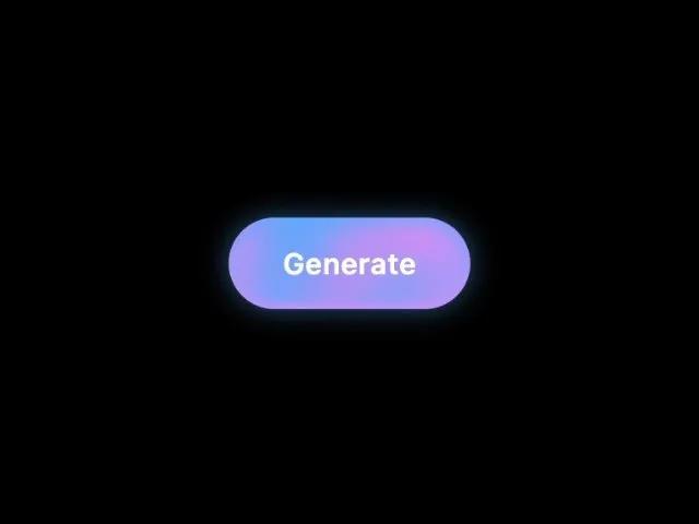 All Prompts
buttonanimatedgradienttailwindctaglowparticlesinteractive
Animated Gradient Aura Button
Кнопка CTA с анимированной радиальной градиентной аурой и свечением. Идеальна для секций, форм, генераторов. Создана с Tailwind.
Prompt
<button class="cursor-pointer border-none leading-relaxed overflow-hidden min-w-[132px] text-base font-semibold tracking-wide text-center rounded-full mt-0 mr-0 mb-0 ml-0 pt-0 pr-0 pb-0 pl-0 relative" style="background: radial-gradient(circle, #4facfe, #ec87f3 80%); box-shadow: 0 0 14px rgba(79, 172, 254, 0.5); -webkit-tap-highlight-color: transparent; -webkit-appearance: none; outline: none">
  <div class="absolute inset-0 rounded-full pointer-events-none z-[3]" style="box-shadow: inset 0 3px 12px rgba(79, 172, 254, 0.9), inset 0 -3px 4px rgba(236, 135, 243, 0.8);"></div>
  <div class="overflow-hidden rounded-full pt-3 pr-0 pb-3 pl-0 relative">
    <span class="inline-block relative z-[1] text-white">Generate</span>
    <div class="circle circle-1 absolute left-0 top-0 w-10 h-10 rounded-full" style="filter: blur(8px); background: rgba(79, 172, 254, 0.7); transform: translate(0, -40px) translateZ(0); animation: circle-1 7s linear infinite;"></div>
    <div class="circle circle-2 absolute left-0 top-0 w-10 h-10 rounded-full" style="filter: blur(12px); background: rgba(79, 172, 254, 0.7); transform: translate(92px, 8px) translateZ(0); animation: circle-2 7s linear infinite;"></div>
    <div class="circle circle-3 absolute left-0 top-0 w-10 h-10 rounded-full" style="filter: blur(14px); background: #ec87f3; transform: translate(-12px, -12px) translateZ(0); animation: circle-3 7s linear infinite;"></div>
    <div class="circle circle-4 absolute left-0 top-0 w-10 h-10 rounded-full" style="filter: blur(14px); background: #ec87f3; transform: translate(80px, -12px) translateZ(0); animation: circle-4 7s linear infinite;"></div>
    <div class="circle circle-5 absolute left-0 top-0 w-10 h-10 rounded-full" style="filter: blur(16px); background: #f06bda; transform: translate(12px, -4px) translateZ(0); animation: circle-5 7s linear infinite;"></div>
    <div class="circle circle-6 absolute left-0 top-0 w-10 h-10 rounded-full" style="filter: blur(16px); background: #f06bda; transform: translate(56px, 16px) translateZ(0); animation: circle-6 7s linear infinite;"></div>
    <div class="circle circle-7 absolute left-0 top-0 w-10 h-10 rounded-full" style="filter: blur(12px); background: rgba(79, 172, 254, 0.7); transform: translate(8px, 28px) translateZ(0); animation: circle-7 7s linear infinite;"></div>
    <div class="circle circle-8 absolute left-0 top-0 w-10 h-10 rounded-full" style="filter: blur(12px); background: rgba(79, 172, 254, 0.7); transform: translate(28px, -4px) translateZ(0); animation: circle-8 7s linear infinite;"></div>
    <div class="circle circle-9 absolute left-0 top-0 w-10 h-10 rounded-full" style="filter: blur(8px); background: rgba(79, 172, 254, 0.7); transform: translate(20px, -12px) translateZ(0); animation: circle-9 7s linear infinite;"></div>
    <div class="circle circle-10 absolute left-0 top-0 w-10 h-10 rounded-full" style="filter: blur(8px); background: rgba(79, 172, 254, 0.7); transform: translate(64px, 16px) translateZ(0); animation: circle-10 7s linear infinite;"></div>
    <div class="circle circle-11 w-10 h-10 rounded-full absolute top-0 left-0" style="filter: blur(12px); background: rgba(79, 172, 254, 0.7); transform: translate(4px, 4px) translateZ(0); animation: circle-11 7s linear infinite"></div>
    <div class="circle circle-12 absolute left-0 top-0 w-10 h-10 rounded-full" style="filter: blur(14px); background: rgba(236, 135, 243, 0.7); transform: translate(52px, 4px) translateZ(0); animation: circle-12 7s linear infinite;"></div>
  </div>
  <style>
    @keyframes circle-1 { 33% { transform: translate(0px, 16px) translateZ(0); } 66% { transform: translate(12px, 64px) translateZ(0); } }
    @keyframes circle-2 { 33% { transform: translate(80px, -10px) translateZ(0); } 66% { transform: translate(72px, -48px) translateZ(0); } }
    @keyframes circle-3 { 33% { transform: translate(20px, 12px) translateZ(0); } 66% { transform: translate(12px, 4px) translateZ(0); } }
    @keyframes circle-4 { 33% { transform: translate(76px, -12px) translateZ(0); } 66% { transform: translate(112px, -8px) translateZ(0); } }
    @keyframes circle-5 { 33% { transform: translate(84px, 28px) translateZ(0); } 66% { transform: translate(40px, -32px) translateZ(0); } }
    @keyframes circle-6 { 33% { transform: translate(28px, -16px) translateZ(0); } 66% { transform: translate(76px, -56px) translateZ(0); } }
    @keyframes circle-7 { 33% { transform: translate(8px, 28px) translateZ(0); } 66% { transform: translate(20px, -60px) translateZ(0); } }
    @keyframes circle-8 { 33% { transform: translate(32px, -4px) translateZ(0); } 66% { transform: translate(56px, -20px) translateZ(0); } }
    @keyframes circle-9 { 33% { transform: translate(20px, -12px) translateZ(0); } 66% { transform: translate(80px, -8px) translateZ(0); } }
    @keyframes circle-10 { 33% { transform: translate(68px, 20px) translateZ(0); } 66% { transform: translate(100px, 28px) translateZ(0); } }
    @keyframes circle-11 { 33% { transform: translate(4px, 4px) translateZ(0); } 66% { transform: translate(68px, 20px) translateZ(0); } }
    @keyframes circle-12 { 33% { transform: translate(56px, 0px) translateZ(0); } 66% { transform: translate(60px, -32px) translateZ(0); } }
    button[data-element-id="aura-emhken6qvtnfaw8z"]:hover .circle { animation-duration: 1.4s !important; }
  </style>
</button>