All Prompts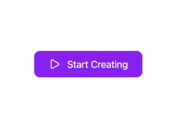 All Prompts
buttonctaanimatedgradienthoverpulsetailwindinteractiveiconcss
Animated Gradient Play CTA Button
Анимированная кнопка CTA с градиентом и иконкой. Реагирует на наведение и нажатие. Идеально для медиа-плееров, лендингов.
Prompt
<button class="inline-flex animate-glow h-34 items-center" style="position: relative; border: none; color: rgb(255, 255, 255); background-image: linear-gradient(195deg, rgb(58, 181, 176) 0%, rgb(136, 33, 241) 2%); border-radius: 10px; font-family: inherit; font-size: 17px; padding: 0.6em 1.5em; transition: scale 0.2s; cursor: pointer; animation: auto ease 0s 1 normal none running none; scale: 1;" onmouseover="this.style.webkitAnimation='pulse512 1.5s infinite'; this.style.animation='pulse512 1.5s infinite';" onmouseout="this.style.webkitAnimation='none'; this.style.animation='none';" onmousedown="this.style.scale='0.95';" onmouseup="this.style.scale='1';" onmouseleave="this.style.scale='1';">
  <svg xmlns="http://www.w3.org/2000/svg" width="24" height="24" viewBox="0 0 24 24" fill="none" stroke="currentColor" stroke-width="2" stroke-linecap="round" stroke-linejoin="round" data-lucide="play" class="lucide lucide-play mr-3 w-5 h-5"><path d="M5 5a2 2 0 0 1 3.008-1.728l11.997 6.998a2 2 0 0 1 .003 3.458l-12 7A2 2 0 0 1 5 19z" class=""></path></svg>
  Start Creating
  <style>
    @keyframes pulse512 {
      0% {
        box-shadow: 0 0 0 0 #05bada66;
      }
      70% {
        box-shadow: 0 0 0 10px rgba(218, 03, 8, 0);
      }
      100% {
        box-shadow: 0 0 0 0 rgba(218, 03, 8, 0);
      }
    }
  </style>
</button>