All Prompts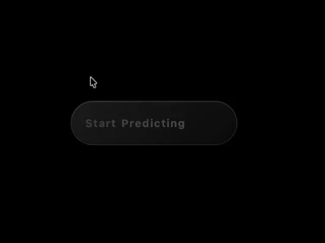 All Prompts
buttonanimatedgradientinteractivectacss
Animated Plasma Gradient CTA Button
Анимированная CTA кнопка с плазменным градиентом. Эффект свечения текста, анимация при наведении. Идеальна для лендингов и интерфейсов, требует внимания.
Prompt
<button class="inline-flex transition overflow-hidden group text-sm font-medium text-white rounded-full pt-3 pr-5 pb-3 pl-5 relative gap-x-2 gap-y-2 items-center font-custom" style="background: linear-gradient(135deg, rgb(26, 26, 26) 0%, rgb(10, 10, 10) 100%); border: 1px solid rgba(255, 255, 255, 0.1); box-shadow: rgba(0, 0, 0, 0.4) 0px 8px 32px, rgba(255, 255, 255, 0.1) 0px 1px 0px inset, rgba(0, 0, 0, 0.5) 0px -1px 0px inset; transition: 0.4s cubic-bezier(0.4, 0, 0.2, 1); transform: translateY(0px); height: 64px; min-width: 240px;" onmouseover="this.style.transform='translateY(-3px)'; this.style.boxShadow='0 12px 40px rgba(0,0,0,0.5), inset 0 1px 0 rgba(255,255,255,0.15), inset 0 -1px 0 rgba(0,0,0,0.6), 0 0 0 2px rgba(13,148,136,0.4)';" onmouseout="this.style.transform='translateY(0)'; this.style.boxShadow='0 8px 32px rgba(0,0,0,0.4), inset 0 1px 0 rgba(255,255,255,0.1), inset 0 -1px 0 rgba(0,0,0,0.5)';">

  <!-- Plasma Effect -->
  <div class="loader" style="position: absolute; top: 0; left: 0; height: 100%; width: 100%; z-index: 1; background-color: transparent; mask: repeating-linear-gradient(90deg, transparent 0, transparent 6px, black 7px, black 8px); -webkit-mask: repeating-linear-gradient(90deg, transparent 0, transparent 6px, black 7px, black 8px)">
    <div style="content: ''; position: absolute; top: 0; left: 0; width: 100%; height: 100%; background-image: radial-gradient(circle at 50% 50%, #0D9488 0%, transparent 50%), radial-gradient(circle at 45% 45%, #F97316 0%, transparent 45%), radial-gradient(circle at 55% 55%, #14B8A6 0%, transparent 45%), radial-gradient(circle at 45% 55%, #FB923C 0%, transparent 45%), radial-gradient(circle at 55% 45%, #0F766E 0%, transparent 45%); mask: radial-gradient(circle at 50% 50%, transparent 0%, transparent 10%, black 25%); -webkit-mask: radial-gradient(circle at 50% 50%, transparent 0%, transparent 10%, black 25%); animation: plasma-move 2s infinite alternate, plasma-opacity 4s infinite; animation-timing-function: cubic-bezier(0.6, 0.8, 0.5, 1); filter: drop-shadow(0 0 8px rgba(13, 148, 136, 0.6))"></div>
  </div>

  <!-- Text: Start Predicting -->
  <span style="position: relative; z-index: 2; font-size: 1.1em; font-weight: 700; user-select: none; color: #fff; display: flex; gap: 0.08em; letter-spacing: 0.02em;">
    <span class="letter" style="display: inline-block; opacity: 0; animation: letter-glow 4s infinite linear; animation-delay: 0.1s">S</span>
    <span class="letter" style="display: inline-block; opacity: 0; animation: letter-glow 4s infinite linear; animation-delay: 0.14s">t</span>
    <span class="letter" style="display: inline-block; opacity: 0; animation: letter-glow 4s infinite linear; animation-delay: 0.18s">a</span>
    <span class="letter" style="display: inline-block; opacity: 0; animation: letter-glow 4s infinite linear; animation-delay: 0.22s">r</span>
    <span class="letter" style="display: inline-block; opacity: 0; animation: letter-glow 4s infinite linear; animation-delay: 0.26s">t</span>
    <span style="display: inline-block; width: 0.35em;"></span>
    <span class="letter" style="display: inline-block; opacity: 0; animation: letter-glow 4s infinite linear; animation-delay: 0.34s">P</span>
    <span class="letter" style="display: inline-block; opacity: 0; animation: letter-glow 4s infinite linear; animation-delay: 0.38s">r</span>
    <span class="letter" style="display: inline-block; opacity: 0; animation: letter-glow 4s infinite linear; animation-delay: 0.42s">e</span>
    <span class="letter" style="display: inline-block; opacity: 0; animation: letter-glow 4s infinite linear; animation-delay: 0.46s">d</span>
    <span class="letter" style="display: inline-block; opacity: 0; animation: letter-glow 4s infinite linear; animation-delay: 0.50s">i</span>
    <span class="letter" style="display: inline-block; opacity: 0; animation: letter-glow 4s infinite linear; animation-delay: 0.54s">c</span>
    <span class="letter" style="display: inline-block; opacity: 0; animation: letter-glow 4s infinite linear; animation-delay: 0.58s">t</span>
    <span class="letter" style="display: inline-block; opacity: 0; animation: letter-glow 4s infinite linear; animation-delay: 0.62s">i</span>
    <span class="letter" style="display: inline-block; opacity: 0; animation: letter-glow 4s infinite linear; animation-delay: 0.66s">n</span>
    <span class="letter" style="display: inline-block; opacity: 0; animation: letter-glow 4s infinite linear; animation-delay: 0.70s">g</span>
  </span>

  <style>
    @keyframes plasma-move {
      0% { transform: translateX(-55%); }
      100% { transform: translateX(55%); }
    }

    @keyframes plasma-opacity {
      0%, 100% { opacity: 0; }
      15% { opacity: 1; }
      65% { opacity: 0; }
    }

    @keyframes letter-glow {
      0% { opacity: 0; transform: scale(1) translateY(0); }
      5% {
        opacity: 1;
        text-shadow: 0 0 8px #0D9488, 0 0 16px #F97316;
        transform: scale(1.02) translateY(-1px);
      }
      20% { opacity: 0.4; transform: scale(1) translateY(0); text-shadow: none; }
      100% { opacity: 0; }
    }
  </style>
</button>