All Prompts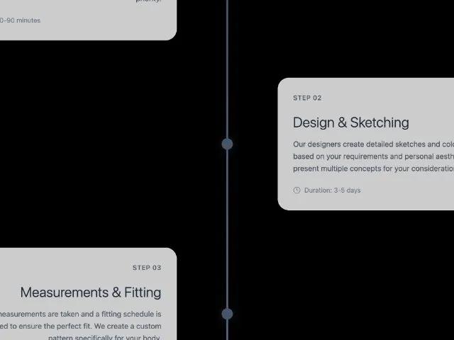 All Prompts
timelinetailwindcssanimatedscrollworkflowresponsiveprogresssection
Animated Process Timeline Section
Анимированная секция таймлайна: вертикальный компонент с 4 шагами, плавной анимацией прогресса и плавным появлением карточек при скролле. Идеально для демонстрации процессов, дорожных карт.
Prompt
<section id="process" class="max-w-7xl sm:px-6 scroll-reveal visible mr-auto ml-auto pt-20 pr-4 pb-20 pl-4">
<div class="text-center mb-16 slide-up visible">
<p class="text-sm text-slate-500 uppercase tracking-wider mb-4">Our Process</p>
<h2 class="sm:text-7xl text-gradient text-5xl font-light tracking-tight font-playfair mb-6">From Vision to Reality</h2>
<p class="max-w-2xl text-xl text-slate-600 mr-auto ml-auto">A seamless journey from initial consultation to your perfect garment.</p>
</div>
<div class="relative" id="timeline-container">
<!-- Enhanced Progress Line -->
<div class="absolute left-1/2 transform -translate-x-0.5 w-1 h-full bg-slate-200 hidden lg:block rounded-full overflow-hidden">
<div id="progress-line" class="w-full progress-line rounded-full" style="height: 100%; background: linear-gradient(rgb(71, 85, 105), rgb(100, 116, 139)); transition: height 1.2s cubic-bezier(0.25, 0.46, 0.45, 0.94); box-shadow: rgba(71, 85, 105, 0.3) 0px 0px 10px;"></div>
</div>
<div class="space-y-20" id="timeline-steps">
<!-- Step 1 -->
<div class="flex flex-col lg:flex-row gap-12 items-center timeline-step animate-in" data-step="1" style="opacity: 1; transform: translateY(0px); transition: 0.8s cubic-bezier(0.16, 1, 0.3, 1);">
<div class="flex-1 lg:text-right lg:pr-12">
<div class="glass hover-lift bg-white/80 border-slate-200/60 border rounded-3xl pt-8 pr-8 pb-8 pl-8 transform transition-all duration-500">
<div class="flex gap-4 lg:justify-end mb-6 items-center">
<span class="uppercase text-sm font-medium text-slate-600 tracking-wider">Step 01</span>
</div>
<h3 class="text-3xl font-light font-playfair mb-4 text-slate-800">Initial Consultation</h3>
<p class="leading-relaxed text-slate-600 mb-6">We begin with a detailed conversation about your vision, style preferences, and the occasion for your custom piece. Understanding your lifestyle and aesthetic goals is our first priority.</p>
<div class="flex items-center gap-2 text-sm text-slate-500">
<svg xmlns="http://www.w3.org/2000/svg" width="16" height="16" viewBox="0 0 24 24" fill="none" stroke="currentColor" stroke-width="1.5" stroke-linecap="round" stroke-linejoin="round" class=""><circle cx="12" cy="12" r="10" class=""></circle><polyline points="12,6 12,12 16,14" class=""></polyline></svg>
<span>Duration: 60-90 minutes</span>
</div>
</div>
</div>
<div class="w-6 h-6 z-10 flex-shrink-0 rounded-full shadow-lg timeline-dot active" data-dot="1" style="background: rgb(71, 85, 105); transform: scale(1); opacity: 1; transition: 0.8s cubic-bezier(0.25, 0.46, 0.45, 0.94); box-shadow: rgba(71, 85, 105, 0.4) 0px 0px 20px;"></div>
<div class="flex-1 lg:pl-12"></div>
</div>
<!-- Step 2 -->
<div class="flex flex-col lg:flex-row items-center gap-12 timeline-step animate-in" data-step="2" style="opacity: 1; transform: translateY(0px); transition: 0.8s cubic-bezier(0.16, 1, 0.3, 1);">
<div class="flex-1 lg:pr-12"></div>
<div class="w-6 h-6 z-10 flex-shrink-0 rounded-full shadow-lg timeline-dot active" data-dot="2" style="background: rgb(71, 85, 105); transform: scale(1); opacity: 1; transition: 0.8s cubic-bezier(0.25, 0.46, 0.45, 0.94); box-shadow: rgba(71, 85, 105, 0.4) 0px 0px 20px;"></div>
<div class="flex-1 lg:pl-12">
<div class="glass hover-lift bg-white/80 border-slate-200/60 border rounded-3xl pt-8 pr-8 pb-8 pl-8 transform transition-all duration-500">
<div class="flex gap-4 mb-6 items-center">
<span class="uppercase text-sm font-medium text-slate-600 tracking-wider">Step 02</span>
</div>
<h3 class="text-3xl font-light font-playfair mb-4 text-slate-800">Design & Sketching</h3>
<p class="leading-relaxed text-slate-600 mb-6">Our designers create detailed sketches and color palettes based on your requirements and personal aesthetic. We'll present multiple concepts for your consideration.</p>
<div class="flex items-center gap-2 text-sm text-slate-500">
<svg xmlns="http://www.w3.org/2000/svg" width="16" height="16" viewBox="0 0 24 24" fill="none" stroke="currentColor" stroke-width="1.5" stroke-linecap="round" stroke-linejoin="round" class=""><circle cx="12" cy="12" r="10" class=""></circle><polyline points="12,6 12,12 16,14" class=""></polyline></svg>
<span>Duration: 3-5 days</span>
</div>
</div>
</div>
</div>
<!-- Step 3 -->
<div class="flex flex-col lg:flex-row items-center gap-12 timeline-step" data-step="3" style="opacity: 1; transform: translateY(0px); transition: 0.8s cubic-bezier(0.16, 1, 0.3, 1);">
<div class="flex-1 lg:text-right lg:pr-12">
<div class="glass border rounded-3xl p-8 hover-lift bg-white/80 border-slate-200/60 transform transition-all duration-500">
<div class="flex items-center gap-4 lg:justify-end mb-6">
<span class="uppercase text-sm font-medium text-slate-600 tracking-wider">Step 03</span>
</div>
<h3 class="text-3xl font-light font-playfair mb-4 text-slate-800">Measurements & Fitting</h3>
<p class="leading-relaxed text-slate-600 mb-6">Precise measurements are taken and a fitting schedule is established to ensure the perfect fit. We create a custom pattern specifically for your body.</p>
<div class="flex items-center gap-2 text-sm text-slate-500">
<svg xmlns="http://www.w3.org/2000/svg" width="16" height="16" viewBox="0 0 24 24" fill="none" stroke="currentColor" stroke-width="1.5" stroke-linecap="round" stroke-linejoin="round" class=""><circle cx="12" cy="12" r="10" class=""></circle><polyline points="12,6 12,12 16,14" class=""></polyline></svg>
<span>Duration: 45-60 minutes</span>
</div>
</div>
</div>
<div class="w-6 h-6 z-10 flex-shrink-0 rounded-full shadow-lg timeline-dot" data-dot="3" style="background: rgb(71, 85, 105); transform: scale(1); opacity: 1; transition: 0.8s cubic-bezier(0.25, 0.46, 0.45, 0.94); box-shadow: rgba(71, 85, 105, 0.4) 0px 0px 20px;"></div>
<div class="flex-1 lg:pl-12"></div>
</div>
<!-- Step 4 -->
<div class="flex flex-col lg:flex-row items-center gap-12 timeline-step" data-step="4" style="opacity: 1; transform: translateY(0px); transition: 0.8s cubic-bezier(0.16, 1, 0.3, 1);">
<div class="flex-1 lg:pr-12"></div>
<div class="w-6 h-6 z-10 flex-shrink-0 rounded-full shadow-lg timeline-dot" data-dot="4" style="background: rgb(71, 85, 105); transform: scale(1); opacity: 1; transition: 0.8s cubic-bezier(0.25, 0.46, 0.45, 0.94); box-shadow: rgba(71, 85, 105, 0.4) 0px 0px 20px;"></div>
<div class="flex-1 lg:pl-12">
<div class="glass border rounded-3xl p-8 hover-lift bg-white/80 border-slate-200/60 transform transition-all duration-500">
<div class="flex items-center gap-4 mb-6">
<span class="uppercase text-sm font-medium text-slate-600 tracking-wider">Step 04</span>
</div>
<h3 class="text-3xl font-light font-playfair mb-4 text-slate-800">Final Creation</h3>
<p class="leading-relaxed text-slate-600 mb-6">Your masterpiece is carefully crafted by our skilled artisans with meticulous attention to every detail. Quality checks ensure perfection at every stage.</p>
<div class="flex items-center gap-2 text-sm text-slate-500">
<svg xmlns="http://www.w3.org/2000/svg" width="16" viewBox="0 0 24 24" fill="none" stroke="currentColor" stroke-width="1.5" stroke-linecap="round" stroke-linejoin="round" class=""><circle cx="12" cy="12" r="10" class=""></circle><polyline points="12,6 12,12 16,14" class=""></polyline></svg>
<span>Duration: 4-6 weeks</span>
</div>
</div>
</div>
</div>
</div>
</div>
<script>
// Enhanced timeline animation with smooth sequential reveal
function initSmoothTimeline() {
const progressLine = document.getElementById('progress-line');
const timelineSteps = document.querySelectorAll('.timeline-step');
const timelineDots = document.querySelectorAll('.timeline-dot');
const timelineContainer = document.getElementById('timeline-container');
if (!progressLine || !timelineSteps.length || !timelineDots.length) return;
let animationStarted = false;
// Reset all elements to initial state
function resetTimeline() {
progressLine.style.height = '0%';
timelineSteps.forEach(step => {
step.style.opacity = '0';
step.style.transform = 'translateY(50px)';
});
timelineDots.forEach(dot => {
dot.style.background = '#e2e8f0';
dot.style.transform = 'scale(0.8)';
dot.style.opacity = '0.5';
dot.style.boxShadow = 'none';
});
}
// Animate timeline sequentially
function animateTimeline() {
if (animationStarted) return;
animationStarted = true;
// Animate progress line first
setTimeout(() => {
progressLine.style.height = '100%';
}, 200);
// Animate each step with staggered timing
timelineSteps.forEach((step, index) => {
const dot = timelineDots[index];
const delay = 400 + (index * 600); // 600ms between each step
setTimeout(() => {
// Fade in step card
step.style.opacity = '1';
step.style.transform = 'translateY(0px)';
// Animate corresponding dot
if (dot) {
dot.style.background = '#475569';
dot.style.transform = 'scale(1)';
dot.style.opacity = '1';
dot.style.boxShadow = '0 0 20px rgba(71, 85, 105, 0.4)';
}
}, delay);
});
}
// Intersection Observer to trigger animation when section comes into view
const observer = new IntersectionObserver((entries) => {
entries.forEach(entry => {
if (entry.isIntersecting) {
animateTimeline();
} else if (!entry.isIntersecting && entry.boundingClientRect.top > 0) {
// Reset when scrolling back up past the section
animationStarted = false;
resetTimeline();
}
});
}, {
threshold: 0.2,
rootMargin: '-100px 0px -50px 0px'
});
// Initialize
resetTimeline();
observer.observe(timelineContainer);
}
// Initialize when DOM is ready
if (document.readyState === 'loading') {
document.addEventListener('DOMContentLoaded', initSmoothTimeline);
} else {
initSmoothTimeline();
}
</script>
</section>