All Prompts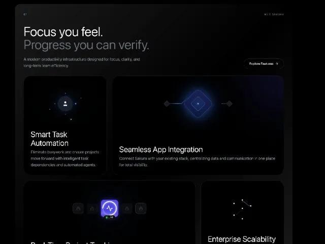 All Prompts
featuresectionanimatedresponsivetailwindmarketingsaas
Animated Productivity Features Section
Анимированная секция с функциями для SaaS-маркетинга. Выделяет преимущества продукта, включает карточки с анимацией и CTA. Адаптивный дизайн.
Prompt
<section class="animate-entry delay-200 [animation:animationIn_0.8s_ease-out_0.1s_both] animate-on-scroll animate lg:mx-auto bg-gradient-to-br from-white/10 via-white/0 to-white/10 max-w-7xl rounded-3xl mt-24 mr-auto mb-24 ml-auto pt-10 pr-10 pb-10 pl-10 relative" style="position: relative; --border-gradient: linear-gradient(135deg, rgba(255, 255, 255, 0.2), rgba(255, 255, 255, 0), rgba(255, 255, 255, 0.1)); --border-radius-before: 24px">
<!-- Header -->
<!-- Main Grid -->
<div class="flex flex-col rounded-none mt-0 mb-0 pt-0 pr-0 pb-0 pl-0 relative">
<!-- Header Section -->
<div class="flex flex-col gap-10 w-full gap-x-10 gap-y-10">
<!-- Top label row -->
<div class="flex items-center gap-6">
<span class="text-xs font-mono text-blue-400 tracking-widest font-sans" style="">
01
</span>
<div class="h-px flex-1 bg-white/10"></div>
<span class="uppercase text-xs tracking-widest text-gray-500 font-sans" style="">
Why Sakura
</span>
</div>
<!-- Main content -->
<div class="flex flex-col md:flex-row md:items-end md:justify-between gap-10 gap-x-10 gap-y-10">
<div class="max-w-3xl flex flex-col gap-6">
<h2 class="text-4xl md:text-5xl lg:text-6xl leading-[1.05] text-white font-oswald font-light" style="">
Focus you feel.
<span class="block text-gray-500 font-oswald font-light" style="">
Progress you can verify.
</span>
</h2>
<p class="text-lg text-gray-400 font-light max-w-xl leading-relaxed font-sans" style="">
A modern productivity infrastructure designed for focus,
clarity, and long-term team efficiency.
</p>
</div>
<!-- Secondary CTA -->
<button class="group flex items-center gap-2 px-6 py-3 border border-white/15 text-white text-sm font-medium rounded-full hover:bg-white/5 transition font-sans whitespace-nowrap">
<span class="font-sans" style="">Explore Features</span>
<svg xmlns="http://www.w3.org/2000/svg" width="16" height="16" viewBox="0 0 24 24" fill="none" stroke="currentColor" stroke-width="2" stroke-linecap="round" stroke-linejoin="round" class="w-4 h-4 transition-transform group-hover:translate-x-1">
<path d="M5 12h14" class=""></path>
<path d="m12 5 7 7-7 7" class=""></path>
</svg>
</button>
</div>
</div>
<!-- Features Grid -->
<div class="grid grid-cols-1 md:grid-cols-3 w-full mt-8 gap-x-6 gap-y-6">
<!-- Card 1: Decentralized Identity -->
<div class="group flex flex-col overflow-hidden hover:border-blue-500/30 transition-all duration-500 md:col-span-1 bg-[#000000] border-white/10 border rounded-[2rem] pt-8 pr-8 pb-8 pl-8 relative justify-between">
<style>
@keyframes orbit-slow {
from { transform: rotate(0deg); }
to { transform: rotate(360deg); }
}
@keyframes breathe-glow {
0%, 100% { transform: scale(1); box-shadow: 0 0 20px rgba(59, 130, 246, 0.1); }
50% { transform: scale(1.05); box-shadow: 0 0 35px rgba(59, 130, 246, 0.3); }
}
@keyframes ripple-expand {
0% { transform: scale(0.8); opacity: 0.6; border-width: 1px; }
100% { transform: scale(2.5); opacity: 0; border-width: 0px; }
}
@keyframes dot-handoff {
0%, 100% { opacity: 0.3; r: 2px; fill: #60A5FA; }
50% { opacity: 1; r: 3.5px; fill: #3B82F6; }
}
</style>
<!-- Visual -->
<div class="relative h-48 w-full flex items-center justify-center mb-6 overflow-visible">
<!-- Ambient Background -->
<div class="absolute inset-0 bg-gradient-to-b from-blue-500/5 to-transparent opacity-50 rounded-full blur-3xl transform scale-75"></div>
<!-- Expanding Ripple Ring -->
<div class="absolute w-16 h-16 rounded-full border border-blue-400/30 z-0" style="animation: ripple-expand 4s cubic-bezier(0, 0, 0.2, 1) infinite;"></div>
<svg class="w-full h-full text-blue-500/20 z-10" viewBox="0 0 200 200" fill="none" xmlns="http://www.w3.org/2000/svg">
<!-- Rotating Container for Orbiting Elements -->
<g style="transform-origin: 100px 100px; animation: orbit-slow 12s linear infinite;" class="">
<!-- Outer Dashed Ring -->
<circle cx="100" cy="100" r="80" stroke="currentColor" stroke-width="1" stroke-dasharray="6 6" class="opacity-30"></circle>
<!-- Orbiting Dots -->
<circle cx="100" cy="20" r="3" fill="#60A5FA" class="drop-shadow-[0_0_8px_rgba(96,165,250,0.8)]"></circle>
<circle cx="180" cy="100" r="2.5" fill="#3B82F6" class="opacity-60"></circle>
<circle cx="20" cy="100" r="2.5" fill="#3B82F6" class="opacity-60"></circle>
</g>
<!-- Static Inner Ring -->
<circle cx="100" cy="100" r="50" stroke="currentColor" stroke-width="1" class="opacity-40"></circle>
<!-- Sequential Hand-off Dots (Inner) -->
<!-- Top -->
<circle cx="100" cy="50" r="2" fill="#3B82F6" style="animation: dot-handoff 3s ease-in-out infinite; animation-delay: 0s;" class=""></circle>
<!-- Right -->
<circle cx="150" cy="100" r="2" fill="#3B82F6" style="animation: dot-handoff 3s ease-in-out infinite; animation-delay: 1s;" class=""></circle>
<!-- Bottom -->
<circle cx="100" cy="150" r="2" fill="#3B82F6" style="animation: dot-handoff 3s ease-in-out infinite; animation-delay: 2s;" class=""></circle>
<!-- Left -->
<circle cx="50" cy="100" r="2" fill="#3B82F6" style="animation: dot-handoff 3s ease-in-out infinite; animation-delay: 3s;" class=""></circle>
</svg>
<!-- Breathing Center Icon -->
<div class="absolute flex items-center justify-center w-16 h-16 bg-[#15151A] rounded-full border border-white/10 z-20" style="animation: breathe-glow 4s ease-in-out infinite;">
<div class="absolute inset-0 bg-blue-500/10 rounded-full blur-sm"></div>
<svg xmlns="http://www.w3.org/2000/svg" width="28" height="28" viewBox="0 0 24 24" fill="currentColor" stroke="none" class="text-gray-100 relative z-10">
<path d="M19 21v-2a4 4 0 0 0-4-4H9a4 4 0 0 0-4 4v2" class=""></path>
<circle cx="12" cy="7" r="4" class=""></circle>
</svg>
</div>
</div>
<!-- Content -->
<div class="relative z-10">
<h3 class="text-4xl text-white text-left font-oswald font-light" style="">
Smart Task Automation
</h3>
<p class="leading-relaxed text-lg font-light text-gray-400 text-left mt-2 font-sans" style="">
Eliminate busywork and ensure projects move forward with
intelligent task dependencies and automated agents.
</p>
</div>
</div>
<!-- Card 2: Blockchain Integration -->
<div class="md:col-span-2 group flex flex-col overflow-hidden hover:border-blue-500/30 transition-all duration-500 bg-[#000000] border-white/10 border rounded-[2rem] px-8 py-8 relative justify-between">
<style>
@keyframes flowData {
0% { stroke-dashoffset: 120; opacity: 0; }
15% { opacity: 1; }
85% { opacity: 1; }
100% { stroke-dashoffset: 0; opacity: 0; }
}
@keyframes breatheDiamond {
0%, 100% { transform: rotate(45deg) scale(1); box-shadow: 0 0 30px rgba(59,130,246,0.3); border-color: rgba(59,130,246,0.3); }
50% { transform: rotate(45deg) scale(1.05); box-shadow: 0 0 50px rgba(59,130,246,0.5); border-color: rgba(59,130,246,0.6); }
}
@keyframes orbitSpin {
0% { transform: rotate(0deg); }
100% { transform: rotate(360deg); }
}
</style>
<!-- Background Glow -->
<div class="absolute top-0 right-0 w-[300px] h-[300px] bg-indigo-600/20 blur-[100px] rounded-full -translate-y-1/2 translate-x-1/2 group-hover:bg-indigo-500/30 transition-colors duration-700"></div>
<!-- Visual -->
<div class="relative h-48 w-full flex items-center justify-center mb-6 overflow-visible">
<!-- Graphic lines -->
<svg class="absolute top-0 right-0 bottom-0 left-0 w-full h-full" viewBox="0 0 400 200" fill="none" preserveAspectRatio="xMidYMid meet">
<defs class="">
<linearGradient id="flowGradientLeft" x1="0%" y1="0%" x2="100%" y2="0%" class="">
<stop offset="0%" stop-color="#3B82F6" stop-opacity="0" class=""></stop>
<stop offset="50%" stop-color="#60A5FA" stop-opacity="1" class=""></stop>
<stop offset="100%" stop-color="#3B82F6" stop-opacity="0" class=""></stop>
</linearGradient>
<linearGradient id="flowGradientRight" x1="100%" y1="0%" x2="0%" y2="0%" class="">
<stop offset="0%" stop-color="#3B82F6" stop-opacity="0" class=""></stop>
<stop offset="50%" stop-color="#60A5FA" stop-opacity="1" class=""></stop>
<stop offset="100%" stop-color="#3B82F6" stop-opacity="0" class=""></stop>
</linearGradient>
</defs>
<!-- Static Base Paths -->
<path d="M50 100 L120 100 L150 70" stroke="currentColor" stroke-width="1" class="text-white/10"></path>
<path d="M350 100 L280 100 L250 130" stroke="currentColor" stroke-width="1" class="text-white/10"></path>
<!-- Animated Data Flow -->
<path d="M50 100 L120 100 L150 70" stroke="url(#flowGradientLeft)" stroke-width="2" stroke-linecap="round" stroke-dasharray="120" stroke-dashoffset="120" style="animation: flowData 3s cubic-bezier(0.4, 0, 0.2, 1) infinite;" class=""></path>
<path d="M350 100 L280 100 L250 130" stroke="url(#flowGradientRight)" stroke-width="2" stroke-linecap="round" stroke-dasharray="120" stroke-dashoffset="120" style="animation: flowData 3s cubic-bezier(0.4, 0, 0.2, 1) infinite; animation-delay: 1.5s;" class=""></path>
<!-- End Nodes -->
<g transform="translate(50 100) rotate(45)" class="">
<rect x="-10" y="-10" width="20" height="20" fill="#1A1A20" stroke="white" stroke-opacity="0.2" class="group-hover:stroke-blue-500/50 transition-colors duration-300"></rect>
<circle cx="0" cy="0" r="2" fill="#60A5FA" class="opacity-0 group-hover:opacity-100 transition-opacity duration-500"></circle>
</g>
<g transform="translate(350 100) rotate(45)" class="">
<rect x="-10" y="-10" width="20" height="20" fill="#1A1A20" stroke="white" stroke-opacity="0.2" class="group-hover:stroke-blue-500/50 transition-colors duration-300"></rect>
<circle cx="0" cy="0" r="2" fill="#60A5FA" class="opacity-0 group-hover:opacity-100 transition-opacity duration-500"></circle>
</g>
</svg>
<!-- Center Diamond -->
<div class="relative flex items-center justify-center">
<div class="absolute inset-0 bg-blue-600 blur-[40px] opacity-40 group-hover:opacity-60 transition-opacity duration-500"></div>
<!-- Animated Diamond -->
<div class="w-24 h-24 border border-blue-500/30 bg-gradient-to-br from-indigo-900/50 to-blue-900/20 backdrop-blur-md rounded-2xl flex items-center justify-center shadow-[0_0_30px_rgba(59,130,246,0.3)] z-10 relative overflow-hidden" style="animation: breatheDiamond 4s ease-in-out infinite;">
<!-- Inner Core -->
<div class="w-12 h-12 border border-blue-400/50 rounded-lg flex items-center justify-center bg-blue-500/5 relative z-20">
<div class="w-1.5 h-1.5 bg-blue-400 rounded-full shadow-[0_0_10px_#60A5FA]"></div>
</div>
<!-- Subtle Rotating Ring Highlight -->
<div class="absolute inset-0 z-10 opacity-30" style="animation: orbitSpin 8s linear infinite;">
<div class="w-full h-full rounded-2xl border-t border-r border-blue-400/40"></div>
</div>
</div>
</div>
</div>
<!-- Content -->
<div class="relative z-10">
<h3 class="text-4xl text-white text-left group-hover:text-blue-50 transition-colors duration-300 font-oswald font-light" style="">
Seamless App Integration
</h3>
<p class="leading-relaxed text-lg font-light text-gray-400 text-left mt-2 group-hover:text-gray-300 transition-colors duration-300 font-sans" style="">
Connect Sakura with your existing stack, centralizing data and
communication in one place for total visibility.
</p>
</div>
</div>
<!-- Card 3: Asset Management -->
<div class="md:col-span-2 group flex flex-col overflow-hidden hover:border-blue-500/30 transition-all duration-500 bg-[#000000] border-white/10 border rounded-[2rem] px-8 py-8 relative justify-between">
<style>
@keyframes shimmer-lock {
0%, 100% { opacity: 0.4; border-color: rgba(255,255,255,0.1); transform: scale(1); }
50% { opacity: 0.8; border-color: rgba(255,255,255,0.25); transform: scale(1.05); }
}
@keyframes active-pulse {
0%, 100% { box-shadow: 0 0 20px rgba(79, 70, 229, 0.4); transform: scale(1); border-color: rgba(255,255,255,0.1); }
50% { box-shadow: 0 0 35px rgba(79, 70, 229, 0.6); transform: scale(1.02); border-color: rgba(79, 70, 229, 0.5); }
}
@keyframes scan-sweep {
0% { transform: translateY(-150%) rotate(15deg); opacity: 0; }
20% { opacity: 1; }
80% { opacity: 1; }
100% { transform: translateY(250%) rotate(15deg); opacity: 0; }
}
@keyframes bg-pulse-soft {
0%, 100% { opacity: 0.15; transform: translate(-50%, -50%) scale(0.9); }
50% { opacity: 0.25; transform: translate(-50%, -50%) scale(1.1); }
}
@keyframes progress-spin {
0% { stroke-dashoffset: 100; }
100% { stroke-dashoffset: 25; }
}
</style>
<!-- Visual -->
<div class="flex w-full h-48 mb-6 relative items-center justify-center">
<div class="flex items-center gap-4 relative">
<!-- Background Glow for active element -->
<div class="absolute left-1/2 top-1/2 -translate-x-1/2 -translate-y-1/2 w-48 h-48 bg-blue-600/20 blur-[60px] rounded-full pointer-events-none" style="animation: bg-pulse-soft 4s ease-in-out infinite;"></div>
<!-- Left Locks -->
<div class="w-12 h-12 rounded-xl border border-white/10 bg-[#121215] flex items-center justify-center text-gray-600" style="animation: shimmer-lock 4s ease-in-out infinite; animation-delay: 0s;">
<svg xmlns="http://www.w3.org/2000/svg" width="18" height="18" viewBox="0 0 24 24" fill="none" stroke="currentColor" stroke-width="2" stroke-linecap="round" stroke-linejoin="round" class="">
<rect width="18" height="11" x="3" y="11" rx="2" ry="2" class=""></rect>
<path d="M7 11V7a5 5 0 0 1 10 0v4" class=""></path>
</svg>
</div>
<div class="w-12 h-12 rounded-xl border border-white/10 bg-[#121215] flex items-center justify-center text-gray-500" style="animation: shimmer-lock 4s ease-in-out infinite; animation-delay: 1s;">
<svg xmlns="http://www.w3.org/2000/svg" width="18" height="18" viewBox="0 0 24 24" fill="none" stroke="currentColor" stroke-width="2" stroke-linecap="round" stroke-linejoin="round" class="">
<rect width="18" height="11" x="3" y="11" rx="2" ry="2" class=""></rect>
<path d="M7 11V7a5 5 0 0 1 10 0v4" class=""></path>
</svg>
</div>
<!-- Center Active Asset -->
<div class="relative w-20 h-20 rounded-2xl bg-[#4F46E5] flex items-center justify-center text-white shadow-[0_0_20px_rgba(79,70,229,0.4)] z-10 border border-white/10 ring-4 ring-[#08080A]" style="animation: active-pulse 3s ease-in-out infinite;">
<!-- Scanning Effect -->
<div class="absolute inset-0 overflow-hidden rounded-2xl">
<div class="w-full h-1/3 bg-gradient-to-b from-white/0 via-white/20 to-white/0 absolute top-0 left-0" style="animation: scan-sweep 3s ease-in-out infinite;"></div>
</div>
<!-- Circular Progress SVG Overlay -->
<svg class="absolute inset-0 w-full h-full -rotate-90 p-1" viewBox="0 0 36 36">
<path class="text-white/20" d="M18 2.0845 a 15.9155 15.9155 0 0 1 0 31.831 a 15.9155 15.9155 0 0 1 0 -31.831" fill="none" stroke="currentColor" stroke-width="2"></path>
<path class="text-white drop-shadow-[0_0_2px_rgba(255,255,255,0.8)]" stroke-dasharray="100, 100" d="M18 2.0845 a 15.9155 15.9155 0 0 1 0 31.831 a 15.9155 15.9155 0 0 1 0 -31.831" fill="none" stroke="currentColor" stroke-width="2" style="animation: progress-spin 1.5s ease-out forwards;"></path>
</svg>
<!-- Icon -->
<svg xmlns="http://www.w3.org/2000/svg" width="32" height="32" viewBox="0 0 24 24" fill="none" stroke="currentColor" stroke-width="2" stroke-linecap="round" stroke-linejoin="round" class="relative z-10">
<path d="M22 12h-4l-3 9L9 3l-3 9H2" class=""></path>
</svg>
<!-- Status Badge -->
<div class="absolute -bottom-3 bg-[#08080A] text-white border border-white/10 px-2 py-0.5 rounded-full flex items-center gap-1 shadow-lg">
<span class="relative flex h-2 w-2">
<span class="animate-ping absolute inline-flex h-full w-full rounded-full bg-green-400 opacity-75"></span>
<span class="relative inline-flex rounded-full h-2 w-2 bg-green-500"></span>
</span>
<span class="text-[9px] font-mono tracking-wider font-semibold font-sans" style="">
LIVE
</span>
</div>
</div>
<!-- Right Locks -->
<div class="w-12 h-12 rounded-xl border border-white/10 bg-[#121215] flex items-center justify-center text-gray-500" style="animation: shimmer-lock 4s ease-in-out infinite; animation-delay: 2s;">
<svg xmlns="http://www.w3.org/2000/svg" width="18" height="18" viewBox="0 0 24 24" fill="none" stroke="currentColor" stroke-width="2" stroke-linecap="round" stroke-linejoin="round" class="">
<rect width="18" height="11" x="3" y="11" rx="2" ry="2" class=""></rect>
<path d="M7 11V7a5 5 0 0 1 10 0v4" class=""></path>
</svg>
</div>
<div class="w-12 h-12 rounded-xl border border-white/10 bg-[#121215] flex items-center justify-center text-gray-600" style="animation: shimmer-lock 4s ease-in-out infinite; animation-delay: 3s;">
<svg xmlns="http://www.w3.org/2000/svg" width="18" height="18" viewBox="0 0 24 24" fill="none" stroke="currentColor" stroke-width="2" stroke-linecap="round" stroke-linejoin="round" class="">
<rect width="18" height="11" x="3" y="11" rx="2" ry="2" class=""></rect>
<path d="M7 11V7a5 5 0 0 1 10 0v4" class=""></path>
</svg>
</div>
</div>
</div>
<!-- Content -->
<div class="relative z-10">
<h3 class="text-4xl text-white text-left font-oswald font-light" style="">
Real-Time Project Tracking
</h3>
<p class="leading-relaxed text-lg font-light text-gray-400 text-left mt-2 font-sans" style="">
Monitor project health in real-time, ensuring transparency,
accountability, and speed across all teams.
</p>
</div>
</div>
<!-- Card 4: Scalability -->
<div class="md:col-span-1 group flex flex-col overflow-hidden hover:border-blue-500/30 transition-all duration-500 bg-[#08080A] border-white/10 border rounded-[2rem] p-8 relative justify-between">
<style>
@keyframes drift-vertical-slow {
0%, 100% { transform: translateY(0px); }
50% { transform: translateY(-8px); }
}
@keyframes drift-vertical-reverse {
0%, 100% { transform: translateY(0px); }
50% { transform: translateY(8px); }
}
@keyframes signal-flow {
0% { stroke-dashoffset: 20; opacity: 0.3; }
100% { stroke-dashoffset: 0; opacity: 0.6; }
}
@keyframes signal-pulse {
0%, 100% { stroke-width: 1; opacity: 0.2; }
50% { stroke-width: 1.5; opacity: 0.8; stroke: #60A5FA; }
}
@keyframes node-activate {
0%, 90%, 100% { fill: white; r: 3px; filter: none; }
92% { fill: #3B82F6; r: 4.5px; filter: drop-shadow(0 0 8px rgba(59, 130, 246, 0.8)); }
95% { fill: #60A5FA; r: 4px; }
}
@keyframes grid-pan-diagonal {
0% { background-position: 0% 0%; }
100% { background-position: 100px 100px; }
}
</style>
<!-- Animated Background Grid Parallax -->
<div class="absolute inset-0 opacity-[0.07] pointer-events-none" style="background-image: linear-gradient(#fff 1px, transparent 1px), linear-gradient(90deg, #fff 1px, transparent 1px); background-size: 40px 40px; transform: scale(1.5) rotate(15deg); animation: grid-pan-diagonal 60s linear infinite;"></div>
<div class="bg-[#000000] z-0 absolute top-0 right-0 bottom-0 left-0"></div>
<!-- Visual -->
<div class="relative h-48 w-full flex items-center justify-center mb-6 z-10">
<svg class="w-full h-full text-white/10" viewBox="0 0 200 200" fill="none">
<!-- Vertical Data Lines with Flow -->
<line x1="100" y1="20" x2="100" y2="180" stroke="currentColor" stroke-width="1" class=""></line>
<!-- Left Flow Line -->
<line x1="60" y1="20" x2="60" y2="180" stroke="currentColor" stroke-width="1" stroke-dasharray="4 4" style="animation: signal-flow 3s linear infinite;" class=""></line>
<!-- Right Flow Line -->
<line x1="140" y1="20" x2="140" y2="180" stroke="currentColor" stroke-width="1" stroke-dasharray="4 4" style="animation: signal-flow 4s linear infinite reverse;" class=""></line>
<!-- Drifting Group 1 (Top Left) -->
<g style="animation: drift-vertical-slow 7s ease-in-out infinite;" class="">
<path d="M60 80 C 80 80, 80 100, 100 100" stroke="currentColor" stroke-width="1" style="animation: signal-pulse 5s ease-in-out infinite 0s;" class=""></path>
<circle cx="60" cy="80" r="3" fill="white" style="animation: node-activate 8s ease-in-out infinite 0.5s;" class=""></circle>
</g>
<!-- Drifting Group 2 (Top Right) -->
<g style="animation: drift-vertical-reverse 8s ease-in-out infinite 1s;" class="">
<path d="M100 60 C 120 60, 120 80, 140 80" stroke="currentColor" stroke-width="1" style="animation: signal-pulse 5s ease-in-out infinite 2.5s;" class=""></path>
<circle cx="140" cy="80" r="3" fill="white" style="animation: node-activate 8s ease-in-out infinite 3s;" class=""></circle>
</g>
<!-- Drifting Group 3 (Bottom Left) -->
<g style="animation: drift-vertical-slow 6s ease-in-out infinite 2s;" class="">
<path d="M100 120 C 80 120, 80 140, 60 140" stroke="currentColor" stroke-width="1" style="animation: signal-pulse 5s ease-in-out infinite 1.5s;" class=""></path>
<circle cx="60" cy="140" r="3" fill="white" style="animation: node-activate 8s ease-in-out infinite 5.5s;" class=""></circle>
</g>
<!-- Central Nodes (Pulsing Sequence) -->
<circle cx="100" cy="60" r="3" fill="white" style="animation: node-activate 8s ease-in-out infinite 0s;" class=""></circle>
<circle cx="100" cy="100" r="3" fill="white" style="animation: node-activate 8s ease-in-out infinite 2s;" class=""></circle>
<circle cx="100" cy="150" r="3" fill="white" style="animation: node-activate 8s ease-in-out infinite 4s;" class=""></circle>
<!-- Floating Micro Particles -->
<circle cx="120" cy="40" r="1" fill="#60A5FA" class="opacity-50" style="animation: drift-vertical-reverse 10s ease-in-out infinite;"></circle>
<circle cx="80" cy="160" r="1" fill="#60A5FA" class="opacity-50" style="animation: drift-vertical-slow 9s ease-in-out infinite;"></circle>
</svg>
</div>
<!-- Content -->
<div class="relative z-10">
<h3 class="text-4xl text-white text-left group-hover:text-blue-50 transition-colors duration-300 font-oswald font-light" style="">
Enterprise Scalability
</h3>
<p class="leading-relaxed text-lg font-light text-gray-400 text-left mt-2 group-hover:text-gray-300 transition-colors duration-300 font-sans" style="">
Sakura grows with you, effortlessly handling thousands of users
and millions of tasks without missing a beat.
</p>
</div>
</div>
</div>
</div>
<!-- Bottom Features -->
</section>