All Prompts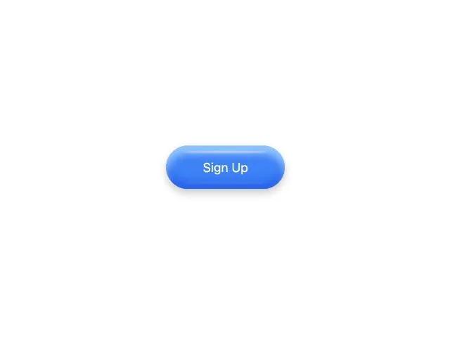 All Prompts
buttonanimatedjellyhover-effect3dglossyctaprimary-actionblueinteractive
Animated Jelly Button
Анимированная кнопка с эффектом желе при наведении. Современный 3D-дизайн. Идеально для CTA и основных действий.
Prompt
<button class="spring-button">
    Sign Up
    <style>
        .spring-button {
            position: relative;
            width: 150px;
            height: 55px;
            border-radius: 45px;
            border: none;
            background-color: rgb(59, 130, 246);
            color: white;
            box-shadow: 0px 10px 10px rgb(147, 197, 253) inset,
                0px 5px 10px rgba(5, 5, 5, 0.212),
                0px -10px 10px rgb(37, 99, 235) inset;
            cursor: pointer;
            display: flex;
            align-items: center;
            justify-content: center;
        }

        .spring-button::before {
            width: 70%;
            height: 2px;
            position: absolute;
            background-color: rgba(250, 250, 250, 0.678);
            content: "";
            filter: blur(1px);
            top: 7px;
            border-radius: 50%;
        }

        .spring-button::after {
            width: 70%;
            height: 2px;
            position: absolute;
            background-color: rgba(250, 250, 250, 0.137);
            content: "";
            filter: blur(1px);
            bottom: 7px;
            border-radius: 50%;
        }

        .spring-button:hover {
            animation: jello-horizontal 1.2s both ease-in-out;
        }

        @keyframes jello-horizontal {
            0% {
                transform: scale3d(1, 1, 1);
            }

            20% {
                transform: scale3d(1.15, 0.85, 1);
            }

            30% {
                transform: scale3d(0.9, 1.1, 1);
            }

            40% {
                transform: scale3d(1.08, 0.92, 1);
            }

            50% {
                transform: scale3d(0.95, 1.05, 1);
            }

            60% {
                transform: scale3d(1.03, 0.97, 1);
            }

            70% {
                transform: scale3d(0.98, 1.02, 1);
            }

            80% {
                transform: scale3d(1.01, 0.99, 1);
            }

            90% {
                transform: scale3d(0.99, 1.01, 1);
            }

            100% {
                transform: scale3d(1, 1, 1);
            }
        }
    </style>
</button>