All Prompts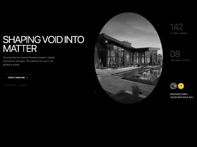 All Prompts
heroresponsiveanimatedtailwindlandingarchitecturalinteractive
Architectural Hero Section with Stats and CTA
Геройский раздел с интерактивной статистикой и CTA. Адаптивный дизайн, анимация, Tailwind. Идеально для лендингов.
Prompt
<section class="flex-grow grid grid-cols-1 lg:px-12 lg:grid-cols-12 mt-32 mb-32 pb-12 relative gap-x-8 gap-y-8">
  <style>
  /* --- Animated Button CSS (Kept from previous) --- */
.btn-wrapper::after {
  content: ""; position: absolute; top: 0; left: 0; width: 100%; height: 100%;
  border-radius: inherit; pointer-events: none; background-color: #0000;
  background-image: repeating-linear-gradient(45deg, var(--grid-color) 0 1px, transparent 2px 5px);
  opacity: 0; z-index: -1;
}
.btn-wrapper:has(.btn:hover)::after { animation: opacity-anim calc(var(--animation-speed) * 4) ease-in-out forwards; }
@keyframes opacity-anim { 80% { opacity: 0; } 100% { opacity: 1; } }
.btn-wrapper .btn {
  position: relative; display: flex; justify-content: center; align-items: center;
  padding: 1rem 1.5rem; background-color: #fff0; border: 1px solid var(--grid-color);
  color: #fffd; font-family: "Inter", sans-serif; letter-spacing: -0.01em;
  font-size: 1rem; font-weight: 600; text-transform: uppercase; border-radius: 0px;
  cursor: pointer; transition: transform .2s ease-in-out, letter-spacing .2s ease-in-out;
}
.btn-wrapper .btn:hover { background-color: #FACC15; color: #000; border-color: #FACC15; transform: scale(1.05); letter-spacing: .06em; }
.btn-wrapper .btn:active { background-color: #EAB308; transform: scale(.98); letter-spacing: .02em; }
.btn-wrapper .btn-svg { margin-left: .5rem; height: 20px; width: 20px; stroke-width: 1.5; stroke-linecap: round; stroke-linejoin: round; stroke: currentColor; fill: none; transition: all .2s ease-in-out; }
.btn-wrapper .dot { position: absolute; width: var(--dot-size); aspect-ratio: 1; border-radius: 0px; background-color: var(--dot-color); transition: all .3s ease-in-out; opacity: 0; }
.btn-wrapper:has(.btn:hover) .dot.top.left { top: 50%; left: 20%; animation: move-top-left var(--animation-speed) ease-in-out forwards; }
@keyframes move-top-left { 90% { opacity: .6; } 100% { top: calc(var(--dot-size) * -0.5); left: calc(var(--dot-size) * -0.5); opacity: 1; } }
.btn-wrapper:has(.btn:hover) .dot.top.right { top: 50%; right: 20%; animation: move-top-right var(--animation-speed) ease-in-out forwards; animation-delay: calc(var(--animation-speed)*.6); }
@keyframes move-top-right { 80% { opacity: .6; } 100% { top: calc(var(--dot-size) * -0.5); right: calc(var(--dot-size) * -0.5); opacity: 1; } }
.btn-wrapper:has(.btn:hover) .dot.bottom.right { bottom: 50%; right: 20%; animation: move-bottom-right var(--animation-speed) ease-in-out forwards; animation-delay: calc(var(--animation-speed)*1.2); }
@keyframes move-bottom-right { 80% { opacity: .6; } 100% { bottom: calc(var(--dot-size) * -0.5); right: calc(var(--dot-size) * -0.5); opacity: 1; } }
.btn-wrapper:has(.btn:hover) .dot.bottom.left { bottom: 50%; left: 20%; animation: move-bottom-left var(--animation-speed) ease-in-out forwards; animation-delay: calc(var(--animation-speed)*1.8); }
@keyframes move-bottom-left { 80% { opacity: .6; } 100% { bottom: calc(var(--dot-size) * -0.5); left: calc(var(--dot-size) * -0.5); opacity: 1; } }
.btn-wrapper .line { position: absolute; transition: all .3s ease-in-out; }
.btn-wrapper .line.horizontal { height: var(--line-weight); width: 100%; background-image: repeating-linear-gradient(90deg, #0000 0 calc(var(--line-weight)*2), var(--line-color) calc(var(--line-weight)*2) calc(var(--line-weight)*4)); }
.btn-wrapper .line.vertical { width: var(--line-weight); height: 100%; background-image: repeating-linear-gradient(0deg, #0000 0 calc(var(--line-weight)*2), var(--line-color) calc(var(--line-weight)*2) calc(var(--line-weight)*4)); }
.btn-wrapper .line.top { top: calc(var(--line-weight)*-0.5); transform-origin: top left; transform: rotate(5deg) scaleX(0); }
.btn-wrapper:has(.btn:hover) .line.top { animation: draw-top var(--animation-speed) ease-in-out forwards; animation-delay: calc(var(--animation-speed)*.8); }
@keyframes draw-top { 100% { transform: rotate(0deg) scaleX(1); } }
.btn-wrapper .line.bottom { bottom: calc(var(--line-weight)*-0.5); transform-origin: bottom right; transform: rotate(5deg) scaleX(0); }
.btn-wrapper:has(.btn:hover) .line.bottom { animation: draw-bottom var(--animation-speed) ease-in-out forwards; animation-delay: calc(var(--animation-speed)*2); }
@keyframes draw-bottom { 100% { transform: rotate(0deg) scaleX(1); } }
.btn-wrapper .line.left { left: calc(var(--line-weight)*-0.5); transform-origin: bottom left; transform: rotate(0deg) scaleY(0); }
.btn-wrapper:has(.btn:hover) .line.left { animation: draw-left var(--animation-speed) ease-in-out forwards; animation-delay: calc(var(--animation-speed)*2.4); }
@keyframes draw-left { 100% { transform: rotate(0deg) scaleY(1); } }
.btn-wrapper .line.right { right: calc(var(--line-weight)*-0.5); transform-origin: top right; transform: rotate(5deg) scaleY(0); }
.btn-wrapper:has(.btn:hover) .line.right { animation: draw-right var(--animation-speed) ease-in-out forwards; animation-delay: calc(var(--animation-speed)*1.4); }
@keyframes draw-right { 100% { transform: rotate(0deg) scaleY(1); } }
</style>

  <!-- Left Column: Headlines -->
  <div class="lg:col-span-5 flex flex-col lg:pt-10 z-20 relative justify-center">
    <h1
      class="text-6xl lg:text-[5rem] leading-[0.9] font-normal tracking-tighter text-white mb-6 uppercase [animation:fadeSlideIn_0.8s_ease-out_0.1s_both] animate-on-scroll">
      Shaping
      Void
      Into
      Matter
    </h1>

    <p
      class="text-lg text-neutral-400 max-w-md leading-relaxed mb-12 font-light [animation:fadeSlideIn_0.8s_ease-out_0.2s_both] animate-on-scroll">
      Constructing the ethereal through parametric design and brutalist principles. We redefine the skyline one artifact
      at a time.
    </p>

    <div class="flex flex-col items-start gap-3 [animation:fadeSlideIn_0.8s_ease-out_0.3s_both] animate-on-scroll">
      <!-- Animated Button Wrapper -->
      <a href="#" class="btn-wrapper"
        style="--dot-size: 6px; --line-weight: 1px; --line-distance: 0.8rem 1rem; --animation-speed: 0.35s; --dot-color: #FACC15; --line-color: #FACC15; --grid-color: #fff3; position: relative; display: inline-flex; justify-content: center; align-items: center; width: auto; height: auto; padding: var(--line-distance); user-select: none">
        <div class="line horizontal top"></div>
        <div class="line vertical right"></div>
        <div class="line horizontal bottom"></div>
        <div class="line vertical left"></div>

        <div class="dot top left"></div>
        <div class="dot top right"></div>
        <div class="dot bottom right"></div>
        <div class="dot bottom left"></div>

        <button class="btn">
                        <span class="btn-text tracking-tight">Start Creating</span>
                        <svg class="btn-svg" xmlns="http://www.w3.org/2000/svg" width="24" height="24" viewBox="0 0 24 24" fill="none" stroke="currentColor" stroke-width="1.5" stroke-linecap="round" stroke-linejoin="round"><path d="M5 12h14" class=""></path><path d="m12 5 7 7-7 7" class=""></path></svg>
                    </button>
      </a>

      <span class="text-xs text-neutral-500 uppercase tracking-widest pl-4 opacity-70">View Showreel (01:20)</span>
    </div>
  </div>

  <!-- Center Column: Visuals & Grid Background -->
  <div
    class="lg:col-span-4 relative flex items-center justify-center py-20 lg:py-0 [animation:fadeSlideIn_1s_ease-out_0.2s_both] animate-on-scroll">
    <!-- Background Grid overlay specific to this area -->
    <div
      class="absolute inset-0 grid-bg opacity-100 z-0 mx-[-2rem] mask-image-linear-gradient(to bottom, black, transparent)">
    </div>

    <!-- Decorative Plus Signs -->
    <div class="absolute top-1/4 right-0 text-neutral-700 text-2xl font-light z-10">+</div>
    <div class="absolute bottom-20 left-0 text-neutral-700 text-2xl font-light z-10">+</div>

    <!-- Oval Image Container -->
    <div
      class="relative z-10 w-full aspect-[3/4] rounded-[50%] overflow-hidden shadow-2xl border border-white/10 group">
      <img src="https://hoirqrkdgbmvpwutwuwj.supabase.co/storage/v1/object/public/assets/assets/a5f2766e-81d8-4036-baed-e613aa1fcca4_1600w.webp" alt="Architectural Detail" class="group-hover:grayscale-0 opacity-90 w-full h-full object-cover grayscale scale-110" id="main-image">
    </div>
  </div>

  <!-- Right Column: Stats & Sidebar -->
  <div
    class="lg:col-span-3 flex flex-col relative z-20 pt-10 pl-6 [animation:fadeSlideIn_0.8s_ease-out_0.4s_both] animate-on-scroll">
    <!-- Vertical Beam Border -->
    <div class="beam-border-v"></div>

    <div class="flex-1 flex flex-col justify-between h-full pb-10">
      <!-- Interactive Stat 1 -->
      <div class="stat-item mt-10" data-img-id="1">
        <span class="stat-value text-7xl font-light tracking-tighter text-neutral-700 block transition-colors">142</span>
        <span class="text-sm text-neutral-500 uppercase tracking-widest mt-2 block pl-2 group-hover:text-white">Global Awards</span>
      </div>

      <!-- Interactive Stat 2 -->
      <div class="stat-item py-12 border-t border-white/5 border-dashed" data-img-id="2">
        <span class="stat-value text-7xl font-light tracking-tighter text-neutral-700 block transition-colors">08</span>
        <span class="text-sm text-neutral-500 uppercase tracking-widest mt-2 block pl-2 group-hover:text-white">Regional Offices</span>
      </div>

      <!-- Interactive Stat 3 (Profile as trigger) -->
      <div class="stat-item border-t border-white/5 border-dashed pt-12" data-img-id="3">
        <div class="flex items-start gap-4 mb-4">
          <div class="relative group cursor-pointer">
            <img src="https://hoirqrkdgbmvpwutwuwj.supabase.co/storage/v1/object/public/assets/assets/63a6abea-fa7c-44e7-b134-9d70239f3d3f_320w.webp" alt="Lead Architect" class="w-14 h-14 rounded-full border border-neutral-800 object-cover relative z-10 grayscale group-hover:grayscale-0 transition-all">
            <div
              class="absolute -right-2 top-1/2 -translate-y-1/2 w-12 h-12 bg-[#FACC15] rounded-full flex items-center justify-center z-0 translate-x-full -ml-6 transition-transform group-hover:translate-x-[110%]">
              <svg xmlns="http://www.w3.org/2000/svg" width="1em" height="1em" viewBox="0 0 24 24"
                class="text-black text-xl" style="" data-icon-set="solar" data-solar="arrow-right-up-bold-duotone">
                <path fill="currentColor" fill-rule="evenodd"
                  d="M17.47 15.53a.75.75 0 0 0 1.28-.53V6a.75.75 0 0 0-.75-.75H9a.75.75 0 0 0-.53 1.28z"
                  clip-rule="evenodd" class=""></path>
                <path fill="currentColor" d="M5.47 17.47a.75.75 0 1 0 1.06 1.06l6.97-6.97l-1.06-1.06z" opacity=".5"
                  class="">
                </path>
              </svg>
            </div>
          </div>
        </div>

        <p
          class="text-base font-normal text-neutral-300 uppercase leading-relaxed tracking-tight max-w-[200px] mt-6 pointer-events-none">
          Redefining urban landscapes since 2024
        </p>
      </div>
    </div>
  </div>

</section>