All Prompts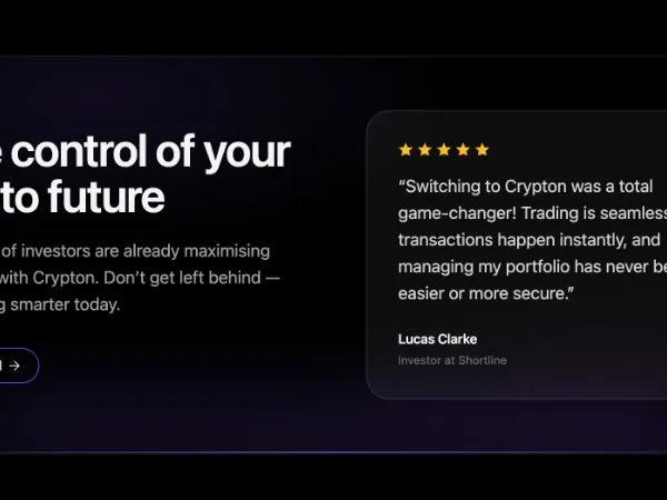 All Prompts
heroctaanimatedtestimonialtailwindresponsivelanding-page
Hero Section with Animated CTA & Testimonial
Адаптивный Hero блок: заголовок, текст, анимированная кнопка CTA, карточка отзыва. Для лендингов SaaS и крипто.
Prompt
<div class="relative overflow-hidden bg-neutral-50/0 border-white/10 border ring-white/5 ring-1 rounded-3xl">
      <!-- Soft noise / radial lighting -->
      <div class="pointer-events-none absolute inset-0" style="background:
        radial-gradient(600px 240px at 25% 10%, rgba(139,92,246,0.12), transparent 65%),
        radial-gradient(700px 280px at 90% 100%, rgba(88,28,135,0.12), transparent 70%)"></div>

      <!-- Content -->
      <div class="relative grid grid-cols-1 lg:grid-cols-2 gap-10 lg:gap-12 sm:p-10 lg:p-14 pt-8 pr-8 pb-8 pl-8 items-center">
        <!-- Left: Headline + copy + CTA -->
        <div class="">
          <h2 class="text-4xl sm:text-5xl font-semibold tracking-tight leading-[1.1] text-neutral-100">
            Take control of your
            <span class="block text-neutral-100">crypto future</span>
          </h2>
          <p class="mt-5 max-w-xl text-base sm:text-lg text-neutral-400 leading-relaxed">
            Thousands of investors are already maximising their gains with Crypton. Don’t get left behind — start trading smarter today.
          </p>

          <div class="mt-8">
            <button type="button" class="button">
<div class="points_wrapper">
<i class="point"></i>
<i class="point"></i>
<i class="point"></i>
<i class="point"></i>
<i class="point"></i>
<i class="point"></i>
<i class="point"></i>
<i class="point"></i>
<i class="point"></i>
<i class="point"></i>
</div>

<span class="inner font-space-grotesk" style="">Get Started<svg class="icon" fill="none" stroke="currentColor" viewBox="0 0 24 24" xmlns="http://www.w3.org/2000/svg" stroke-linecap="round" stroke-linejoin="round" stroke-width="1.5">
<path d="M5 12h14" class=""></path>
<path d="m12 5 7 7-7 7" class=""></path>
</svg></span>
<style>
.button {
cursor: pointer;
position: relative;
display: inline-flex;
align-items: center;
justify-content: center;
overflow: hidden;
transition: all 0.25s ease;
background: radial-gradient(65.28% 65.28% at 50% 100%,
    rgba(99, 102, 241, 0.8) 0%,
    rgba(99, 102, 241, 0) 100%),
  linear-gradient(0deg, #4f46e5, #4f46e5);
border-radius: 9999px;
border: none;
outline: none;
padding: 8px 18px;
min-height: 36px;
min-width: 90px;
}

.button::before,
.button::after {
content: "";
position: absolute;
transition: all 0.5s ease-in-out;
z-index: 0;
}

.button::before {
inset: 1px;
background: black;
border-radius: 9999px;
}

.button::after {
inset: 2px;
background: black),
  linear-gradient(0deg, #4f46e5, #4f46e5);
border-radius: 9999px;
}

.button:active {
transform: scale(0.95);
}

.points_wrapper {
overflow: hidden;
width: 100%;
height: 100%;
pointer-events: none;
position: absolute;
z-index: 1;
}

.points_wrapper .point {
bottom: -8px;
position: absolute;
animation: floating-points infinite ease-in-out;
pointer-events: none;
width: 1.5px;
height: 1.5px;
background-color: #fff;
border-radius: 9999px;
}

@keyframes floating-points {
0% {
  transform: translateY(0);
}

85% {
  opacity: 0;
}

100% {
  transform: translateY(-40px);
  opacity: 0;
}
}

.points_wrapper .point:nth-child(1) {
left: 10%;
opacity: 1;
animation-duration: 2.35s;
animation-delay: 0.2s;
}

.points_wrapper .point:nth-child(2) {
left: 30%;
opacity: 0.7;
animation-duration: 2.5s;
animation-delay: 0.5s;
}

.points_wrapper .point:nth-child(3) {
left: 25%;
opacity: 0.8;
animation-duration: 2.2s;
animation-delay: 0.1s;
}

.points_wrapper .point:nth-child(4) {
left: 44%;
opacity: 0.6;
animation-duration: 2.05s;
}

.points_wrapper .point:nth-child(5) {
left: 50%;
opacity: 1;
animation-duration: 1.9s;
}

.points_wrapper .point:nth-child(6) {
left: 75%;
opacity: 0.5;
animation-duration: 1.5s;
animation-delay: 1.5s;
}

.points_wrapper .point:nth-child(7) {
left: 88%;
opacity: 0.9;
animation-duration: 2.2s;
animation-delay: 0.2s;
}

.points_wrapper .point:nth-child(8) {
left: 58%;
opacity: 0.8;
animation-duration: 2.25s;
animation-delay: 0.2s;
}

.points_wrapper .point:nth-child(9) {
left: 98%;
opacity: 0.6;
animation-duration: 2.6s;
animation-delay: 0.1s;
}

.points_wrapper .point:nth-child(10) {
left: 65%;
opacity: 1;
animation-duration: 2.5s;
animation-delay: 0.2s;
}

.inner {
z-index: 2;
gap: 5px;
position: relative;
width: 100%;
color: white;
display: inline-flex;
align-items: center;
justify-content: center;
font-size: 14px;
font-weight: 500;
line-height: 1.5;
transition: color 0.2s ease-in-out;
}

.inner svg.icon {
width: 16px;
height: 16px;
transition: transform 0.3s ease;
stroke: white;
fill: none;
}

.button:hover svg.icon {
transform: translateX(2px);
}

.button:hover svg.icon path {
animation: dash 0.8s linear forwards;
}

@keyframes dash {
0% {
  stroke-dasharray: 0, 20;
  stroke-dashoffset: 0;
}

50% {
  stroke-dasharray: 10, 10;
  stroke-dashoffset: -5;
}

100% {
  stroke-dasharray: 20, 0;
  stroke-dashoffset: -10;
}
}

/* Loading Component Styles */
#h2 {
  color: white;
  mix-blend-mode: difference;
  text-align: center;
  margin: 0;
  font-size: 12px;
  line-height: 30px;
  font-family: Arial, Helvetica, sans-serif;
  text-shadow: 0 0 3px;
  padding: 0;
  letter-spacing: 5px;
}

.div {
  position: relative;
  top: 0px;
  left: 0%;
  max-width: 200px;
  width: 100%;
  height: 30px;
  background: linear-gradient(to right, white, black);
  background-size: 200% 100%;
  animation-delay: 2s;
  border-radius: 10px;
  box-shadow: 0 0 3px;
  -webkit-box-reflect: below 1px
    linear-gradient(to bottom, rgba(0, 0, 0, 0), rgba(0, 0, 0, 0.4));
  animation: gradientAnimation 10s linear infinite reverse;
}

@keyframes gradientAnimation {
  0% {
    background-position: 0;
  }

  100% {
    background-position: 200% 0;
  }
}

@media (max-width: 768px) {
  .div {
    width: 500px;
    left: 10%;
  }
}
</style>
</button>
          </div>
        </div>

        <!-- Right: Testimonial card -->
        <div class="lg:pl-4">
          <div class="rounded-3xl bg-white/5 border border-white/10 ring-1 ring-white/5 p-6 sm:p-8 shadow-lg shadow-black/20 backdrop-blur">
            <!-- Stars -->
            <div class="flex items-center gap-1 text-amber-400">
              <svg xmlns="http://www.w3.org/2000/svg" width="16" height="16" viewBox="0 0 24 24" class="h-4 w-4" fill="currentColor" stroke="currentColor" stroke-width="1.5"><path d="M12 2.75 14.66 9l6.84.52-5.2 4.19 1.64 6.54L12 17.98 6.06 20.25 7.7 13.71l-5.2-4.19L9.34 9 12 2.75z" class=""></path></svg>
              <svg xmlns="http://www.w3.org/2000/svg" width="16" height="16" viewBox="0 0 24 24" class="h-4 w-4" fill="currentColor" stroke="currentColor" stroke-width="1.5"><path d="M12 2.75 14.66 9l6.84.52-5.2 4.19 1.64 6.54L12 17.98 6.06 20.25 7.7 13.71l-5.2-4.19L9.34 9 12 2.75z" class=""></path></svg>
              <svg xmlns="http://www.w3.org/2000/svg" width="16" height="16" viewBox="0 0 24 24" class="h-4 w-4" fill="currentColor" stroke="currentColor" stroke-width="1.5"><path d="M12 2.75 14.66 9l6.84.52-5.2 4.19 1.64 6.54L12 17.98 6.06 20.25 7.7 13.71l-5.2-4.19L9.34 9 12 2.75z" class=""></path></svg>
              <svg xmlns="http://www.w3.org/2000/svg" width="16" height="" viewBox="0 0 24 24" class="h-4 w-4" fill="currentColor" stroke="currentColor" stroke-width="1.5"><path d="M12 2.75 14.66 9l6.84.52-5.2 4.19 1.64 6.54L12 17.98 6.06 20.25 7.7 13.71l-5.2-4.19L9.34 9 12 2.75z" class=""></path></svg>
              <svg xmlns="http://www.w3.org/2000/svg" width="16" height="16" viewBox="0 0 24 24" class="h-4 w-4" fill="currentColor" stroke="currentColor" stroke-width="1.5"><path d="M12 2.75 14.66 9l6.84.52-5.2 4.19 1.64 6.54L12 17.98 6.06 20.25 7.7 13.71l-5.2-4.19L9.34 9 12 2.75z" class=""></path></svg>
            </div>

            <!-- Quote -->
            <p class="mt-4 text-base sm:text-lg text-neutral-300 leading-relaxed">
              “Switching to Crypton was a total game‑changer! Trading is seamless, transactions happen instantly, and managing my portfolio has never been easier or more secure.”
            </p>

            <!-- Author -->
            <div class="mt-6">
              <div class="text-sm font-semibold tracking-tight text-neutral-100">Lucas Clarke</div>
              <div class="text-xs text-neutral-500 mt-1">Investor at Shortline</div>
            </div>
          </div>
        </div>
      </div>

      <!-- Bottom neon underline + glow -->
      <div class="pointer-events-none absolute inset-x-6 sm:inset-x-10 bottom-0">
        <div class="h-px w-full rounded-full bg-gradient-to-r from-transparent via-violet-500 to-transparent"></div>
        <div class="absolute left-1/2 -translate-x-1/2 bottom-0 h-10 sm:h-12 w-[88%] sm:w-[82%] rounded-full bg-violet-500/25 blur-2xl"></div>
      </div>
    </div>