All Prompts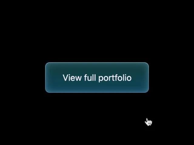 All Prompts
buttonctagradienthoveranimatedcsslinkportfolioui
Gradient Border Call-to-Action Button
Кнопка CTA с неоновым градиентным бордером и эффектом при наведении. Чистый CSS. Идеально для ссылок, секций и акцентов в UI.
Prompt
<a href="#work" class="button"
  style="padding: 1rem 2rem; border-radius: 0.5rem; border: none; font-size: 1rem; font-weight: 400; color: #f4f0ff; text-align: center; position: relative; cursor: pointer; text-decoration: none; display: inline-block; margin-top: 1rem;">
  <div class="button-border"
    style="position: absolute; top: 0; left: 0; height: 100%; width: 100%; border-radius: 0.5rem; z-index: -1;">
    <div
      style="content: ''; position: absolute; border-radius: 0.5rem; padding: 1px; inset: 0; background: linear-gradient(180deg, rgba(184, 238, 255, 0.24) 0%, rgba(184, 238, 255, 0) 100%), linear-gradient(0deg, rgba(184, 238, 255, 0.32), rgba(184, 238, 255, 0.32)); -webkit-mask: linear-gradient(#fff 0 0) content-box, linear-gradient(#fff 0 0); -webkit-mask-composite: xor; pointer-events: none;">
    </div>
  </div>
  <div
    style="content: ''; display: block; position: absolute; left: 0; top: 0; height: 100%; width: 100%; border-radius: 0.5rem; background: linear-gradient(180deg, rgba(8, 77, 126, 0) 0%, rgba(8, 77, 126, 0.42) 100%), rgba(47, 255, 255, 0.24); box-shadow: inset 0 0 12px rgba(151, 200, 255, 0.44); z-index: -1;">
  </div>
  <div
    style="content: ''; display: block; position: absolute; top: 0; left: 0; width: 100%; height: 100%; background: linear-gradient(180deg, rgba(8, 77, 126, 0) 0%, rgba(8, 77, 126, 0.42) 100%), rgba(47, 255, 255, 0.24); box-shadow: inset 0 0 12px rgba(151, 200, 255, 0.44); border-radius: 0.5rem; opacity: 0; z-index: -1; transition: all 0.3s ease-in;"
    onmouseover="this.style.opacity='1'" onmouseout="this.style.opacity='0'"></div>
  View full portfolio
</a>