All Prompts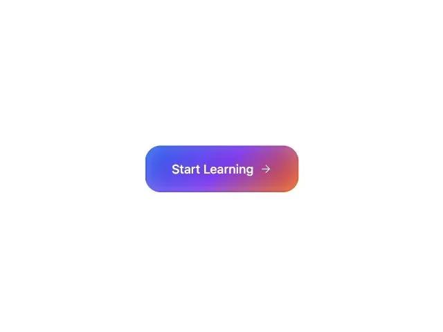 All Prompts
buttonctagradienttailwindiconanimatedresponsiveui
Gradient Border CTA Button with Icon
Кнопка CTA с градиентной рамкой и иконкой. Адаптивный дизайн, анимация при наведении. Идеальна для лендингов и форм.
Prompt
<button type="submit" class="relative gradient-border-button w-fit sm:w-auto">
    <div class="inline-flex gap-2 hover:shadow-xl transition-all duration-200 text-base font-medium text-white font-geist rounded-2xl pt-4 pr-8 pb-4 pl-8 shadow-lg items-center justify-center" style="box-shadow: inset 0 -2px 25px -4px rgba(255, 255, 255, 0.3);">
        <span class="font-geist">Start Learning</span>
        <svg xmlns="http://www.w3.org/2000/svg" width="24" height="24" viewBox="0 0 24 24" fill="none" stroke="currentColor" stroke-width="2" stroke-linecap="round" stroke-linejoin="round" data-lucide="arrow-right" class="lucide lucide-arrow-right w-4 h-4" style="stroke-width: 1.5;"><path d="M5 12h14"></path><path d="m12 5 7 7-7 7"></path></svg>
    </div>
    <style>
        .gradient-border-button {
            position: relative;
            background: linear-gradient(135deg, #2563eb, #7c3aed, #ea580c);
            border-radius: 20px;
            padding: 2px;
        }
        .gradient-border-button::before {
            content: '';
            position: absolute;
            inset: 0;
            background: linear-gradient(135deg, #3b82f6, #8b5cf6, #f97316);
            border-radius: 20px;
            padding: 1px;
            -webkit-mask: linear-gradient(#fff 0 0) content-box, linear-gradient(#fff 0 0);
            -webkit-mask-composite: exclude;
            mask: linear-gradient(#fff 0 0) content-box, linear-gradient(#fff 0 0);
            mask-composite: exclude;
        }
        .button-inner {
            position: relative;
            background: linear-gradient(135deg, #2563eb, #7c3aed, #ea580c);
            border-radius: 1rem;
            z-index: 1;
        }
    </style>
</button>