All Prompts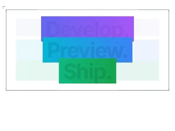 All Prompts
herogradientanimatedtextlandingmodernresponsive
Gradient Hero Text Display
Компонент текста Hero с анимированным градиентом. Идеален для лендингов и промо-разделов, привлекает внимание.
by Lucide ReactLive Preview
Prompt
<div class="w-full bg-black">
  <style>@import url('https://fonts.googleapis.com/css2?family=Inter:wght@400;500;600;700;800;900&display=swap'); .gradient-1-start { --tw-gradient-from: #6366f1; } .gradient-1-end { --tw-gradient-to: #8b5cf6; } .gradient-2-start { --tw-gradient-from: #06b6d4; } .gradient-2-end { --tw-gradient-to: #3b82f6; } .gradient-3-start { --tw-gradient-from: #10b981; } .gradient-3-end { --tw-gradient-to: #059669; } .animate-gradient-foreground-1 { animation: gradientShift1 3s ease-in-out infinite; } .animate-gradient-foreground-2 { animation: gradientShift2 3s ease-in-out infinite 1s; } .animate-gradient-foreground-3 { animation: gradientShift3 3s ease-in-out infinite 2s; } .animate-gradient-background-1::before { animation: backgroundPulse1 3s ease-in-out infinite; opacity: 0.1; background: linear-gradient(to right, #6366f1, #8b5cf6); } .animate-gradient-background-2::before { animation: backgroundPulse2 3s ease-in-out infinite 1s; opacity: 0.1; background: linear-gradient(to right, #06b6d4, #3b82f6); } .animate-gradient-background-3::before { animation: backgroundPulse3 3s ease-in-out infinite 2s; opacity: 0.1; background: linear-gradient(to right, #10b981, #059669); } @keyframes gradientShift1 { 0%, 100% { background-position: 0% 50%; } 50% { background-position: 100% 50%; } } @keyframes gradientShift2 { 0%, 100% { background-position: 0% 50%; } 50% { background-position: 100% 50%; } } @keyframes gradientShift3 { 0%, 100% { background-position: 0% 50%; } 50% { background-position: 100% 50%; } } @keyframes backgroundPulse1 { 0%, 100% { opacity: 0.05; } 50% { opacity: 0.15; } } @keyframes backgroundPulse2 { 0%, 100% { opacity: 0.05; } 50% { opacity: 0.15; } } @keyframes backgroundPulse3 { 0%, 100% { opacity: 0.05; } 50% { opacity: 0.15; } } * { font-family: 'Inter', -apple-system, BlinkMacSystemFont, sans-serif; }</style>
  <div class="mb-10 mt-4 md:mt-6">
    <div class="px-2">
      <div class="relative p-8 w-full h-full border dark:border-slate-800 border-slate-800" style="-webkit-mask-image: radial-gradient(200rem 24rem at center, white, transparent); mask-image: radial-gradient(200rem 24rem at center, white, transparent);">
        <h1 class="tracking-tighter flex select-none px-3 py-2 flex-col text-center text-7xl font-extrabold leading-none sm:text-8xl md:flex-col lg:flex-row">
          <svg class="absolute -left-4 -top-4 h-8 w-8 text-indigo-500" fill="none" stroke="currentColor" viewBox="0 0 24 24">
            <path stroke-linecap="round" stroke-linejoin="round" stroke-width="2" d="M12 4v16m8-8H4"></path>
          </svg>
          <svg class="absolute -bottom-4 -left-4 h-8 w-8 text-indigo-500" fill="none" stroke="currentColor" viewBox="0 0 24 24">
            <path stroke-linecap="round" stroke-linejoin="round" stroke-width="2" d="M12 4v16m8-8H4"></path>
          </svg>
          <svg class="absolute -right-4 -top-4 h-8 w-8 text-indigo-500" fill="none" stroke="currentColor" viewBox="0 0 24 24">
            <path stroke-linecap="round" stroke-linejoin="round" stroke-width="2" d="M12 4v16m8-8H4"></path>
          </svg>
          <svg class="absolute -bottom-4 -right-4 h-8 w-8 text-indigo-500" fill="none" stroke="currentColor" viewBox="0 0 24 24">
            <path stroke-linecap="round" stroke-linejoin="round" stroke-width="2" d="M12 4v16m8-8H4"></path>
          </svg>
          <span data-content="Develop." class="animate-gradient-background-1 relative before:absolute before:bottom-4 before:left-0 before:top-0 before:z-0 before:w-full before:px-2 before:content-[attr(data-content)] sm:before:top-0">
            <span class="animate-gradient-foreground-1 bg-gradient-to-r from-indigo-500 to-purple-500 bg-clip-text px-2 text-transparent sm:px-5">NewSide.</span>
          </span>
          <span data-content="Preview." class="animate-gradient-background-2 relative before:absolute before:bottom-0 before:left-0 before:top-0 before:z-0 before:w-full before:px-2 before:content-[attr(data-content)] sm:before:top-0">
            <span class="animate-gradient-foreground-2 bg-gradient-to-r from-cyan-500 to-blue-500 bg-clip-text px-2 text-transparent sm:px-5">Preview.</span>
          </span>
          <span data-content="Ship." class="animate-gradient-background-3 relative before:absolute before:bottom-1 before:left-0 before:top-0 before:z-0 before:w-full before:px-2 before:content-[attr(data-content)] sm:before:top-0">
            <span class="animate-gradient-foreground-3 bg-gradient-to-r from-emerald-500 bg-clip-text px-2 text-transparent sm:px-5 to-green-400">Ship.</span>
          </span>
        </h1>
      </div>
    </div>
  </div>
</div>