All Prompts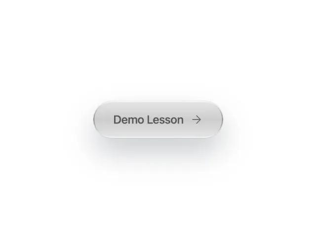 All Prompts
buttonctatailwindinteractiveicongradient
Gradient Pill Button with Icon
Стилизованная кнопка CTA в форме таблетки с градиентом, иконкой и эффектом при наведении. Идеальна для акцентирования ссылок в hero-блоках. Tailwind-CSS.
Prompt
<button class="hover:bg-slate-50 hover:text-slate- transition-all flex text-sm font-medium text-slate-600 bg-gradient-to-b from-black/10 via-black/20 to-black/10 rounded-full pt-3 pr-6 pb-3 pl-6 shadow-[0px_0px_0px_1px_rgba(0,0,0,0.06),0px_1px_1px_-0.5px_rgba(0,0,0,0.06),0px_3px_3px_-1.5px_rgba(0,0,0,0.06),_0px_6px_6px_-3px_rgba(0,0,0,0.06),0px_12px_12px_-6px_rgba(0,0,0,0.06),0px_24px_24px_-12px_rgba(0,0,0,0.06)] gap-x-2 gap-y-2 items-center" style="box-shadow: 0 18px 35px rgba(31, 41, 55, 0.25), 0 0 0 1px rgba(209, 213, 219, 0.3);                  color: #e5e7eb; position: relative; --border-gradient: linear-gradient(180deg, rgba(255, 255, 255, 0.8), rgba(0, 0, 0, 0.4), rgba(255, 255, 255, 0.8)); --border-radius-before: 9999px">

  <span class="text-sm font-medium text-black/60 tracking-tight">
    Demo Lesson
  </span><svg xmlns="http://www.w3.org/2000/svg" width="16" height="16" viewBox="0 0 24 24" fill="none" stroke="#666" stroke-width="1.5" stroke-linecap="round" stroke-linejoin="round" class="w-[16px] h-[16px]" data-lucide="arrow-right" data-icon-set="lucide" data-icon-replaced="true" style="color: rgb(229, 231, 235); width: 16px; height: 16px;"><path d="M5 12h14" class=""></path><path d="m12 5 7 7-7 7"></path></svg>
  <style id="border-gradient-shared-style">
  [style*="--border-gradient"]::before {
    content: "";
    position: absolute;
    inset: 0;
    padding: 1px;
    border-radius: var(--border-radius-before, inherit);
    -webkit-mask: linear-gradient(#fff 0 0) content-box,
      linear-gradient(#fff 0 0);
    -webkit-mask-composite: xor;
    mask-composite: exclude;
    background: var(--border-gradient);
    pointer-events: none;
  }</style>
</button>