All Prompts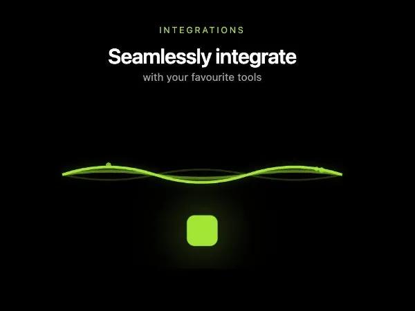 All Prompts
cardtailwindglassmorphismanimatedsvgintegrationmarketingdashboard
Integration Showcase Card with Animated Waves
Карточка "Integration Showcase" с анимированными волнами. Glassmorphic UI-компонент на Tailwind CSS для демонстрации интеграций SaaS-продуктов.
Prompt
<div class="glass overflow-hidden rounded-2xl mb-6 pt-5 pr-5 pb-5 pl-5">
  <div class="text-center mb-4">
    <span class="text-[10px] uppercase tracking-[0.2em] text-lime-300/90">
                      Integrations
                    </span>
    <h4 class="text-2xl font-semibold tracking-tight mt-1">
      Seamlessly integrate
    </h4>
    <p class="text-xs text-neutral-400">
      with your favourite tools
    </p>
  </div>


  <!-- New Wave Animation Schema -->
  <div class="relative h-44">
    <svg viewBox="0 0 320 176" class="absolute inset-0 w-full h-full">
      <!-- Outer waves -->
      <path d="M0 88 Q 53 40, 106 88 T 212 88 T 320 88" stroke="rgba(163,230,53,0.2)" stroke-width="2" fill="none"
        class="wave-path" style="animation: wave 4s ease-in-out infinite;"></path>
      <path d="M0 88 Q 53 60, 106 88 T 212 88 T 320 88" stroke="rgba(163,230,53,0.3)" stroke-width="2" fill="none"
        class="wave-path" style="animation: wave 3.5s ease-in-out infinite 0.2s;"></path>
      <!-- Middle waves -->
      <path d="M0 88 Q 53 70, 106 88 T 212 88 T 320 88" stroke="rgba(163,230,53,0.5)" stroke-width="2.5" fill="none"
        class="wave-path" style="animation: wave 3s ease-in-out infinite 0.4s;"></path>
      <path d="M0 88 Q 53 75, 106 88 T 212 88 T 320 88" stroke="#a3e635" stroke-width="3" fill="none" class="wave-path"
        style="animation: wave 2.8s ease-in-out infinite 0.6s;"></path>
      <!-- Inner glow waves -->
      <path d="M0 88 Q 53 75, 106 88 T 212 88 T 320 88" stroke="rgba(163,230,53,0.4)" stroke-width="8" fill="none"
        opacity="0.3" class="wave-path" style="animation: wave 2.8s ease-in-out infinite 0.6s; filter: blur(4px);">
      </path>
      <!-- Flowing particles -->
      <circle cx="80" cy="88" r="3" fill="#a3e635" opacity="0.8" class="flowing-particle"
        style="animation: flowParticle 5s ease-in-out infinite;"></circle>
      <circle cx="160" cy="88" r="2.5" fill="#a3e635" opacity="0.6" class="flowing-particle"
        style="animation: flowParticle 4.5s ease-in-out infinite 1s;"></circle>
      <circle cx="240" cy="88" r="3" fill="#a3e635" opacity="0.7" class="flowing-particle"
        style="animation: flowParticle 5.5s ease-in-out infinite 2s;"></circle>
    </svg>

    <!-- Destination cube with pulse -->
    <div
      class="absolute bottom-2 left-1/2 -translate-x-1/2 w-8 h-8 rounded-lg bg-lime-400 flex items-center justify-center shadow-[0_0_30px_rgba(163,230,53,0.45)]"
      style="animation: destinationPulse 2s ease-in-out infinite;">
      <i data-lucide="cube" class="w-4 h-4 text-neutral-900"></i>
    </div>
  </div>

  <style>
    @keyframes wave {

      0%,
      100% {
        d: path("M0 88 Q 53 70, 106 88 T 212 88 T 320 88");
      }

      25% {
        d: path("M0 88 Q 53 100, 106 88 T 212 88 T 320 88");
      }

      50% {
        d: path("M0 88 Q 53 76, 106 88 T 212 88 T 320 88");
      }

      75% {
        d: path("M0 88 Q 53 94, 106 88 T 212 88 T 320 88");
      }
    }

    @keyframes flowParticle {
      0% {
        cx: 0;
        cy: 88;
        opacity: 0;
      }

      10% {
        opacity: 0.8;
      }

      50% {
        cy: 70;
      }

      90% {
        opacity: 0.8;
      }

      100% {
        cx: 320;
        cy: 88;
        opacity: 0;
      }
    }

    @keyframes destinationPulse {

      0%,
      100% {
        transform: translate(-50%, 0) scale(1);
        box-shadow: 0 0 30px rgba(163, 230, 53, 0.45);
      }

      50% {
        transform: translate(-50%, 0) scale(1.1);
        box-shadow: 0 0 45px rgba(163, 230, 53, 0.7);
      }
    }

    .wave-path {
      transform-origin: center;
    }
  </style>
</div>