All Prompts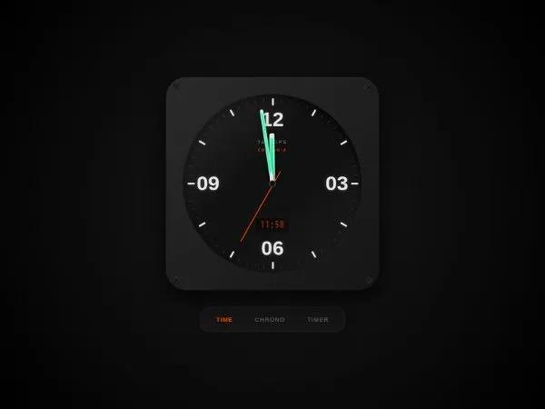 All Prompts
uiinteractiveanimatedclocktimerstopwatchtailwindcss
Interactive Chronograph Watch UI
Интерактивный UI хронографа: аналогово-цифровые часы с анимацией, радиальными метками и LCD. Переключаемые режимы: часы, секундомер, таймер. Dark/futuristic стиль.
Prompt
<div class="flex items-center justify-center min-h-screen w-full bg-[#0a0a0a] overflow-hidden m-0 p-0"
  style="font-family: 'Chakra Petch', sans-serif; background-image: radial-gradient(circle at 50% 50%, #1a1a1a 0%, #000000 100%);">
  <style>
    .watch-case {
      width: 500px;
      height: 500px;
      background: linear-gradient(135deg, #2a2a2a 0%, #151515 100%);
      border-radius: 48px;
      position: relative;
      box-shadow: 0 20px 50px rgba(0, 0, 0, 0.8), inset 0 1px 1px rgba(255, 255, 255, 0.1);
      display: flex;
      align-items: center;
      justify-content: center;
    }

    .dial {
      width: 420px;
      height: 420px;
      background: #0f0f0f;
      border-radius: 50%;
      position: relative;
      box-shadow: inset 0 10px 20px rgba(0, 0, 0, 0.8), 0 0 0 2px #222;
      overflow: hidden;
    }

    .dial::before {
      content: '';
      position: absolute;
      inset: 0;
      background: repeating-linear-gradient(45deg, transparent 0, transparent 2px, rgba(255, 255, 255, 0.02) 2px, rgba(255, 255, 255, 0.02) 4px);
      border-radius: 50%;
      pointer-events: none;
    }

    .screw {
      width: 16px;
      height: 16px;
      background: #2a2a2a;
      border-radius: 50%;
      position: absolute;
      box-shadow: inset 0 1px 2px rgba(0, 0, 0, 0.8), 0 1px 1px rgba(255, 255, 255, 0.1);
      display: flex;
      align-items: center;
      justify-content: center;
    }

    .screw::before,
    .screw::after {
      content: '';
      width: 100%;
      height: 2px;
      background: #111;
      position: absolute;
    }

    .screw::before {
      transform: rotate(45deg);
    }

    .screw::after {
      transform: rotate(-45deg);
    }

    .tick {
      position: absolute;
      left: 50%;
      top: 0;
      width: 2px;
      height: 50%;
      transform-origin: bottom center;
      pointer-events: none;
    }

    .tick::after {
      content: '';
      position: absolute;
      left: 50%;
      transform: translateX(-50%);
      background: #3a3a3a;
    }

    .tick.major::after {
      top: 10px;
      height: 16px;
      width: 4px;
      background: #e5e5e5;
      box-shadow: 0 0 5px rgba(229, 229, 229, 0.3);
    }

    .tick.minor::after {
      top: 10px;
      height: 8px;
      width: 1px;
    }

    .numeral {
      position: absolute;
      font-size: 3rem;
      font-weight: 700;
      color: #e5e5e5;
      text-shadow: 0 0 10px rgba(255, 255, 255, 0.2);
      line-height: 1;
      transform: translate(-50%, -50%);
    }

    .hand {
      position: absolute;
      bottom: 50%;
      left: 50%;
      transform-origin: bottom center;
      z-index: 10;
      border-radius: 4px;
      box-shadow: 0 4px 8px rgba(0, 0, 0, 0.5);
      transition: transform 0.1s cubic-bezier(0.4, 2.08, 0.55, 0.44);
    }

    .hand-hour {
      width: 12px;
      height: 28%;
      background: #e5e5e5;
      margin-left: -6px;
    }

    .hand-hour::after {
      content: '';
      position: absolute;
      top: 10%;
      left: 3px;
      right: 3px;
      bottom: 10%;
      background: #00ff9d;
      opacity: 0.8;
      box-shadow: 0 0 5px #00ff9d;
    }

    .hand-minute {
      width: 8px;
      height: 42%;
      background: #e5e5e5;
      margin-left: -4px;
    }

    .hand-minute::after {
      content: '';
      position: absolute;
      top: 5%;
      left: 2px;
      right: 2px;
      bottom: 15%;
      background: #00ff9d;
      opacity: 0.8;
      box-shadow: 0 0 5px #00ff9d;
    }

    .hand-second {
      width: 2px;
      height: 45%;
      background: #ff4500;
      margin-left: -1px;
      z-index: 12;
      transform-origin: 50% 80%;
      bottom: 40%;
      transition: transform 0.05s linear;
    }

    .lcd-panel {
      position: absolute;
      bottom: 22%;
      left: 50%;
      transform: translateX(-50%);
      background: #080a08;
      padding: 4px 12px;
      border-radius: 4px;
      border: 1px solid #333;
      opacity: 0.6;
      transition: all 0.3s;
    }

    .lcd-panel.active {
      opacity: 1;
      border-color: #ff4500;
    }

    .lcd-text {
      font-family: 'JetBrains Mono', monospace;
      color: #ff4500;
      font-size: 1.2rem;
      letter-spacing: 2px;
      text-shadow: 0 0 5px rgba(255, 69, 0, 0.4);
    }

    @keyframes flicker {

      0%,
      10%,
      20%,
      100% {
        opacity: 1;
      }

      5%,
      15% {
        opacity: 0.4;
      }
    }

    .flicker {
      animation: flicker 0.2s linear;
    }
  </style>

  <div class="flex flex-col items-center">
    <div class="watch-case">
      <div class="screw top-4 left-4"></div>
      <div class="screw top-4 right-4" style="transform: rotate(90deg)"></div>
      <div class="screw bottom-4 left-4" style="transform: rotate(180deg)"></div>
      <div class="screw bottom-4 right-4" style="transform: rotate(270deg)"></div>

      <div class="dial" id="chronoDial">
        <div
          style="position: absolute; inset: 0; border-radius: 50%; background: linear-gradient(135deg, rgba(255, 255, 255, 0.1) 0%, transparent 40%, transparent 60%, rgba(255, 255, 255, 0.05) 100%); pointer-events: none; z-index: 20;">
        </div>
        <div
          style="position: absolute; top: 25%; left: 50%; transform: translateX(-50%); font-size: 0.7rem; letter-spacing: 3px; color: #666; font-weight: 600; text-align: center;">
          TAC-OPS<br><span style="font-size: 0.5rem; color: #ff4500;">CHRONO-X</span>
        </div>
        <div
          style="position: absolute; top: 50%; left: 50%; transform: translate(-50%, -50%); width: 16px; height: 16px; background: #111; border: 2px solid #444; border-radius: 50%; z-index: 15;">
        </div>
        <div class="hand hand-hour" id="hrHnd"></div>
        <div class="hand hand-minute" id="minHnd"></div>
        <div class="hand hand-second" id="secHnd"></div>
        <div class="lcd-panel" id="lcdPnl"><span class="lcd-text" id="digDisp">00:00.00</span></div>
      </div>
    </div>

    <div class="mt-10 flex gap-5 bg-[#151515] p-2.5 px-5 rounded-[20px] border border-[#333] shadow-2xl">
      <button class="mode-btn text-[#ff4500] uppercase font-semibold text-sm tracking-widest px-4 py-2" onclick="switchMode('clock')">Time</button>
      <button class="mode-btn text-[#555] uppercase font-semibold text-sm tracking-widest px-4 py-2" onclick="switchMode('stopwatch')">Chrono</button>
      <button class="mode-btn text-[#555] uppercase font-semibold text-sm tracking-widest px-4 py-2" onclick="switchMode('timer')">Timer</button>
    </div>
  </div>

  <script src="https://cdn.tailwindcss.com"></script>
  <script>
    (function() {
      const dial = document.getElementById('chronoDial');
      const dig = document.getElementById('digDisp');
      const pnl = document.getElementById('lcdPnl');
      const hrH = document.getElementById('hrHnd');
      const minH = document.getElementById('minHnd');
      const secH = document.getElementById('secHnd');
      let mode = 'clock', swInt, swTime = 0, tmInt;

      for (let i = 0; i < 60; i++) {
        const t = document.createElement('div');
        t.className = `tick ${i % 5 === 0 ? 'major' : 'minor'}`;
        t.style.transform = `rotate(${i * 6}deg)`;
        dial.appendChild(t);
        if (i % 15 === 0) {
          const n = document.createElement('div');
          n.className = 'numeral';
          n.innerText = (i === 0 ? 12 : i / 5).toString().padStart(2, '0');
          const rad = (i * 6) * (Math.PI / 180);
          n.style.left = `${50 + 36 * Math.sin(rad)}%`;
          n.style.top = `${50 - 36 * Math.cos(rad)}%`;
          dial.appendChild(n);
        }
      }

      window.switchMode = (m) => {
        mode = m;
        document.querySelectorAll('.mode-btn').forEach(b => b.style.color = b.innerText.toLowerCase().includes(m==='stopwatch'?'chrono':m) ? '#ff4500' : '#555');
        dig.classList.add('flicker'); setTimeout(() => dig.classList.remove('flicker'), 200);
        clearInterval(swInt); clearInterval(tmInt);
        if (m === 'clock') pnl.style.opacity = '0.6';
        else if (m === 'stopwatch') {
          pnl.style.opacity = '1'; swTime = 0;
          swInt = setInterval(() => {
            swTime += 10;
            const ms = Math.floor((swTime % 1000) / 10), s = Math.floor((swTime / 1000) % 60), mn = Math.floor(swTime / 60000);
            dig.innerText = `${mn.toString().padStart(2,'0')}:${s.toString().padStart(2,'0')}.${ms.toString().padStart(2,'0')}`;
            secH.style.transform = `rotate(${(swTime/1000)*6}deg)`;
            minH.style.transform = `rotate(${(swTime/60000)*6}deg)`;
            hrH.style.transform = `rotate(0deg)`;
          }, 10);
        } else {
          pnl.style.opacity = '1'; let left = 300000, start = Date.now();
          tmInt = setInterval(() => {
            const rem = Math.max(0, left - (Date.now() - start));
            const s = Math.floor((rem/1000)%60), mn = Math.floor(rem/60000);
            dig.innerText = `${mn.toString().padStart(2,'0')}:${s.toString().padStart(2,'0')}.00`;
            secH.style.transform = `rotate(${(rem/1000)*6}deg)`;
            if (rem === 0) clearInterval(tmInt);
          }, 100);
        }
      };

      setInterval(() => {
        if (mode !== 'clock') return;
        const n = new Date(), s = n.getSeconds() + n.getMilliseconds()/1000, m = n.getMinutes() + s/60, h = n.getHours() + m/60;
        secH.style.transform = `rotate(${s*6}deg)`;
        minH.style.transform = `rotate(${m*6}deg)`;
        hrH.style.transform = `rotate(${h*30}deg)`;
        dig.innerText = `${n.getHours().toString().padStart(2,'0')}:${n.getMinutes().toString().padStart(2,'0')}`;
      }, 50);
    })();
  </script>
</div>