All Prompts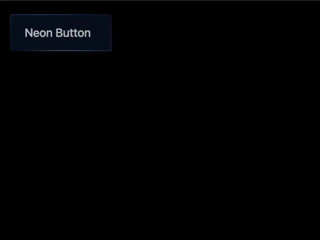 All Prompts
buttontailwindcssanimatedhovergradientneoninteractivecta
Neon Border Animated Button
Анимированная кнопка с неоновой границей и эффектом при наведении. UI компонент CTA на Tailwind CSS для современных сайтов.
Prompt
<div class="inline-block group text-sm relative m-4">
  <button class="neon-border group inline-flex min-w-[120px] cursor-pointer transition-all duration-[1000ms] ease-[cubic-bezier(0.15,0.83,0.66,1)] hover:-translate-y-[3px] hover:scale-[1.1] border-gradient overflow-hidden text-sm font-medium text-white/70 tracking-tight bg-blue-500/10 pt-[12px] pr-[17px] pb-[12px] pl-[17px] relative backdrop-blur-xl items-center justify-center">
            <span class="line block"></span>
            <span class="line block"></span>
            <span class="line block"></span>
            <span class="line block"></span>
            <span class="button-text z-10 text-sm font-medium mr-2 relative transition-colors duration-200">Neon Button</span>
            <span aria-hidden="true" class="-translate-x-1/2 transition-all duration-[1000ms] ease-[cubic-bezier(0.15,0.83,0.66,1)] group-hover:opacity-80 text-xs opacity-20 w-[70%] h-[1px] absolute bottom-0 left-1/2" style="background:linear-gradient(90deg,rgba(255,255,255,0) 0%,rgba(255,255,255,1) 50%,rgba(255,255,255,0) 100%);"></span>
        </button>
  <span class="bottom-glow pointer-events-none absolute -bottom-3 left-1/2 z-0 h-6 w-44 -translate-x-1/2 opacity-0 transition-opacity duration-300 ease-out group-hover:opacity-100" aria-hidden="true"></span>
  <style class="">
    .border-gradient {
      position: relative;
    }

    .border-gradient::before {
      content: "";
      position: absolute;
      inset: 0;
      border-radius: inherit;
      padding: 1px;
      -webkit-mask: linear-gradient(#fff 0 0) content-box,
        linear-gradient(#fff 0 0);
      -webkit-mask-composite: xor;
      mask-composite: exclude;
      background: linear-gradient(225deg,
          rgba(33, 150, 243, 0.0) 0%,
          rgba(33, 150, 243, 0.4) 50%,
          rgba(33, 150, 243, 0.0) 100%);
      pointer-events: none;
    }

    .neon-border span.line:nth-child(1) {
      position: absolute;
      top: 0;
      left: -100%;
      width: 100%;
      height: 2px;
      background: linear-gradient(90deg, transparent, #2196f3);
    }

    .neon-border:hover span.line:nth-child(1) {
      left: 100%;
      transition: left 1s;
    }

    .neon-border span.line:nth-child(2) {
      position: absolute;
      top: -100%;
      right: 0;
      width: 2px;
      height: 100%;
      background: linear-gradient(180deg, transparent, #2196f3);
    }

    .neon-border:hover span.line:nth-child(2) {
      top: 100%;
      transition: top 1s 0.25s;
    }

    .neon-border span.line:nth-child(3) {
      position: absolute;
      bottom: 0;
      right: -100%;
      width: 100%;
      height: 2px;
      background: linear-gradient(270deg, transparent, #2196f3);
    }

    .neon-border:hover span.line:nth-child(3) {
      right: 100%;
      transition: right 1s 0.5s;
    }

    .neon-border span.line:nth-child(4) {
      position: absolute;
      bottom: -100%;
      left: 0;
      width: 2px;
      height: 100%;
      background: linear-gradient(360deg, transparent, #2196f3);
    }

    .neon-border:hover span.line:nth-child(4) {
      bottom: 100%;
      transition: bottom 1s 0.75s;
    }

    .neon-border:hover {
      background: #2196f3 !important;
      box-shadow: 0 0 10px #2196f3, 0 0 40px #2196f3, 0 0 80px #2196f3;
      transition: all 0.2s 1s;
    }

    .neon-border:hover .button-text {
      color: #ffffff !important;
    }

    .neon-border:hover .button-icon {
      color: #ffffff !important;
    }

    .bottom-glow {
      background: radial-gradient(60% 100% at 50% 50%, rgba(33, 150, 243, 0.55), rgba(33, 150, 243, 0.28) 35%, transparent 70%);
      filter: blur(10px) saturate(120%);
    }
  </style>
</div>