All Prompts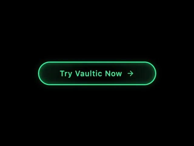 All Prompts
buttonctatailwindanimatedgradienthoverlinksvg-icon
Neon Gradient CTA Button with Hover Sweep
Анимированная кнопка CTA с неоновым градиентным переходом при наведении. Кнопка-ссылка с иконкой для привлечения внимания на лендингах.
Prompt
<a href="#"
class="inline-flex items-center gap-2 hover:bg-emerald-400 transition-colors relative overflow-hidden text-sm font-medium rounded-full pt-3 pr-6 pb-3 pl-6"
style="--green: #1BFD9C; font-size: 15px; padding: 0.7em 2.7em; letter-spacing: 0.06em; position: relative; font-family: inherit; border-radius: 2.6em; overflow: hidden; line-height: 1.4em; border: 2px solid var(--green); background: linear-gradient(to right, rgba(27, 253, 156, 0.1) 1%, transparent 40%, transparent 60%, rgba(27, 253, 156, 0.1) 100%); color: var(--green); box-shadow: rgba(27, 253, 156, 0.4) 0px 0px 10px inset, rgba(27, 253, 156, 0.1) 0px 0px 9px 3px;"
onmouseover="this.style.color='#82ffc9'; this.style.boxShadow='inset 0 0 10px rgba(27, 253, 156, 0.6), 0 0 9px 3px rgba(27, 253, 156, 0.2)'; this.querySelector('.sweep-effect').style.transform='translateX(15em)';"
onmouseout="this.style.color='var(--green)'; this.style.boxShadow='inset 0 0 10px rgba(27, 253, 156, 0.4), 0 0 9px 3px rgba(27, 253, 156, 0.1)'; this.querySelector('.sweep-effect').style.transform='translateX(-4em)';">
<span class="sweep-effect" style="content: ""; position: absolute; left: -4em; width: 4em; height: 100%; top: 0px; background: linear-gradient(to right, transparent 1%, rgba(27, 253, 156, 0.1) 40%, rgba(27, 253, 156, 0.1) 60%, transparent 100%); pointer-events: none; transform: translateX(-4em);"></span>
Try Vaultic Now
<svg xmlns="http://www.w3.org/2000/svg" width="16" height="16" viewBox="0 0 24 24" fill="none" stroke="currentColor"
stroke-width="2" stroke-linecap="round" stroke-linejoin="round" class="">
<path d="M5 12h14" class=""></path>
<path d="m12 5 7 7-7 7" class=""></path>
</svg>
</a>