All Prompts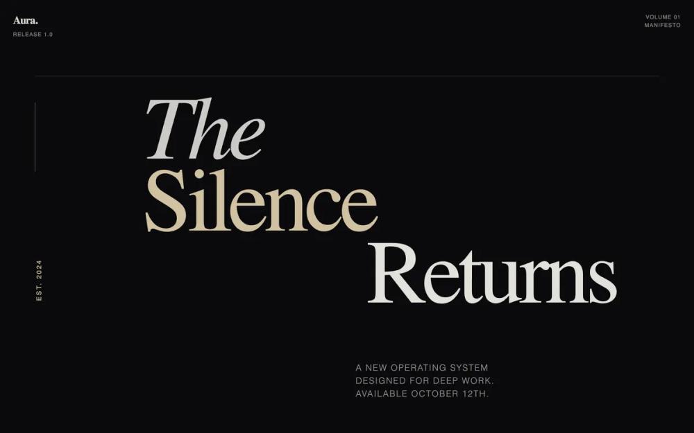 All Prompts
dark-navy-charcoalivory accentgold accenthigh contrasteditorialmanifesto toneproduct launchnarrative verticallaunchlanding page
Aura OS - Launch Manifesto
Дизайн-система Aura OS: типографика, асимметрия, темная палитра. Для престижных запусков, SaaS, портфолио. Подчеркивает нарратив и пространство.
by Shirley LouLive Preview
Prompt
# Aura OS - Launch Manifesto

{
  "summary": "A premium editorial-style launch page characterized by massive typographic headlines, a rhythmic vertical scroll, and a sophisticated contrast between deep charcoal and warm cream. The design prioritizes long-form storytelling over traditional UI patterns, using grain textures and asymmetric alignment to create an intentional, cinematic atmosphere.",
  "style": {
    "description": "The style is 'Modern Editorial Manifesto.' It relies on high-contrast typography pairing: Fraunces (a high-contrast serif) and Manrope (a clean, modern sans-serif). Colors are deep and organic: '#0a0a0c' (Canvas), '#e8e6e1' (Paper), and '#d4c5a2' (Accent gold/cream). The visual language uses grain overlays and mix-blend-mode for depth, with animations focused on subtle fades and vertical translations.",
    "prompt": "Create a design with an editorial aesthetic using a high-contrast palette: Background #0a0a0c, Text #e8e6e1, Accents #d4c5a2. Apply a subtle SVG noise/grain overlay (opacity 0.03) globally for a tactile feel. Typography: Headlines in 'Fraunces' (Variable Serif, weight 100-900, with optical sizing) and body text in 'Manrope' (Sans-serif, weight 300-600). Use massive font sizes (up to 15vw) for hero statements with tight leading (0.8). Selection color must be #d4c5a2 with dark text. Include subtle fade-in animations (cubic-bezier) for section entrances. Use 'mix-blend-difference' on navigation elements to ensure visibility across varying background intensities."
  },
  "layout_and_structure": {
    "description": "A vertical narrative layout consisting of 10 distinct thematic chapters. It utilizes generous padding (py-32), sticky headers, and mixed alignment (centered text vs. asymmetric grids) to guide the reader through a story.",
    "prompts": [
      {
        "part": "Sticky Navigation",
        "prompt": "A minimal fixed top bar. Left side: Brand mark in serif (20px, bold) with a sub-label (10px uppercase, tracking-widest). Right side: Meta-info (e.g., Volume/Issue) in tiny uppercase text. Use 'mix-blend-difference' to allow the nav to float over both light and dark backgrounds."
      },
      {
        "part": "Hero Cover Section",
        "prompt": "A full-screen typographic cover. A massive three-line headline (13vw-15vw) using 'Fraunces'. Line 1: Italic, Line 2: Light weight in #d4c5a2, Line 3: Right-aligned. Include a vertical label on the far left using 'writing-mode: vertical-rl' and a decorative 1px border-top above the content."
      },
      {
        "part": "Intro Paragraph",
        "prompt": "A max-width 4xl container. Large editorial text (32px-48px) in Serif. Use mixed styling within the paragraph: italicize specific concepts in #d4c5a2 and use heavy weights for emphasis. Maintain a leading of 1.3 for readability and impact."
      },
      {
        "part": "Two-Column Essay Section",
        "prompt": "A split layout with a sticky left column containing a title (Serif, 60px) and author meta-info. The right column (7-cols) contains long-form prose (prose-lg) with light font weights. Insert a large pull-quote using a left-border accent (#d4c5a2) and 40px italic serif text."
      },
      {
        "part": "Vertical Narrative List",
        "prompt": "A feature section with full-width rows. Each row has a top border (white/10 opacity) and a hover effect that changes the background to white/5. Layout: 3-column grid—Title (italic serif), Description (2xl light sans), and Meta-detail (tiny muted uppercase). Transitions should be 500ms ease."
      },
      {
        "part": "Manifesto Grid",
        "prompt": "A high-contrast section with background #e8e6e1 and text #0a0a0c. Layout: 3-column grid for principles. Each column features a massive serif number (01, 02, 03) at low opacity, an uppercase bold heading, and descriptive prose."
      },
      {
        "part": "Editorial Testimonials",
        "prompt": "Centered typographic quotes without avatars. Quote text: 5xl Serif, using a vertical gradient from white to white/60. Citation: Small uppercase tracking-widest text preceded by an em-dash."
      },
      {
        "part": "Call to Action Card",
        "prompt": "A centered box with a 1px border (white/10) and backdrop-blur. Content: Two-column header with meta-details (Version, Platform). Main button: Full-width, rectangular, background #ffffff, text #0a0a0c, transitioning to #d4c5a2 on hover. Text must be uppercase tracking-widest."
      },
      {
        "part": "Final Statement & Footer",
        "prompt": "Final Statement: A single, centered massive headline (9vw) in Serif. Footer: Border-top, flex layout. Left: Brand and copyright. Right: Horizontal links in uppercase tiny text with hover state color shifts."
      }
    ]
  },
  "special_ui_components": [
    {
      "component": "Grain Overlay",
      "description": "A global texture that breaks the digital flatness of the dark theme.",
      "prompt": "Implement a fixed div at z-index 50 with pointer-events: none. Use a data-URI SVG turbulence filter (baseFrequency 0.9, numOctaves 3) to create a noise texture. Set opacity to 0.03-0.05 to simulate paper stock."
    },
    {
      "component": "The Vertical Narrative Row",
      "description": "A sophisticated way to list features without using cards or icons.",
      "prompt": "Create a flex or grid row with a 1px top border. On hover, the text color of the 'Title' should transition from muted gray to #d4c5a2 while the background subtly lifts with a white/5 tint. All elements inside should align to the baseline."
    }
  ],
  "special_notes": "Must avoid: Standard box-shadows, rounded buttons, and icon libraries. Must use: Raw typography for hierarchy, thin borders (1px) for structure, and negative space to create a sense of premium quality. Keep all animations slow and deliberate (1s+) to match the 'thoughtful' brand tone."
}