All Prompts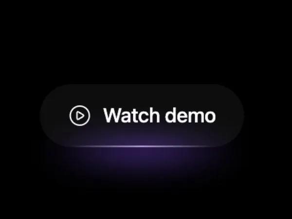 All Prompts
buttontailwindgradienthovericoninteractivecta
Play CTA Button with Gradient Hover Effects
Интерактивная кнопка CTA с иконкой 'play', градиентным эффектом и подсветкой при наведении. Идеально для запуска видео или промо.
Prompt
<div class="inline-block group relative" data-element-locator="html > body:nth-of-type(1) > main:nth-of-type(1) > section:nth-of-type(1) > div:nth-of-type(1) > div:nth-of-type(4) > div:nth-of-type(1)"> <button class="group inline-flex min-w-[140px] cursor-pointer transition-all duration-300 hover:-translate-y-1 hover:scale-105 border-gradient text-sm font-medium text-white/80 hover:text-white tracking-tight bg-white/5 backdrop-blur-xl rounded-full py-3 px-5 relative items-center justify-center gap-2"> <svg xmlns="http://www.w3.org/2000/svg" width="24" height="24" viewBox="0 0 24 24" fill="none" stroke="currentColor" stroke-width="2" stroke-linecap="round" stroke-linejoin="round" data-lucide="play-circle" class="lucide lucide-play-circle h-4 w-4" style="stroke-width: 1.5;"><path d="M9 9.003a1 1 0 0 1 1.517-.859l4.997 2.997a1 1 0 0 1 0 1.718l-4.997 2.997A1 1 0 0 1 9 14.996z" class=""></path><circle cx="12" cy="12" r="10" class=""></circle></svg> <span class="relative">Watch demo</span> <span aria-hidden="true" class="transition-all duration-300 group-hover:opacity-80 opacity-20 w-[70%] h-[1px] rounded-full absolute bottom-0 left-1/2 -translate-x-1/2" style="background:linear-gradient(90deg,rgba(255,255,255,0) 0%,rgba(255,255,255,1) 50%,rgba(255,255,255,0) 100%);"></span> </button> <span class="pointer-events-none absolute -bottom-3 left-1/2 z-0 h-6 w-44 -translate-x-1/2 rounded-full opacity-0 transition-opacity duration-300 ease-out group-hover:opacity-100" style="background: radial-gradient(60% 100% at 50% 50%, rgba(139,92,246,.55), rgba(139,92,246,.28) 35%, transparent 70%); filter: blur(10px) saturate(120%);" aria-hidden="true"></span> </div>