All Prompts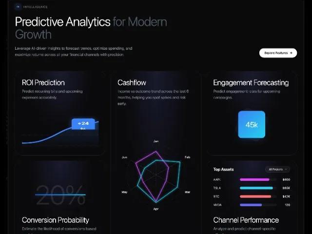 All Prompts
featuresectiondashboardanalyticstailwindanimatedinteractiveresponsive
Predictive Analytics Feature Grid Section
Секция с сеткой предиктивной аналитики: анимированные KPI, автообновление счетчиков. Идеально для дашбордов и маркетинговых страниц. Tailwind CSS.
Prompt
<div class="flex flex-col bg-[#0A0A0C] border-[#ffffff]/10 border rounded-3xl mt-24 mb-24 pt-8 pr-8 pb-16 pl-8 gap-x-16 gap-y-16">
<!-- Header Section -->
<div class="flex flex-col md:flex-row md:items-end justify-between gap-8 w-full">
<div class="flex flex-col gap-6 max-w-3xl">
<div class="flex gap-3 gap-x-3 gap-y-3 items-center scroll-item scroll-fade-up" style="animation-play-state: running;">
<span class="flex items-center justify-center w-7 h-7 rounded-lg bg-blue-500/10 text-[11px] font-mono font-medium text-blue-400 border border-blue-500/20 shadow-[0_0_10px_rgba(59,130,246,0.2)] font-sans" style="">
01
</span>
<span class="text-sm font-medium tracking-widest uppercase text-gray-500 font-sans" style="">
Intelligence
</span>
</div>
<h2 class="text-4xl md:text-5xl lg:text-6xl text-white leading-[1.1] font-oswald font-light tracking-tight scroll-item scroll-fade-up delay-100" style="animation-play-state: running;">
Predictive Analytics
<span class="text-gray-600 font-oswald font-light tracking-tight" style="">
for Modern Growth
</span>
</h2>
<p class="leading-relaxed text-lg font-light text-gray-400 max-w-xl scroll-item scroll-fade-up delay-200" style="animation-play-state: running;">
Leverage AI-driven insights to forecast trends, optimize
spending, and maximize returns across all your financial
channels with precision.
</p>
</div>
<button class="group flex items-center gap-2 pl-6 pr-5 py-3 bg-white text-black rounded-full text-sm font-medium hover:bg-gray-200 transition-all duration-200 font-sans whitespace-nowrap scroll-item scroll-fade-up delay-300" style="animation-play-state: running;">
<span class="font-sans" style="">Explore Features</span>
<svg xmlns="http://www.w3.org/2000/svg" width="16" height="16" viewBox="0 0 24 24" fill="none" stroke="currentColor" stroke-width="2" stroke-linecap="round" stroke-linejoin="round" class="lucide lucide-arrow-right w-4 h-4 transition-transform group-hover:translate-x-1">
<path d="M5 12h14" class=""></path>
<path d="m12 5 7 7-7 7" class=""></path>
</svg>
</button>
</div>
<!-- Features Grid -->
<div class="grid grid-cols-1 md:grid-cols-2 lg:grid-cols-3 lg:auto-rows-[400px] gap-6 gap-x-6 gap-y-6" id="dashboard-grid">
<style>
/* Looping Animations Definitions */
@keyframes draw-path-loop {
0% { stroke-dashoffset: 1000; opacity: 0; }
5% { opacity: 1; }
40% { stroke-dashoffset: 0; }
90% { stroke-dashoffset: 0; opacity: 1; }
100% { stroke-dashoffset: 0; opacity: 0; }
}
@keyframes width-grow-loop {
0% { width: 0; opacity: 1; }
40% { width: var(--target-width); }
90% { width: var(--target-width); opacity: 1; }
100% { width: var(--target-width); opacity: 0; }
}
@keyframes fade-in-up-loop {
0% { opacity: 0; transform: translateY(10px); }
20% { opacity: 1; transform: translateY(0); }
90% { opacity: 1; transform: translateY(0); }
100% { opacity: 0; transform: translateY(0); }
}
@keyframes scale-in-loop {
0% { transform: scale(0.8); opacity: 0; }
20% { transform: scale(1); opacity: 1; }
90% { transform: scale(1); opacity: 1; }
100% { transform: scale(1); opacity: 0; }
}
@keyframes spin-slow {
from { transform: rotate(0deg); }
to { transform: rotate(360deg); }
}
@keyframes spin-slow-reverse {
from { transform: rotate(0deg); }
to { transform: rotate(-360deg); }
}
/* Animation Classes */
.animate-draw {
stroke-dasharray: 1000;
stroke-dashoffset: 1000;
animation: draw-path-loop 6s cubic-bezier(0.4, 0, 0.2, 1) infinite;
animation-play-state: paused;
}
.animate-width {
width: 0;
animation: width-grow-loop 6s cubic-bezier(0.4, 0, 0.2, 1) infinite;
animation-play-state: paused;
}
.animate-fade-up {
opacity: 0;
animation: fade-in-up-loop 6s ease-out infinite;
animation-play-state: paused;
}
.animate-scale {
opacity: 0;
animation: scale-in-loop 6s cubic-bezier(0.175, 0.885, 0.32, 1.275) infinite;
animation-play-state: paused;
}
/* Utility to start animations */
.in-view .animate-draw,
.in-view .animate-width,
.in-view .animate-fade-up,
.in-view .animate-scale {
animation-play-state: running;
}
</style>
<!-- ROI Prediction -->
<div class="relative h-[400px] rounded-[2rem] bg-[#0A0A0C] border border-white/10 p-8 overflow-hidden flex flex-col justify-between group hover:border-white/[0.15] transition-colors scroll-item scroll-fade-up delay-100" style="animation-play-state: running;">
<!-- Background -->
<div class="pointer-events-none absolute inset-0 bg-[radial-gradient(ellipse_at_top,_var(--tw-gradient-stops))] from-[#1a1a2e] via-[#0A0A0C] to-[#0A0A0C]"></div>
<div class="pointer-events-none absolute inset-0 opacity-20" style="background-image: radial-gradient(white 1px, transparent 1px); background-size: 40px 40px;"></div>
<!-- Header -->
<div class="relative z-10">
<h3 class="text-4xl font-light text-white tracking-tight font-oswald">
ROI Prediction
</h3>
<p class="mt-2 text-lg font-light leading-relaxed text-gray-400">
Predict recurring bills and upcoming expenses accurately.
</p>
</div>
<!-- Visual -->
<div class="relative z-10 h-32 w-full">
<svg class="w-full h-full overflow-visible" viewBox="0 0 100 50" preserveAspectRatio="none">
<path d="M0 45 L100 45" stroke="rgba(255,255,255,0.06)" stroke-width="1" stroke-dasharray="4 4" class=""></path>
<path d="M0 25 L100 25" stroke="rgba(255,255,255,0.06)" stroke-width="1" stroke-dasharray="4 4" class=""></path>
<defs class="">
<linearGradient id="gradient-area" x1="0%" y1="0%" x2="0%" y2="100%" class="">
<stop offset="0%" style="stop-color:#3b82f6;stop-opacity:0.2" class=""></stop>
<stop offset="100%" style="stop-color:#3b82f6;stop-opacity:0" class=""></stop>
</linearGradient>
</defs>
<path d="M0 40 C 20 40, 30 35, 50 20 C 70 5, 80 10, 100 0 V 50 H 0 Z" fill="url(#gradient-area)" class="animate-fade-up" style="animation-delay: 0.1s"></path>
<path d="M0 40 C 20 40, 30 35, 50 20 C 70 5, 80 10, 100 0" fill="none" stroke="#3b82f6" stroke-width="2" class="animate-draw"></path>
<foreignObject x="60" y="-10" width="40" height="25" class="animate-scale" style="animation-delay: 0.8s">
<div xmlns="http://www.w3.org/1999/xhtml" class="px-2 py-1 rounded bg-blue-500 text-white text-[10px] text-center shadow-[0_0_10px_rgba(59,130,246,0.5)] transform scale-75 origin-center font-sans font-semibold">
<span data-counter-target="24" data-counter-prefix="+" class="">+0</span>
%
</div>
</foreignObject>
</svg>
</div>
</div>
<!-- CASHFLOW (MIDDLE) — LONG CARD -->
<div class="relative rounded-[2rem] bg-[#0A0A0C] border border-white/10 p-8 overflow-hidden flex flex-col h-[400px] md:h-[400px] lg:h-[824px] lg:row-span-2 group hover:border-white/[0.15] transition-colors scroll-item scroll-fade-up delay-200" style="animation-play-state: running;">
<!-- Background -->
<div class="pointer-events-none absolute inset-0 bg-[radial-gradient(ellipse_at_top,_var(--tw-gradient-stops))] from-[#1a1a2e] via-[#0A0A0C] to-[#0A0A0C]"></div>
<div class="pointer-events-none absolute inset-0 opacity-20" style="background-image: radial-gradient(white 1px, transparent 1px); background-size: 40px 40px; mask-image: radial-gradient(circle, black 40%, transparent 100%); -webkit-mask-image: radial-gradient(circle, black 40%, transparent 100%);"></div>
<!-- Header -->
<div class="relative z-10">
<h3 class="text-4xl font-light text-white tracking-tight font-oswald">
Cashflow
</h3>
<p class="mt-2 text-lg font-light leading-relaxed text-gray-400 max-w-[26rem]">
Income vs outcome trend across the last 6 months, helping you
spot spikes and risk early.
</p>
</div>
<!-- Radar (centered, takes the remaining height) -->
<div class="relative z-10 flex-1 flex items-center justify-center pt-6">
<svg viewBox="0 0 300 300" class="w-[320px] h-[320px] md:w-[360px] md:h-[360px] lg:w-[380px] lg:h-[380px] overflow-visible" preserveAspectRatio="xMidYMid meet">
<defs class="">
<filter id="glow-purple" x="-50%" y="-50%" width="200%" height="200%" class="">
<feGaussianBlur stdDeviation="3" result="coloredBlur" class=""></feGaussianBlur>
<feMerge class="">
<feMergeNode in="coloredBlur" class=""></feMergeNode>
<feMergeNode in="SourceGraphic" class=""></feMergeNode>
</feMerge>
</filter>
<filter id="glow-cyan" x="-50%" y="-50%" width="200%" height="200%" class="">
<feGaussianBlur stdDeviation="3" result="coloredBlur" class=""></feGaussianBlur>
<feMerge class="">
<feMergeNode in="coloredBlur" class=""></feMergeNode>
<feMergeNode in="SourceGraphic" class=""></feMergeNode>
</feMerge>
</filter>
<linearGradient id="grad-purple" x1="0%" y1="0%" x2="100%" y2="100%" class="">
<stop offset="0%" stop-color="#d946ef" class=""></stop>
<stop offset="100%" stop-color="#a855f7" class=""></stop>
</linearGradient>
<linearGradient id="grad-cyan" x1="0%" y1="0%" x2="100%" y2="100%" class="">
<stop offset="0%" stop-color="#22d3ee" class=""></stop>
<stop offset="100%" stop-color="#06b6d4" class=""></stop>
</linearGradient>
</defs>
<g fill="none" stroke="#ffffff" stroke-opacity="0.10" stroke-width="1" stroke-dasharray="3 3" class="">
<circle cx="150" cy="150" r="22" class="animate-scale" style="animation-delay: 0.1s"></circle>
<circle cx="150" cy="150" r="44" class="animate-scale" style="animation-delay: 0.2s"></circle>
<circle cx="150" cy="150" r="66" class="animate-scale" style="animation-delay: 0.3s"></circle>
<circle cx="150" cy="150" r="88" class="animate-scale" style="animation-delay: 0.4s"></circle>
<circle cx="150" cy="150" r="110" class="animate-scale" style="animation-delay: 0.5s"></circle>
</g>
<g stroke="#ffffff" stroke-opacity="0.15" stroke-width="1" class="animate-fade-up" style="animation-delay: 0.3s">
<line x1="150" y1="150" x2="150" y2="40" class=""></line>
<line x1="150" y1="150" x2="245" y2="95" class=""></line>
<line x1="150" y1="150" x2="245" y2="205" class=""></line>
<line x1="150" y1="150" x2="150" y2="260" class=""></line>
<line x1="150" y1="150" x2="55" y2="205" class=""></line>
<line x1="150" y1="150" x2="55" y2="95" class=""></line>
</g>
<g class="fill-white font-sans text-[11px] font-medium animate-fade-up" text-anchor="middle" dominant-baseline="middle" style="animation-delay: 0.4s">
<text x="150" y="25" class="">Jan</text>
<text x="268" y="85" class="">Feb</text>
<text x="268" y="215" class="">Mar</text>
<text x="150" y="278" class="">Apr</text>
<text x="32" y="215" class="">May</text>
<text x="32" y="85" class="">Jun</text>
</g>
<path d="M150 62 L197 122 L188 172 L150 249 L102 177 L74 106 Z" fill="none" stroke="url(#grad-purple)" stroke-width="2" filter="url(#glow-purple)" stroke-linejoin="round" stroke-linecap="round" class="animate-draw" style="animation-delay: 0.3s"></path>
<path d="M150 95 L240 102 L230 196 L150 254 L80 190 L107 125 Z" fill="none" stroke="url(#grad-cyan)" stroke-width="2" filter="url(#glow-cyan)" stroke-linejoin="round" stroke-linecap="round" class="animate-draw" style="animation-delay: 0.6s"></path>
</svg>
</div>
</div>
<!-- Engagement Forecasting -->
<div class="relative h-[400px] rounded-[2rem] bg-[#0A0A0C] border border-white/10 p-8 overflow-hidden flex flex-col group hover:border-white/[0.15] transition-colors scroll-item scroll-fade-up delay-300" style="animation-play-state: running;">
<!-- Background -->
<div class="pointer-events-none absolute inset-0 bg-[radial-gradient(ellipse_at_top,_var(--tw-gradient-stops))] from-[#1a1a2e] via-[#0A0A0C] to-[#0A0A0C]"></div>
<div class="pointer-events-none absolute inset-0 opacity-20" style="background-image: radial-gradient(white 1px, transparent 1px); background-size: 40px 40px; mask-image: radial-gradient(circle, black 40%, transparent 100%); -webkit-mask-image: radial-gradient(circle, black 40%, transparent 100%);"></div>
<div class="relative z-10">
<h3 class="text-4xl font-light text-white tracking-tight font-oswald">
Engagement Forecasting
</h3>
<p class="mt-2 text-lg font-light leading-relaxed text-gray-400">
Predict engagement rates for upcoming campaigns.
</p>
</div>
<div class="relative z-10 flex-1 flex items-center justify-center">
<!-- Rotating Elements -->
<div class="absolute w-32 h-32 rounded-3xl bg-white/[0.03] border border-white/[0.05] animate-[spin-slow_20s_linear_infinite]" style="animation-duration: 25s"></div>
<div class="absolute w-24 h-24 rounded-2xl bg-white/[0.05] border border-white/[0.05] animate-[spin-slow-reverse_15s_linear_infinite]" style="animation-duration: 15s"></div>
<!-- Central Card -->
<div class="w-32 h-32 rounded-2xl bg-gradient-to-br from-blue-500 to-cyan-400 flex items-center justify-center shadow-[0_12px_30px_-10px_rgba(59,130,246,0.4)] animate-scale relative z-10">
<span class="text-4xl text-white font-oswald font-light tracking-tight flex items-baseline">
<span data-counter-target="45" data-counter-suffix="k">0k</span>
</span>
</div>
</div>
</div>
<!-- Conversion Probability -->
<div class="relative h-[400px] rounded-[2rem] bg-[#0A0A0C] border border-white/10 p-8 overflow-hidden flex flex-col justify-end group hover:border-white/[0.15] transition-colors scroll-item scroll-fade-up delay-500" style="animation-play-state: running;">
<!-- Background -->
<div class="pointer-events-none absolute inset-0 bg-[radial-gradient(ellipse_at_top,_var(--tw-gradient-stops))] from-[#1a1a2e] via-[#0A0A0C] to-[#0A0A0C]"></div>
<div class="pointer-events-none absolute inset-0 opacity-20" style="background-image: radial-gradient(white 1px, transparent 1px); background-size: 40px 40px; mask-image: radial-gradient(circle, black 40%, transparent 100%); -webkit-mask-image: radial-gradient(circle, black 40%, transparent 100%);"></div>
<div class="absolute inset-0 flex items-center justify-center -translate-y-10 z-10">
<div class="relative animate-fade-up">
<span class="text-[8rem] text-white/10 select-none font-oswald font-light tracking-tight flex">
<span data-counter-target="20" data-counter-suffix="%">0%</span>
</span>
<div class="absolute top-1/2 left-0 h-[4px] bg-gradient-to-r from-blue-600 to-cyan-400 shadow-[0_0_18px_rgba(59,130,246,0.6)] animate-width" style="--target-width: 100%;"></div>
</div>
</div>
<div class="relative z-10">
<h3 class="text-4xl font-light text-white tracking-tight font-oswald">
Conversion Probability
</h3>
<p class="mt-2 text-lg font-light leading-relaxed text-gray-400">
Estimate the likelihood of conversions based on data.
</p>
</div>
</div>
<!-- Channel Performance -->
<div class="relative h-[400px] rounded-[2rem] bg-[#0A0A0C] border border-white/10 p-8 overflow-hidden flex flex-col justify-end group hover:border-white/[0.15] transition-colors">
<!-- Background -->
<div class="pointer-events-none absolute inset-0 bg-[radial-gradient(ellipse_at_top,_var(--tw-gradient-stops))] from-[#1a1a2e] via-[#0A0A0C] to-[#0A0A0C]"></div>
<div class="pointer-events-none absolute inset-0 opacity-20" style="background-image: radial-gradient(white 1px, transparent 1px); background-size: 40px 40px; mask-image: radial-gradient(circle, black 40%, transparent 100%); -webkit-mask-image: radial-gradient(circle, black 40%, transparent 100%);"></div>
<div class="relative z-10 mb-10 flex flex-col gap-6">
<div class="flex items-center justify-between">
<h4 class="text-xl font-semibold text-white tracking-tight font-sans">
Top Assets
</h4>
<button class="flex items-center gap-2 rounded-full border border-white/10 bg-white/5 pl-4 pr-3 py-1.5 text-xs font-medium text-gray-300 transition-colors hover:bg-white/10 hover:text-white font-sans">
All Projects
<svg xmlns="http://www.w3.org/2000/svg" width="14" height="14" viewBox="0 0 24 24" fill="none" stroke="currentColor" stroke-width="2" stroke-linecap="round" stroke-linejoin="round" class="opacity-70">
<path d="m6 9 6 6 6-6" class=""></path>
</svg>
</button>
</div>
<div class="flex flex-col gap-5">
<div class="flex items-center gap-4">
<span class="w-[110px] shrink-0 text-sm text-gray-300 font-medium truncate font-sans">
AAPL
</span>
<div class="h-3 flex-1 rounded-full bg-white/5 overflow-hidden">
<div class="h-full rounded-full bg-[#d946ef] animate-width" style="--target-width: 80%; animation-delay: 0.1s"></div>
</div>
<span class="w-12 shrink-0 text-right text-sm text-white font-medium font-sans animate-fade-up" style="animation-delay: 0.1s">
$800
</span>
</div>
<div class="flex items-center gap-4">
<span class="w-[110px] shrink-0 text-sm text-gray-300 font-medium truncate font-sans">
TSLA
</span>
<div class="h-3 flex-1 rounded-full bg-white/5 overflow-hidden">
<div class="h-full rounded-full bg-[#22d3ee] animate-width" style="--target-width: 90%; animation-delay: 0.2s"></div>
</div>
<span class="w-12 shrink-0 text-right text-sm text-white font-medium font-sans animate-fade-up" style="animation-delay: 0.2s">
$85K
</span>
</div>
<div class="flex items-center gap-4">
<span class="w-[110px] shrink-0 text-sm text-gray-300 font-medium truncate font-sans">
BTC
</span>
<div class="h-3 flex-1 rounded-full bg-white/5 overflow-hidden">
<div class="h-full rounded-full bg-[#f87171] animate-width" style="--target-width: 85%; animation-delay: 0.3s"></div>
</div>
<span class="w-12 shrink-0 text-right text-sm text-white font-medium font-sans animate-fade-up" style="animation-delay: 0.3s">
$42K
</span>
</div>
<div class="flex items-center gap-4">
<span class="w-[110px] shrink-0 text-sm text-gray-300 font-medium truncate font-sans">
NVDA
</span>
<div class="h-3 flex-1 rounded-full bg-white/5 overflow-hidden">
<div class="h-full rounded-full bg-[#6366f1] animate-width" style="--target-width: 60%; animation-delay: 0.4s"></div>
</div>
<span class="w-12 shrink-0 text-right text-sm text-white font-medium font-sans animate-fade-up" style="animation-delay: 0.4s">
120
</span>
</div>
</div>
</div>
<div class="relative z-10">
<h3 class="text-4xl font-light text-white tracking-tight font-oswald">
Channel Performance
</h3>
<p class="mt-2 text-lg font-light leading-relaxed text-gray-400">
Analyze and predict channel-specific effectiveness.
</p>
</div>
</div>
<script>
document.addEventListener("DOMContentLoaded", () => {
const container = document.getElementById('dashboard-grid');
const counters = document.querySelectorAll('[data-counter-target]');
const LOOP_DURATION = 6000; // Matches CSS animation duration
let counterInterval;
const runCounterAnimation = () => {
counters.forEach(counter => {
const target = +counter.getAttribute('data-counter-target');
const prefix = counter.getAttribute('data-counter-prefix') || '';
const suffix = counter.getAttribute('data-counter-suffix') || '';
let count = 0;
const duration = 1500; // Counter duration
const increment = target / (duration / 20);
counter.innerText = prefix + '0' + suffix;
const timer = setInterval(() => {
count += increment;
if (count >= target) {
count = target;
clearInterval(timer);
}
counter.innerText = prefix + Math.ceil(count) + suffix;
}, 20);
});
};
const observer = new IntersectionObserver((entries) => {
entries.forEach(entry => {
if (entry.isIntersecting) {
container.classList.add('in-view');
// Run initially
runCounterAnimation();
// Start Loop
if (!counterInterval) {
counterInterval = setInterval(() => {
if (container.classList.contains('in-view')) {
runCounterAnimation();
}
}, LOOP_DURATION);
}
} else {
container.classList.remove('in-view');
// We can optionally clear interval here if we want to stop background processing
}
});
}, { threshold: 0.2 });
observer.observe(container);
});
</script>
</div>
</div>