All Prompts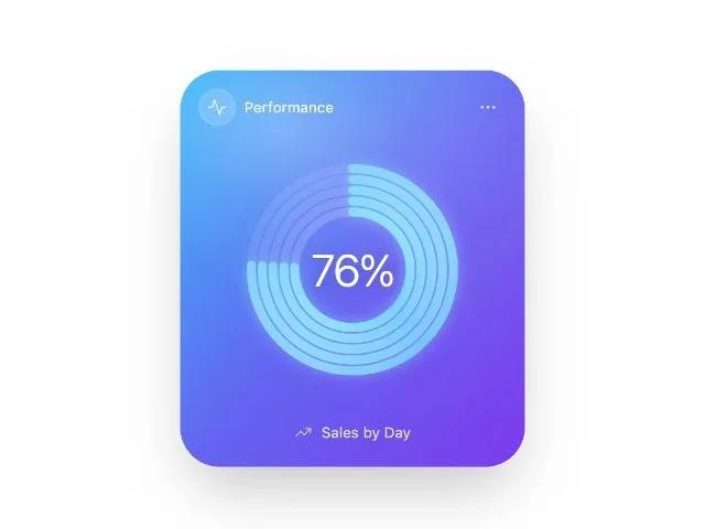 All Prompts
cardprogressradialanimatedgradientdashboardmetricssvgglassmorphism
Radial Progress Card
Карточка с анимированным радиальным прогрессом и градиентом. Идеально для отображения метрик, данных продаж, процентов выполнения.
Prompt
<div class="w-full max-w-[260px] sm:max-w-[280px]">
  <div class="relative overflow-hidden rounded-[32px] shadow-2xl ring-1 ring-white/20 bg-gradient-to-br from-sky-400 via-indigo-500 to-violet-600">
    <div class="pointer-events-none absolute inset-0 opacity-60" style="background: radial-gradient(120% 70% at 30% 15%, rgba(255,255,255,0.45) 0%, rgba(255,255,255,0.12) 28%, rgba(255,255,255,0.0) 55%);"></div>
    <div class="pointer-events-none absolute -inset-24 blur-3xl opacity-30" style="background: radial-gradient(50% 50% at 70% 30%, rgba(255,255,255,0.55) 0%, rgba(255,255,255,0.0) 60%);"></div>
    <div class="flex items-center justify-between px-4 pt-4">
      <div class="flex items-center gap-2">
        <div class="h-7 w-7 rounded-full bg-white/15 backdrop-blur-sm flex items-center justify-center ring-1 ring-white/30">
          <svg xmlns="http://www.w3.org/2000/svg" class="h-4 w-4 text-white/90" viewBox="0 0 24 24" fill="none" stroke="currentColor" stroke-width="1.5" stroke-linecap="round" stroke-linejoin="round">
            <polyline points="22 12 18 12 15 21 9 3 6 12 2 12"></polyline>
          </svg>
        </div>
        <p class="text-white/90 text-xs font-sans">Performance</p>
      </div>
      <button class="p-1.5 rounded-lg hover:bg-white/10 active:bg-white/15 text-white/80 transition">
        <svg xmlns="http://www.w3.org/2000/svg" class="h-4 w-4" viewBox="0 0 24 24" fill="none" stroke="currentColor" stroke-width="1.5" stroke-linecap="round" stroke-linejoin="round">
          <circle cx="12" cy="12" r="1"></circle>
          <circle cx="19" cy="12" r="1"></circle>
          <circle cx="5" cy="12" r="1"></circle>
        </svg>
      </button>
    </div>
    <div class="px-4 pt-2 pb-5">
      <div class="relative mx-auto flex items-center justify-center">
        <svg class="w-[200px] h-[200px] sm:w-[220px] sm:h-[220px]" viewBox="0 0 300 300" aria-label="Sales progress at 76 percent">
          <defs>
            <lineargradient id="ringGradient" x1="0%" y1="0%" x2="100%" y2="100%">
              <stop offset="0%" stop-color="#9AE6FF"></stop>
              <stop offset="50%" stop-color="#73D0FF"></stop>
              <stop offset="100%" stop-color="#9AE6FF"></stop>
            </lineargradient>
          </defs>
          <g transform="rotate(-90 150 150)" stroke-linecap="round" fill="none">
            <circle cx="150" cy="150" r="64" stroke="white" opacity="0.18" stroke-width="10"></circle>
            <circle cx="150" cy="150" r="76" stroke="white" opacity="0.16" stroke-width="10"></circle>
            <circle cx="150" cy="150" r="88" stroke="white" opacity="0.14" stroke-width="10"></circle>
            <circle cx="150" cy="150" r="100" stroke="white" opacity="0.12" stroke-width="10"></circle>
            <circle cx="150" cy="150" r="112" stroke="white" opacity="0.10" stroke-width="10"></circle>
            <circle data-ring="" data-radius="64" cx="150" cy="150" r="64" stroke="url(#ringGradient)" stroke-width="10" style="filter: drop-shadow(rgba(155, 230, 255, 0.55) 0px 0px 8px); transition: stroke-dasharray 1200ms cubic-bezier(0.22, 1, 0.36, 1), stroke-dashoffset 1200ms cubic-bezier(0.22, 1, 0.36, 1); stroke-dasharray: 0 402.124; stroke-dashoffset: 0;"></circle>
            <circle data-ring="" data-radius="76" cx="150" cy="150" r="76" stroke="url(#ringGradient)" stroke-width="10" style="filter: drop-shadow(rgba(155, 230, 255, 0.55) 0px 0px 8px); transition: stroke-dasharray 1200ms cubic-bezier(0.22, 1, 0.36, 1), stroke-dashoffset 1200ms cubic-bezier(0.22, 1, 0.36, 1); stroke-dasharray: 0 477.522; stroke-dashoffset: 0;" opacity="0.95"></circle>
            <circle data-ring="" data-radius="88" cx="150" cy="150" r="88" stroke="url(#ringGradient)" stroke-width="10" style="filter: drop-shadow(rgba(155, 230, 255, 0.55) 0px 0px 8px); transition: stroke-dasharray 1200ms cubic-bezier(0.22, 1, 0.36, 1), stroke-dashoffset 1200ms cubic-bezier(0.22, 1, 0.36, 1); stroke-dasharray: 0 552.92; stroke-dashoffset: 0;" opacity="0.92"></circle>
            <circle data-ring="" data-radius="100" cx="150" cy="150" r="100" stroke="url(#ringGradient)" stroke-width="10" style="filter: drop-shadow(rgba(155, 230, 255, 0.55) 0px 0px 8px); transition: stroke-dasharray 1200ms cubic-bezier(0.22, 1, 0.36, 1), stroke-dashoffset 1200ms cubic-bezier(0.22, 1, 0.36, 1); stroke-dasharray: 0 628.319; stroke-dashoffset: 0;" opacity="0.9"></circle>
            <circle data-ring="" data-radius="112" cx="150" cy="150" r="112" stroke="url(#ringGradient)" stroke-width="10" style="filter: drop-shadow(rgba(155, 230, 255, 0.55) 0px 0px 8px); transition: stroke-dasharray 1200ms cubic-bezier(0.22, 1, 0.36, 1), stroke-dashoffset 1200ms cubic-bezier(0.22, 1, 0.36, 1); stroke-dasharray: 0 703.717; stroke-dashoffset: 0;" opacity="0.88"></circle>
          </g>
        </svg>
        <div class="absolute inset-0 flex items-center justify-center">
          <div class="text-white text-3xl sm:text-4xl tracking-tight drop-shadow-[0_2px_8px_rgba(0,0,0,0.15)] font-light">
            <span id="percentValue">76</span>%
          </div>
        </div>
      </div>
      <div class="mt-3.5 flex items-center justify-center gap-2">
        <svg xmlns="http://www.w3.org/2000/svg" class="h-3.5 w-3.5 text-white/80" viewBox="0 0 24 24" fill="none" stroke="currentColor" stroke-width="1.5" stroke-linecap="round" stroke-linejoin="round">
          <polyline points="22 7 13.5 15.5 8.5 10.5 2 17"></polyline>
          <polyline points="16 7 22 7 22 13"></polyline>
        </svg>
        <p class="text-white/80 text-xs font-sans">Sales by Day</p>
      </div>
    </div>
  </div>
<script>
  const progress = 76; const rings = document.querySelectorAll('[data-ring]'); rings.forEach((ring, idx) => { const r = parseFloat(ring.getAttribute('data-radius')); const circumference = 2 * Math.PI * r; const pct = progress / 100; const dash = Math.max(0, circumference * pct - 2); ring.style.transition = 'stroke-dasharray 1200ms cubic-bezier(0.22, 1, 0.36, 1), stroke-dashoffset 1200ms cubic-bezier(0.22, 1, 0.36, 1)'; ring.style.strokeDasharray = `0 ${circumference}`; ring.style.strokeDashoffset = '0'; setTimeout(() => { ring.style.strokeDasharray = `${dash} ${circumference}`; ring.style.strokeDashoffset = '0'; }, 120 + idx * 80); }); document.getElementById('percentValue').textContent = progress;
</script>
</div>