All Prompts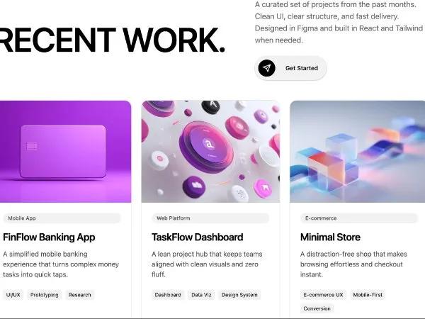 All Prompts
portfoliogridcardctaanimatedresponsivetailwindsection
Recent Work Portfolio Grid with Animated Cards & CTA
Адаптивная сетка портфолио с анимированными карточками и CTA. Отлично подходит для демонстрации работ на личном или агентском сайте.
Prompt
<section class="ssm:py-24 pt-16 pb-16 max-w-5xl">
  <div class="text-center mb-12 fade-in-up animate">
    <!-- Top meta row -->
    <div class="mb-6">
      <div
        class="flex text-[13px] sm:text-sm uppercase font-medium text-black tracking-tight items-center justify-between">
        <span class="">WORK</span>
        <span class="">(02)</span>
      </div>
      <div class="mt-2 h-px w-full bg-black"></div>
    </div>

    <!-- Header layout -->
    <div class="grid grid-cols-1 lg:grid-cols-12 gap-8 text-left items-center">
      <!-- Left: Giant word -->
      <div class="lg:col-span-7 fade-in-left animate">
        <h3
          class="text-[32px] sm:text-[48px] lg:text-[64px] xl:text-[80px] leading-[0.9] uppercase font-semibold tracking-tight">
          Recent work.</h3>
      </div>

      <!-- Right: Description + CTA -->
      <div class="lg:col-span-5 fade-in-right animate">
        <p class="sm:text-lg text-black/60 max-w-3xl mt-0 mr-auto mb-6 ml-0">A curated set of projects from the past
          months. Clean UI, clear structure, and fast delivery. Designed in Figma and built in React and Tailwind when
          needed.</p>
        <div class="flex justify-start">
          <a href="#"
            class="inline-flex items-center gap-3 ring-1 ring-black/10 hover:shadow-2xl transition bg-black/5 rounded-full pt-2 pr-2 pb-2 pl-2 shadow">
            <span class="inline-flex items-center justify-center w-10 h-10 rounded-full bg-black">
            <svg xmlns="http://www.w3.org/2000/svg" class="w-5 h-5 text-white" viewBox="0 0 24 24" fill="none" stroke="currentColor" stroke-width="2">
 <path d="m22 2-7 20-4-9-9-4Z" class=""></path>
              <path d="M22 2 11 13" class=""></path>
            </svg>
          </span>
            <span class="px-3 text-sm font-medium">Get Started</span>
          </a>
        </div>
      </div>
    </div>
  </div>

  <div class="grid grid-cols-1 md:grid-cols-2 lg:grid-cols-3 gap-6 items-stretch">
    <!-- Card 1 -->
    <article
      class="flex flex-col h-full rounded-2xl overflow-hidden ring-1 ring-black/10 bg-white fade-in-up stagger-delay-1 animate">
      <div class="w-full bg-gray-50">
        <img src="https://hoirqrkdgbmvpwutwuwj-all.supabase.co/storage/v1/object/public/assets/assets/657ec554-6482-450d-9b61-f6de483507ed_800w.jpg" alt="FinFlow Banking App" class="w-full h-[220px] sm:h-[240px] object-cover" style="">
      </div>
      <div class="p-6 flex flex-col h-full">
        <span class="inline-block px-3 py-1 text-xs font-medium rounded-full mb-4 bg-black/5 text-black/70">Mobile App</span>
        <h4 class="text-xl sm:text-2xl font-semibold tracking-tight mb-3">FinFlow Banking App</h4>
        <p class="text-black/70 mb-6">A simplified mobile banking experience that turns complex money tasks into quick
          taps.</p>
        <div class="flex flex-wrap gap-2 mb-6">
          <span class="px-2 py-1 text-xs rounded bg-black/5">UI/UX</span>
          <span class="px-2 py-1 text-xs rounded bg-black/5">Prototyping</span>
          <span class="px-2 py-1 text-xs rounded bg-black/5">Research</span>
        </div>
        <a href="#" class="mt-auto inline-flex items-center gap-2 text-sm font-medium">
          View Case Study
          <svg xmlns="http://www.w3.org/2000/svg" class="h-4 w-4" viewBox="0 0 24 24" fill="none" stroke="currentColor"
            stroke-width="1.5" stroke-linecap="round" stroke-linejoin="round">
            <path d="m9 18 6-6-6-6" class=""></path>
          </svg>
        </a>
      </div>
    </article>

    <!-- Card 2 -->
    <article
      class="flex flex-col h-full rounded-2xl overflow-hidden ring-1 ring-black/10 bg-white fade-in-up stagger-delay-2 animate">
      <div class="w-full bg-gray-50">
        <img src="https://hoirqrkdgbmvpwutwuwj-all.supabase.co/storage/v1/object/public/assets/assets/09b4790c-3486-407c-9054-2703be04e545_800w.jpg" alt="TaskFlow Dashboard" class="w-full h-[220px] sm:h-[240px] object-cover" style="">
      </div>
      <div class="p-6 flex flex-col h-full">
        <span class="inline-block px-3 py-1 text-xs font-medium rounded-full mb-4 bg-black/5 text-black/70">Web Platform</span>
        <h4 class="text-xl sm:text-2xl font-semibold tracking-tight mb-3">TaskFlow Dashboard</h4>
        <p class="text-black/70 mb-6">A lean project hub that keeps teams aligned with clean visuals and zero fluff.</p>
        <div class="flex flex-wrap gap-2 mb-6">
          <span class="px-2 py-1 text-xs rounded bg-black/5">Dashboard</span>
          <span class="px-2 py-1 text-xs rounded bg-black/5">Data Viz</span>
          <span class="px-2 py-1 text-xs rounded bg-black/5">Design System</span>
        </div>
        <a href="#" class="mt-auto inline-flex items-center gap-2 text-sm font-medium">
          View Case Study
          <svg xmlns="http://www.w3.org/2000/svg" class="h-4 w-4" viewBox="0 0 24 24" fill="none" stroke="currentColor"
            stroke-width="1.5" stroke-linecap="round" stroke-linejoin="round">
            <path d="m9 18 6-6-6-6" class=""></path>
          </svg>
        </a>
      </div>
    </article>

    <!-- Card 3 -->
    <article
      class="flex flex-col h-full rounded-2xl overflow-hidden ring-1 ring-black/10 bg-white fade-in-up stagger-delay-3 animate">
      <div class="w-full bg-gray-50">
        <img src="https://hoirqrkdgbmvpwutwuwj.supabase.co/storage/v1/object/public/assets/assets/440f14df-a3b7-4f76-acb9-306f07971d75_800w.jpg" alt="Minimal Store" class="w-full h-[220px] sm:h-[240px] object-cover">
      </div>
      <div class="p-6 flex flex-col h-full">
        <span class="inline-block px-3 py-1 text-xs font-medium rounded-full mb-4 bg-black/5 text-black/70">E‑commerce</span>
        <h4 class="text-xl sm:text-2xl font-semibold tracking-tight mb-3">Minimal Store</h4>
        <p class="text-black/70 mb-6">A distraction‑free shop that makes browsing effortless and checkout instant.</p>
        <div class="flex flex-wrap gap-2 mb-6">
          <span class="px-2 py-1 text-xs rounded bg-black/5">E‑commerce UX</span>
          <span class="px-2 py-1 text-xs rounded bg-black/5">Mobile‑First</span>
          <span class="px-2 py-1 text-xs rounded bg-black/5">Conversion</span>
        </div>
        <a href="#" class="mt-auto inline-flex items-center gap-2 text-sm font-medium">
          View Case Study
          <svg xmlns="http://www.w3.org/2000/svg" class="h-4 w-4" viewBox="0 0 24 24" fill="none" stroke="currentColor"
            stroke-width="1.5" stroke-linecap="round" stroke-linejoin="round">
            <path d="m9 18 6-6-6-6" class=""></path>
          </svg>
        </a>
      </div>
    </article>
  </div>
</section>