All Prompts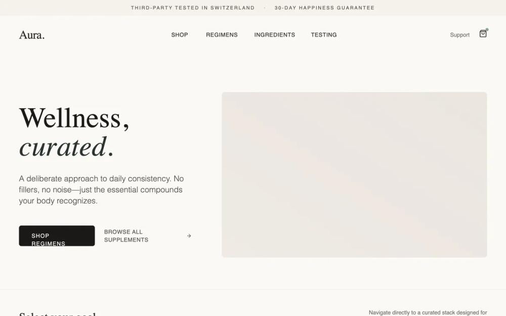 All Prompts
shopifylanding pagelayout
Aura Regimen Studio
Лендинг для wellness-брендов: выбор режима, протоколы, таймлайн. Дизайн для доверия и ясности. Идеально для премиум-продуктов.
by Shirley LouLive Preview
Prompt
# Aura Regimen Studio

{
  "summary": "Create a high-end wellness e-commerce site ('Aura') that balances minimal aesthetics with clinical transparency. The design uses a 'Stone' and 'Sage' color palette, elegant typography (Gambetta and Satoshi), and a structured layout that guides the user through curated product regimens rather than individual items. It prioritizes white space, soft shadows, and smooth transitions to establish a sense of tranquility and professionalism.",
  "style": {
    "description": "The style is 'Modern Editorial Wellness'. It uses a light stone background (#FBF9F6) to reduce visual fatigue and a muted sage green (#8DA399) for subtle action cues. Typography is a sophisticated pairing of the serif 'Gambetta' for headlines and 'Satoshi' for functional text. Animations are limited to gentle scale shifts (105%), smooth transitions (300ms), and backdrop blurs.",
    "prompt": "Color Palette: Background Stone 50 (#FBF9F6), Borders Stone 200 (#EBE5DE), Text Stone 900 (#1C1917), Accent Sage 500 (#8DA399). Typography: Headlines in Gambetta (Serif), Weights 400-700; Body/Nav in Satoshi (Sans-serif), Weights 300-700. Layout Spacing: 1440px max width, 6-12 unit padding on sections. Shadows: Very soft shadow-lg (rgba(141, 163, 153, 0.2)) on hover states. Borders: 1px solid with 50% opacity for a 'barely-there' feel. Animations: 'ease-in-out' 300ms for color changes, 2000ms slow scale zoom on lifestyle images. Micro-interactions: Cards should translate +4px on X-axis or Y-axis on hover to indicate clickability."
  },
  "layout_and_structure": {
    "description": "A multi-layered vertical scroll that transitions from high-level lifestyle messaging to granular product details and ending with deep trust signals.",
    "prompts": [
      {
        "part": "Reassurance Strip & Header",
        "prompt": "Top-bar reassurance strip: Height 40px, Stone 100 background, 10px uppercase tracking-widest text. Sticky Header: Height 96px, 90% opacity Stone 50 with backdrop-blur-md. Logo left (Serif 3xl), Nav center (Sans-serif 14px uppercase tracking-wider), Actions right (Cart icon with notification dot)."
      },
      {
        "part": "Hero Section",
        "prompt": "12-column grid. Left 5 columns: H1 Serif text-7xl with an italicized accent word; P light text-xl leading-relaxed; Button group (Primary: Stone 900, Secondary: Ghost button with arrow icon). Right 7 columns: Aspect-ratio 4:5 image container with 8px border-radius and a soft sage-glow decorative blur behind the bottom-left corner."
      },
      {
        "part": "Regimen Selector",
        "prompt": "Goal-oriented bento grid. Five cards across. Each card: 24px padding, 8px radius. One card should be 'Active/Featured' using Stone 800 background and white text for contrast. Others: White background with Stone 100 borders. Include Lucide icons and small 'AM/PM' tags in the top right corner of each card."
      },
      {
        "part": "Product Protocol Deep Dive",
        "prompt": "Alternating layouts for product groups. Protocol Header: Small italicized serif label (e.g., '01. The Focus Protocol') followed by H2. Product Grid: 3-column layout of product bottles. Below the grid, include a 'Supplement Facts' card (Sage 50 background) using a monospaced font for a clinical feel, paired with a multi-column text area explaining benefits like 'Neurogenesis' or 'Cortisol Management'."
      },
      {
        "part": "Usage Timeline",
        "prompt": "Horizontal 3-stage timeline (Morning/Mid-Day/Evening). Each stage: Centered icon in a colored circle (Sage, Orange, Indigo 50), H3 Serif, and a bulleted list of actions. A faint 1px horizontal line connects the stages in desktop view."
      },
      {
        "part": "Quality & Trust Section",
        "prompt": "Full-bleed section with 2-column grid. Left: Deep Stone 900 background, white serif H2 'Trust is a molecule.', icon-led list using Sage 400 icons. Right: High-quality laboratory or botanical lifestyle image with luminosity blending to match the dark theme."
      },
      {
        "part": "Safety & FAQ",
        "prompt": "Section split: 5 columns for 'Safety' (box with border-l-4 Sage accent) and 7 columns for 'FAQ' using accordion-style details/summary elements. Maintain generous spacing (80px-120px) between this and other sections."
      }
    ]
  },
  "special_ui_components": [
    {
      "component": "Protocol CTA Button",
      "description": "A high-conversion button that displays both action and price.",
      "prompt": "Background: Stone 900; Text: Stone 50; Padding: 16px 32px; Radius: 6px. Content: 'Add [Name] Regimen to Cart | $XX.00'. The price should be separated by a low-opacity vertical pipe (|) and have a lighter weight than the action text."
    },
    {
      "component": "Ingredient Fact Table",
      "description": "Clinical but aesthetic data display.",
      "prompt": "Container: bg-sage-50, p-16. Use a 1px solid border-b for rows. Font: Satoshi Mono or similar system-mono. Columns: Ingredient Name (Left, 400 weight), Dosage (Right, 700 weight). Bottom section includes 'Intentionally Excluded' list in uppercase tracking-widest text."
    }
  ]
}