All Prompts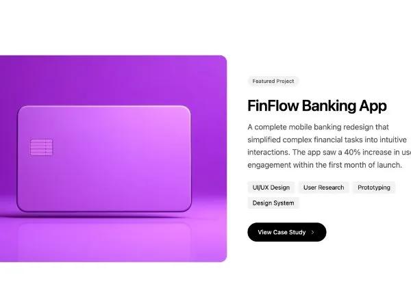 All Prompts
portfoliocase studyresponsivetailwindgridimagecta
Responsive Featured Project Showcase Section
Адаптивная секция для портфолио на Tailwind CSS. Демонстрирует проекты, кейсы, навыки с изображением и CTA. Идеально для лендингов.
Prompt
<article class="grid grid-cols-1 lg:grid-cols-12 gap-8 lg:gap-12 max-w-5xl">
  <div class="lg:col-span-7">
    <div class="rounded-2xl overflow-hidden ring-1 ring-black/10 bg-gray-50">
      <img src="https://hoirqrkdgbmvpwutwuwj-all.supabase.co/storage/v1/object/public/assets/assets/657ec554-6482-450d-9b61-f6de483507ed_800w.jpg" alt="FinFlow Banking App" class="w-full h-[300px] sm:h-[400px] lg:h-[480px] object-cover">
    </div>
  </div>
  <div class="lg:col-span-5 flex flex-col justify-center">
    <span class="inline-block px-3 py-1 text-xs font-medium rounded-full mb-6 bg-black/5 text-black/70 w-fit">Featured Project</span>
    <h4 class="text-2xl sm:text-3xl lg:text-4xl font-semibold tracking-tight mb-4">FinFlow Banking App</h4>
    <p class="text-black/70 mb-6 text-lg leading-relaxed">A complete mobile banking redesign that simplified complex
      financial tasks into intuitive interactions. The app saw a 40% increase in user engagement within the first month
      of launch.</p>
    <div class="flex flex-wrap gap-2 mb-8">
      <span class="px-3 py-1 text-sm rounded bg-black/5">UI/UX Design</span>
      <span class="px-3 py-1 text-sm rounded bg-black/5">User Research</span>
      <span class="px-3 py-1 text-sm rounded bg-black/5">Prototyping</span>
      <span class="px-3 py-1 text-sm rounded bg-black/5">Design System</span>
    </div>
    <a href="#"
      class="inline-flex items-center gap-2 text-sm font-medium bg-black text-white px-6 py-3 rounded-full w-fit hover:bg-black/90 transition">
      View Case Study
      <svg xmlns="http://www.w3.org/2000/svg" class="h-4 w-4" viewBox="0 0 24 24" fill="none" stroke="currentColor"
        stroke-width="1.5" stroke-linecap="round" stroke-linejoin="round">
        <path d="m9 18 6-6-6-6" class=""></path>
      </svg>
    </a>
  </div>
</article>