All Prompts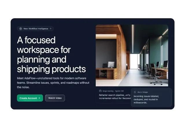 All Prompts
herolanding pagetailwindresponsiveanimatedmarketing
Responsive Hero Section with Animated CTA Buttons
Адаптивный Hero Section для лендингов с анимированными кнопками CTA. Привлекает внимание пользователей интерактивными элементами и дизайном.
Prompt
<div class="ring-1 ring-white/10 md:p-10 bg-slate-900 rounded-3xl pt-6 pr-6 pb-6 pl-6 w-full max-w-5xl">
          <div class="grid lg:grid-cols-2 gap-10 items-center">
            <div class="">
              <div class="inline-flex items-center gap-2 rounded-full border border-white/10 bg-slate-800/60 px-3 py-1 text-xs text-slate-300 font-sans">
                <span class="inline-flex h-5 w-5 items-center justify-center rounded-full bg-slate-700">
                  <svg xmlns="http://www.w3.org/2000/svg" width="24" height="24" viewBox="0 0 24 24" fill="none" stroke="currentColor" stroke-width="1.5" stroke-linecap="round" stroke-linejoin="round" data-lucide="sparkle" class="lucide lucide-sparkle h-3.5 w-3.5 text-neutral-300"><path d="M11.017 2.814a1 1 0 0 1 1.966 0l1.051 5.558a2 2 0 0 0 1.594 1.594l5.558 1.051a1 1 0 0 1 0 1.966l-5.558 1.051a2 2 0 0 0-1.594 1.594l-1.051 5.558a1 1 0 0 1-1.966 0l-1.051-5.558a2 2 0 0 0-1.594-1.594l-5.558-1.051a1 1 0 0 1 0-1.966l5.558-1.051a2 2 0 0 0 1.594-1.594z"></path></svg>
                </span>
                New: Workflow Intelligence
                <svg xmlns="http://www.w3.org/2000/svg" width="24" height="24" viewBox="0 0 24 24" fill="none" stroke="currentColor" stroke-width="1.5" stroke-linecap="round" stroke-linejoin="round" data-lucide="arrow-right" class="lucide lucide-arrow-right h-3.5 w-3.5"><path d="M5 12h14"></path><path d="m12 5 7 7-7 7"></path></svg>
              </div>
              <h1 class="sm:text-6xl text-5xl font-normal text-white tracking-tight font-instrument-serif mt-6">
                A focused workspace for planning and shipping products
              </h1>
              <p class="mt-4 text-base sm:text-lg text-slate-300 font-sans">
                Meet AdaFlow—uncluttered tools for modern software teams. Streamline issues, sprints, and roadmaps without the noise.
              </p>
              <div class="flex gap-3 mt-8 items-center">
                <button type="button" class="button" style="min-height: 44px; padding: 10px 16px;">
  <div class="points_wrapper">
    <i class="point"></i>
    <i class="point"></i>
    <i class="point"></i>
    <i class="point"></i>
    <i class="point"></i>
    <i class="point"></i>
    <i class="point"></i>
    <i class="point"></i>
    <i class="point"></i>
    <i class="point"></i>
  </div>

  <span class="inner">Create Account<svg class="icon" fill="none" stroke="currentColor" viewBox="0 0 24 24" xmlns="http://www.w3.org/2000/svg" stroke-linecap="round" stroke-linejoin="round" stroke-width="1.5">
      <path d="M5 12h14"></path>
      <path d="m12 5 7 7-7 7"></path>
    </svg></span>
  <style>
    .button {
      cursor: pointer;
      position: relative;
      display: inline-flex;
      align-items: center;
      justify-content: center;
      overflow: hidden;
      transition: all 0.25s ease;
      background: radial-gradient(65.28% 65.28% at 50% 100%,
          rgba(16, 185, 129, 0.8) 0%,
          rgba(16, 185, 129, 0) 100%),
        linear-gradient(0deg, #059669, #059669);
      border-radius: 0.75rem;
      border: none;
      outline: none;
      padding: 10px 16px;
      min-height: 44px;
      min-width: 102px;
    }

    .button::before,
    .button::after {
      content: "";
      position: absolute;
      transition: all 0.5s ease-in-out;
      z-index: 0;
    }

    .button::before {
      inset: 1px;
      background: linear-gradient(177.95deg,
          rgba(255, 255, 255, 0.19) 0%,
          rgba(255, 255, 255, 0) 100%);
      border-radius: calc(0.75rem - 1px);
    }

    .button::after {
      inset: 2px;
      background: radial-gradient(65.28% 65.28% at 50% 100%,
          rgba(16, 185, 129, 0.8) 0%,
          rgba(16, 185, 129, 0) 100%),
        linear-gradient(0deg, #059669, #059669);
      border-radius: calc(0.75rem - 2px);
    }

    .button:active {
      transform: scale(0.95);
    }

    .points_wrapper {
      overflow: hidden;
      width: 100%;
      height: 100%;
      pointer-events: none;
      position: absolute;
      z-index: 1;
    }

    .points_wrapper .point {
      bottom: -10px;
      position: absolute;
      animation: floating-points infinite ease-in-out;
      pointer-events: none;
      width: 2px;
      height: 2px;
      background-color: #fff;
      border-radius: 9999px;
    }

    @keyframes floating-points {
      0% {
        transform: translateY(0);
      }

      85% {
        opacity: 0;
      }

      100% {
        transform: translateY(-55px);
        opacity: 0;
      }
    }

    .points_wrapper .point:nth-child(1) {
      left: 10%;
      opacity: 1;
      animation-duration: 2.35s;
      animation-delay: 0.2s;
    }

    .points_wrapper .point:nth-child(2) {
      left: 30%;
      opacity: 0.7;
      animation-duration: 2.5s;
      animation-delay: 0.5s;
    }

    .points_wrapper .point:nth-child(3) {
      left: 25%;
      opacity: 0.8;
      animation-duration: 2.2s;
      animation-delay: 0.1s;
    }

    .points_wrapper .point:nth-child(4) {
      left: 44%;
      opacity: 0.6;
      animation-duration: 2.05s;
    }

    .points_wrapper .point:nth-child(5) {
      left: 50%;
      opacity: 1;
      animation-duration: 1.9s;
    }

    .points_wrapper .point:nth-child(6) {
      left: 75%;
      opacity: 0.5;
      animation-duration: 1.5s;
      animation-delay: 1.5s;
    }

    .points_wrapper .point:nth-child(7) {
      left: 88%;
      opacity: 0.9;
      animation-duration: 2.2s;
      animation-delay: 0.2s;
    }

    .points_wrapper .point:nth-child(8) {
      left: 58%;
      opacity: 0.8;
      animation-duration: 2.25s;
      animation-delay: 0.2s;
    }

    .points_wrapper .point:nth-child(9) {
      left: 98%;
      opacity: 0.6;
      animation-duration: 2.6s;
      animation-delay: 0.1s;
    }

    .points_wrapper .point:nth-child(10) {
      left: 65%;
      opacity: 1;
      animation-duration: 2.5s;
      animation-delay: 0.2s;
    }

    .inner {
      z-index: 2;
      gap: 6px;
      position: relative;
      width: 100%;
      color: white;
      display: inline-flex;
      align-items: center;
      justify-content: center;
      font-size: 15px;
      font-weight: 500;
      line-height: 1.5;
      transition: color 0.2s ease-in-out;
    }

    .inner svg.icon {
      width: 16px;
      height: 16px;
      transition: transform 0.3s ease;
      stroke: white;
      fill: none;
    }

    .button:hover svg.icon {
      transform: translateX(2px);
    }

    .button:hover svg.icon path {
      animation: dash 0.8s linear forwards;
    }

    @keyframes dash {
      0% {
        stroke-dasharray: 0, 20;
        stroke-dashoffset: 0;
      }

      50% {
        stroke-dasharray: 10, 10;
        stroke-dashoffset: -5;
      }

      100% {
        stroke-dasharray: 20, 0;
        stroke-dashoffset: -10;
      }
    }
  </style>
</button>
                <button class="liquid-glass-button relative inline-flex h-11 cursor-pointer outline-none overflow-hidden hover:scale-105 hover:shadow-xl hover:-translate-y-0.5 active:scale-98 active:translate-y-px transition-all duration-300 ease-out text-sm font-medium text-white/90 bg-gradient-to-r from-white/10 to-white/5 border-white/15 border rounded-xl px-5 py-2.5 shadow-lg backdrop-blur-xl items-center justify-center" style="box-shadow: 0 0 6px rgba(0,0,0,0.03), 0 2px 6px rgba(0,0,0,0.08), inset 3px 3px 0.5px -3px rgba(255,255,255,0.2), inset -3px -3px 0.5px -3px rgba(255,255,255,0.1), inset 1px 1px 1px -0.5px rgba(255,255,255,0.3), inset -1px -1px 1px -0.5px rgba(255,255,255,0.15), inset 0 0 6px 6px rgba(255,255,255,0.05), inset 0 0 2px 2px rgba(255,255,255,0.02), 0 0 12px rgba(0,0,0,0.1);">
  <div class="absolute inset-0 rounded-xl overflow-hidden pointer-events-none">
    <div class="absolute inset-0 bg-gradient-to-br from-white/8 via-transparent to-white/3"></div>
  </div>
  <span class="relative z-10">Watch Video</span>
  <script>
    (function(){const button = document.querySelector('.liquid-glass-button');if(button){button.addEventListener('click', function(e){const rect = this.getBoundingClientRect();const x = e.clientX - rect.left;const y = e.clientY - rect.top;const ripple = document.createElement('span');ripple.className = 'absolute rounded-full bg-gradient-radial from-white/30 to-transparent pointer-events-none animate-ping';ripple.style.left = x - 25 + 'px';ripple.style.top = y - 25 + 'px';ripple.style.width = '50px';ripple.style.height = '50px';ripple.style.animation = 'ripple 0.6s linear';this.appendChild(ripple);setTimeout(() => ripple.remove(), 600);});}})()
  </script>

  <style>
    @keyframes ripple {
      0% {
        transform: scale(0);
        opacity: 1
      }

      100% {
        transform: scale(2);
        opacity: 0
      }
    }
  </style>
</button>
              </div>
            </div>

            <!-- Hero visual -->
            <div class="relative">
              <div class="relative mx-auto max-w-xl">
                <div class="relative rounded-2xl ring-1 ring-white/10 bg-slate-900 overflow-hidden">
                  <img src="https://hoirqrkdgbmvpwutwuwj.supabase.co/storage/v1/object/public/assets/assets/6aa8249e-bf9f-4fa9-84b0-056599e70ec2_1600w.jpg" alt="App preview" class="w-full h-80 sm:h-96 object-cover object-center">
                  <div class="p-4 sm:p-5 border-t border-white/10">
                    <div class="flex items-center gap-2 text-xs text-slate-400 font-sans">
                      <svg xmlns="http://www.w3.org/2000/svg" width="24" height="24" viewBox="0 0 24 24" fill="none" stroke="currentColor" stroke-width="1.5" stroke-linecap="round" stroke-linejoin="round" data-lucide="briefcase" class="lucide lucide-briefcase h-4 w-4"><path d="M16 20V4a2 2 0 0 0-2-2h-4a2 2 0 0 0-2 2v16"></path><rect width="20" height="14" x="2" y="6" rx="2"></rect></svg>
                      Engineering · Sprint 34
                    </div>
                    <p class="mt-2 text-sm text-slate-300 line-clamp-2 font-sans">
                      Refactor search pipeline, unify event schemas, and ship incremental rollout for Recommendations v2.
                    </p>
                  </div>
                </div>
              </div>
              <!-- Overlay card -->
              <div class="hidden lg:block absolute -right-6 -bottom-6 w-64">
                <div class="bg-slate-800 border-white/10 border rounded-2xl pt-4 pr-4 pb-4 pl-4">
                  <div class="flex items-center gap-2 text-xs text-slate-400 font-sans">
                    <svg xmlns="http://www.w3.org/2000/svg" width="24" height="24" viewBox="0 0 24 24" fill="none" stroke="currentColor" stroke-width="1.5" stroke-linecap="round" stroke-linejoin="round" data-lucide="zap" class="lucide lucide-zap h-4 w-4"><path d="M4 14a1 1 0 0 1-.78-1.63l9.9-10.2a.5.5 0 0 1 .86.46l-1.92 6.02A1 1 0 0 0 13 10h7a1 1 0 0 1 .78 1.63l-9.9 10.2a.5.5 0 0 1-.86-.46l1.92-6.02A1 1 0 0 0 11 14z"></path></svg>
                    Auto-triage
                  </div>
                  <p class="mt-2 text-sm text-slate-300 font-sans">Incoming issues labeled, deduped, and routed in milliseconds.</p>
                </div>
              </div>
            </div>
          </div>
        </div>