All Prompts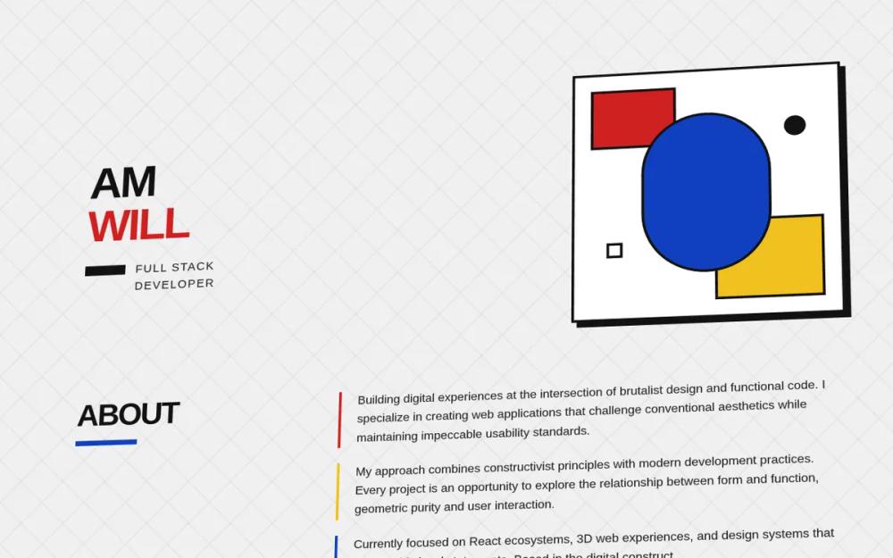 All Prompts
Bauhaus Constructivist Portfolio
Дизайн-система портфолио в стиле Баухаус-Конструктивизм: 3D-наклон, блочная палитра, бруталистская типографика. Идеально для креативных портфолио и дизайн-агентств.
by William RyanLive Preview
Prompt
# Bauhaus Constructivist Portfolio

{
  "summary": "A geometric, high-contrast design system based on Bauhaus principles, utilizing a 3D perspective transform that updates dynamically on scroll to create a 'tilted plane' effect for all content.",
  "style": {
    "description": "The style is strictly modernist/brutalist. It uses the 'Outfit' font family with weights ranging from Medium to Black, favoring heavy uppercase headlines. The color palette is limited to primary Red, Blue, Yellow, and stark Black. Visual depth is achieved through hard 8px-12px shadows with zero blur and a global 3D perspective. Shapes follow a binary rule: either sharp 90-degree corners or 100% circular rounding.",
    "prompt": "### Core Aesthetic\n- **Base Theme:** Light Gray background (#F0F0F0) with a subtle 60px x 60px geometric grid pattern created from transparent 45-degree lines.\n- **Colors:** \n  - Primary Red: #D02020\n  - Primary Blue: #1040C0\n  - Primary Yellow: #F0C020\n  - Foreground/Borders: #121212\n- **Typography:** \n  - Main Font: 'Outfit' (Sans-serif)\n  - H1: font-black (900), uppercase, 64px-72px, leading-none, letter-spacing: -0.05em.\n  - H2/H3: font-bold (700) or semibold (600), uppercase, tracking-tighter.\n  - Body: font-medium (500), 18px, high line-height (1.6).\n- **Borders & Shadows:**\n  - Standard Border: 4px solid #121212.\n  - Hard Shadow: 8px 8px 0px rgba(18,18,18,1). No blur.\n  - Large Shadow: 12px 12px 0px rgba(18,18,18,1).\n- **Animations:** \n  - Interactive elements (buttons/cards) use a 'press effect': `transition: all 100ms ease`, active state `translate(2px, 2px)` with shadow reduced to 4px."
  },
  "layout_and_structure": {
    "description": "The entire layout is wrapped in a perspective container (3000px) and a main 'tilted plane' div that rotates based on user scroll. Sections are vertically stacked with generous negative space, emphasizing geometric composition.",
    "prompts": [
      {
        "part": "3D Plane Controller",
        "prompt": "Apply `perspective: 3000px` to the root. The inner container must have `transform-style: preserve-3d`. On scroll, dynamically calculate: `rotateX = 12 - (scrollY * 0.015)` and `rotateY = -8 + (scrollY * 0.01)`. Clamp rotation between -5 and 20 degrees for X and -15 to 5 for Y."
      },
      {
        "part": "Hero Section",
        "prompt": "Layout: 2-column flex or grid. Left side: Name in 72px black uppercase text, stacked vertically. Below name, a 16x4 black rectangle followed by job title in tracking-widest uppercase. Right side: A 400x400px 'Bauhaus Composition Box'. This box has a 4px border, white background, and a hard shadow. Inside, place a red rectangle at top-left, a yellow rectangle at bottom-right, and a centered 192x256px blue oval. The blue oval contains a grayscale headshot using `mix-blend-mode: multiply`."
      },
      {
        "part": "About Section",
        "prompt": "Layout: Horizontal split. Left side (1/3): Section title 'ABOUT' in 48px bold uppercase with a 96px x 8px blue bar below it. Right side (2/3): Body text paragraphs. Each paragraph must have a 4px solid left-border (cycling colors: Red, Yellow, Blue) and 24px of padding-left. Ensure high contrast and generous whitespace between blocks."
      },
      {
        "part": "Projects Grid",
        "prompt": "Section title 'PROJECTS' followed by a 128px x 16px red horizontal bar. Below, a 3-column responsive grid. Each card: 4px black border, white background, 8px hard shadow. Top of card: 128px height color block (rotating Red/Blue/Yellow) with a centered icon (white or black). Bottom of card: Padding 24px, uppercase title, medium weight description, and small tag chips with 2px borders and primary color backgrounds."
      },
      {
        "part": "Connect Section",
        "prompt": "Heading 'CONNECT' followed by three 16px circles (Red, Blue, Yellow). Below, a flex-wrap container for social buttons. Buttons: 4px border, 8px hard shadow, uppercase text with icons. Each button uses a unique primary color background (GitHub: Red, LinkedIn: Blue, Email: Yellow, X: Black). Active state triggers 2px translation."
      },
      {
        "part": "Footer",
        "prompt": "Full-width bar with 4px top border. Left: Copyright text in small, bold uppercase tracking-widest. Right: Three 32x32px squares with 2px borders, filled with Red, Blue, and Yellow primary colors respectively."
      }
    ]
  },
  "special_ui_components": [
    {
      "component": "Bauhaus Composition Box",
      "description": "An artistic layout component used for profile images or featured highlights.",
      "prompt": "Construct a 400px square relative container with 4px solid black border and 12px hard shadow. Place absolute positioned children: 128x96px Red box at `top: 24px, left: 24px`, 160x128px Yellow box at `bottom: 24px, right: 24px`. Center a Blue oval (rounded-full) 192x256px. The oval must have `overflow: hidden` and a 4px black border. Inside the oval, a high-contrast grayscale image with `mix-blend-mode: multiply` and `opacity: 0.9`."
    },
    {
      "component": "Geometric Button",
      "description": "High-impact call-to-action button with physical feedback.",
      "prompt": "Button specs: 4px solid #121212 border, 8px 8px 0px #121212 shadow. Padding: 16px 32px. Typography: font-bold, uppercase, tracking-wider. Background color: one of #D02020, #1040C0, or #F0C020. Transition: `all 100ms ease`. On `:active`: `transform: translate(2px, 2px)` and `box-shadow: 4px 4px 0px #121212`."
    }
  ]
}