All Prompts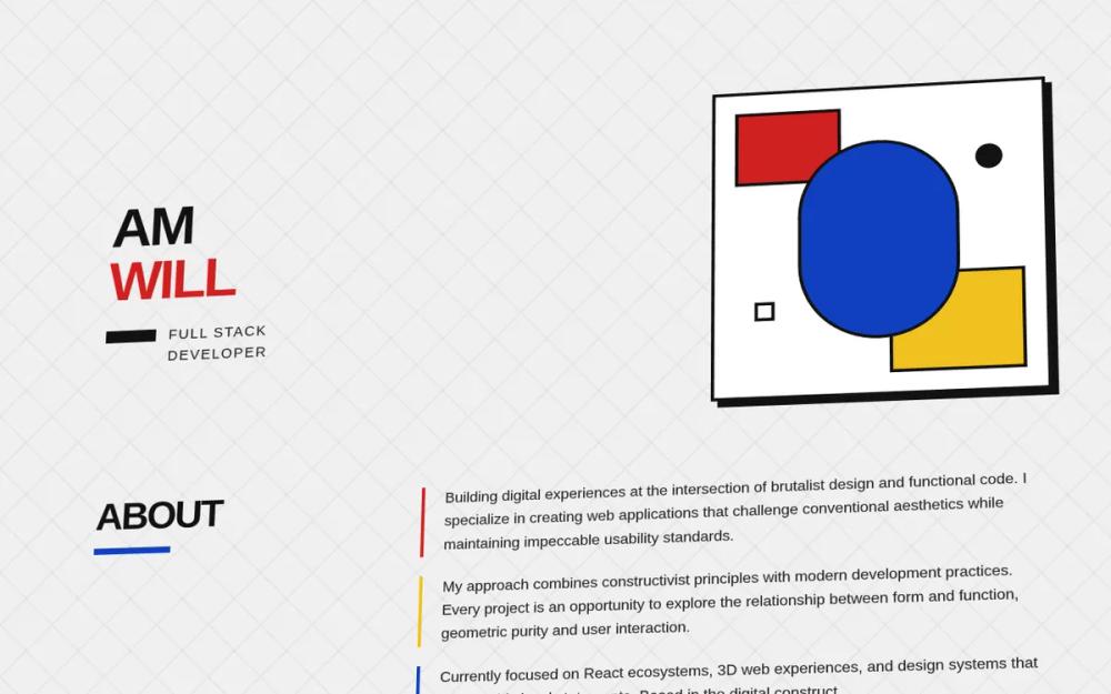 All Prompts
Bauhaus Portfolio - Fixed Hover Animations
Портфолио в стиле Баухаус с 3D-эффектами и анимацией при наведении. Идеально для креативных специалистов и дизайн-агентств. Демонстрирует уникальный стиль и функциональность.
by William RyanLive Preview
Prompt
# Bauhaus Portfolio - Fixed Hover Animations

{
  "summary": "A Bauhaus-themed modernist design system characterized by a 3D perspective layout, primary colors (#D02020, #1040C0, #F0C020), heavy 4px black borders, and 'Outfit' typography. The design emphasizes geometric purity and interactive elements that utilize a signature 'press-effect' hover animation.",
  "style": {
    "description": "The style is a mix of Bauhaus constructivism and neobrutalism. It uses the 'Outfit' font family (weights 300 to 900) for high legibility and impact. The color palette is strictly limited to primary colors (#D02020 Red, #1040C0 Blue, #F0C020 Yellow) plus a core off-white (#F0F0F0) and a deep charcoal black (#121212). Elements feature 4px solid black borders and 8px-12px offset hard shadows (no blur). Layouts are contained within a 3D perspective field (8deg X, -5deg Y tilt).",
    "prompt": "### Core Style Guide\n\n**Typography**:\n- Primary Font: 'Outfit', sans-serif.\n- Headings: Uppercase, font-weight: 900, letter-spacing: -0.05em, line-height: 1.\n- Body: font-weight: 500, font-size: 1.125rem, line-height: 1.625.\n- Accents: Uppercase, tracking-widest (0.1em).\n\n**Color Palette**:\n- Primary Red: `#D02020`\n- Primary Blue: `#1040C0`\n- Primary Yellow: `#F0C020`\n- Neutral Black: `#121212`\n- Background: `#F0F0F0` (with 60px grid pattern overlay: `linear-gradient(45deg, transparent 48%, rgba(18,18,18,0.05) 50%, transparent 52%)`)\n\n**Borders & Shadows**:\n- Borders: `4px solid #121212` everywhere.\n- Standard Shadow: `8px 8px 0px #121212` (no blur).\n- Large Shadow: `12px 12px 0px #121212`.\n\n**3D Perspective**:\n- Parent Container: `perspective: 3000px;`.\n- Main Wrapper: `transform: rotateX(8deg) rotateY(-5deg) rotateZ(1deg); transform-style: preserve-3d;`.\n\n**Interactions**:\n- 'Press-Effect' Hover: On hover, `transform: translate(-6px, -6px);` and `box-shadow: 14px 14px 0px #121212;`. Transition: `transform 0.2s cubic-bezier(0.34, 1.56, 0.64, 1)`.\n- Active State: `transform: translate(2px, 2px); box-shadow: 4px 4px 0px #121212;`."
  },
  "layout_and_structure": {
    "description": "The layout uses a modular, bento-like structure within a 3D tilted plane. It follows a vertical progression: Hero, About (text-heavy), Projects (grid-based), and Connect (button-focused footer).",
    "prompts": [
      {
        "part": "Hero Section",
        "prompt": "Create a split-layout hero. Left side: Vertical name stack in 7xl font, uppercase, black. Underneath, a black horizontal bar (16px height) leading into a 'Full Stack Developer' subtitle with wide tracking. Right side: A 400x400px 'Bauhaus Composition Box' featuring an oval profile image centered within overlapping red and yellow geometric blocks, all contained by a 4px black border and hard shadow."
      },
      {
        "part": "About Section",
        "prompt": "A two-column layout. Left column (1/3): Header 'ABOUT' in 5xl, followed by a blue horizontal bar (24px wide). Right column (2/3): Three paragraphs of text, each with a 4px left border in alternating colors (Red, Yellow, Blue). Each paragraph has 24px of left padding."
      },
      {
        "part": "Projects Grid",
        "prompt": "A 3-column responsive grid of project cards. Each card must have: 4px black border, hard shadow, and a 128px height header area in a solid primary color (Red/Blue/Yellow). Header area contains a centered white icon (64px). Body of card contains uppercase title, opacity 80% description, and 'tag' elements (small colored boxes with 2px borders)."
      },
      {
        "part": "Connect Section",
        "prompt": "A horizontal flex-wrap container of large CTA buttons. Each button uses a primary background color (GitHub: Red, Twitter: Black, LinkedIn: Blue, Email: Yellow), 4px black border, and 8px hard shadow. Include a footer bar with a top 4px black border, copyright text, and three small colored geometric squares at the bottom right."
      }
    ]
  },
  "special_ui_components": [
    {
      "component": "Bauhaus Composition Box",
      "description": "An abstract, layered geometric frame for profile pictures.",
      "prompt": "Build a 400x400 container. Inside, position absolute elements: a 128x96px red block at top-left (24px offset), a 160x128px yellow block at bottom-right (24px offset). Center a 192x256px white oval (rounded-full) with 4px border containing an object-cover image. Add small geometric accents: a black 32px circle at top-right and a white 24px square with black border at bottom-left."
    },
    {
      "component": "Neobrutalist Press-Effect Card",
      "description": "A tactile card interaction that feels like physical pressing.",
      "prompt": "Apply `transition: transform 0.2s cubic-bezier(0.34, 1.56, 0.64, 1), box-shadow 0.2s ease`. Default state: `8px shadow`. Hover state: `translate(-6px, -6px)` and `14px shadow`. Click state: `translate(2px, 2px)` and `4px shadow`. Ensure `will-change: transform, box-shadow` is set for performance."
    }
  ],
  "special_notes": "CRITICAL: To ensure the hover animation is smooth, all children elements within a 'press-effect' container must have `pointer-events: none` to prevent mouse-out flickering during rapid movement. The 3D perspective should be applied to a wrapper containing the entire dashboard to ensure consistent depth perception across all sections."
}