All Prompts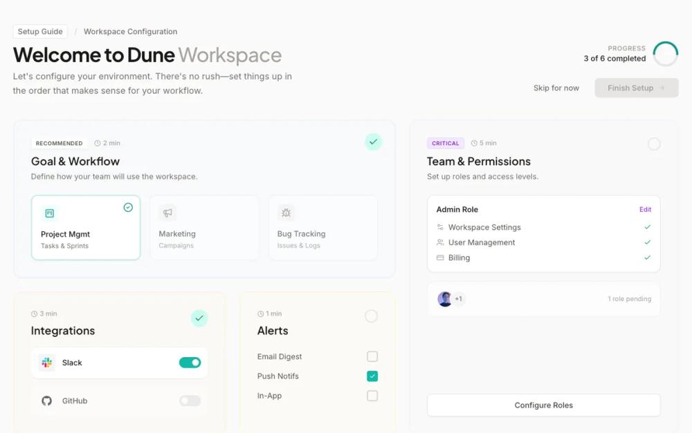 All Prompts
onboardingpagelight modewarm colourneutralstone colourteal accentsassbento gridworkspace setupresponsible admin dashboardmodern
Bento Configuration Dashboard
Bento Configuration Dashboard: Модульный SaaS-дашборд для онбординга в стиле bento grid. Идеален для финтеха, управления workspace и dev-инструментов.
by Shirley LouLive Preview
Prompt
# Bento Configuration Dashboard

{
  "summary": "A clean, workspace-oriented setup dashboard featuring a 12-column bento grid, low-urgency aesthetic, soft color tints, and interactive configuration cards that track progress without linear constraints.",
  "style": {
    "description": "The style is 'Professional Minimalist' with a focus on 'Stone' neutrals and 'Teal' accents. Typography uses Plus Jakarta Sans (bold, tight tracking) for headers and Inter for clean legibility in UI. Color palette includes Stone 50 (#fafaf9) for backgrounds, Stone 800 (#292524) for text, and Accent 500 (#14b8a6) for completion states. Cards utilize 20% opacity backgrounds (e.g., blue-50/20) and double-layered borders (outer border + inner inset border) to create depth. Transitions use a custom cubic-bezier (0.25, 0.8, 0.25, 1).",
    "prompt": "Create a design system with the following specs: \n- **Colors**: Base bg: #fafaf9 (Stone 50); Primary Text: #1c1917 (Stone 900); Secondary Text: #78716c (Stone 500); Global Accent: #14b8a6 (Teal 500). \n- **Typography**: Display font: 'Plus Jakarta Sans', weights 600, 700. Body font: 'Inter', weights 400, 500. H1 size: 36px/40px. H2 size: 20px. UI labels: 12px-14px. \n- **Cards**: Border-radius 16px (2xl). Backgrounds: Color tints at 20% opacity (e.g., #eff6ff33 for blue). Border: 1px solid at 10% opacity, with an additional absolute-positioned inset border at 30% opacity. \n- **Shadows**: Soft elevation (0 4px 20px -2px rgba(0,0,0,0.05)) on cards. \n- **Animation**: Hover transform: translateY(-2px) with cubic-bezier(0.25, 0.8, 0.25, 1). Progress rings: SVG stroke-dasharray transitions."
  },
  "layout_and_structure": {
    "description": "A 12-column grid system using Tailwind's grid-cols-12. The layout is divided into a top header (context + global actions) and a main bento grid that uses varying column and row spans for hierarchy.",
    "prompts": [
      {
        "part": "Header Section",
        "prompt": "Layout: Flex container (row-reverse on mobile, row on desktop). Elements: Left side contains a breadcrumb ('Setup Guide / Workspace'), an H1 with a light-weighted span suffix, and a descriptive paragraph (max-width 512px). Right side contains a circular progress tracker (SVG) with a numeric readout and a button group (link-style 'Skip' and a primary 'Finish Setup' button). Interaction: 'Finish Setup' should remain in a disabled state (bg-stone-200, text-stone-400) until critical tasks are finished."
      },
      {
        "part": "Bento Main Grid",
        "prompt": "Layout: CSS Grid with 12 columns (`grid-cols-12`) and gap-6. Row heights should be dynamic (`auto-rows-min`). Component Distribution: Card 1 (7 cols), Card 2 (5 cols, 2 rows tall), Card 3 (4 cols), Card 4 (3 cols), Card 5 (3 cols), Card 6 (9 cols). Each section represents a standalone configuration module."
      },
      {
        "part": "Configuration Cards",
        "prompt": "Inside each card: \n- **Top Left**: Metadata badges (e.g., 'Recommended' in white/stone or 'Critical' in purple tints) and a clock icon with time estimate (e.g., '2 min').\n- **Top Right**: Completion indicator. If done, show a circle-check with #14b8a6 background. If pending, show a 2px stone-200 ring.\n- **Content**: Card-specific interactive elements like selectable option tiles, member lists with overlapping avatars, or horizontal toggle buttons.\n- **States**: Inactive options should be grayscale (filter: grayscale(1)) and opacity 60%. Active/Selected options use 2px #14b8a6 borders."
      }
    ]
  },
  "special_ui_components": [
    {
      "component": "Progress Circle",
      "description": "A non-obtrusive circular progress indicator using SVG.",
      "prompt": "Create an SVG circle with `viewBox='0 0 36 36'`. Background path: stroke #e7e5e4, stroke-width 3. Progress path: stroke #0d9488, stroke-linecap 'round', stroke-dasharray calculated based on completion. Add a subtle `drop-shadow-sm` to the active stroke."
    },
    {
      "component": "Selection Tiles",
      "description": "Interactive grid items within a card for configuration choice.",
      "prompt": "Small inner cards (border-radius 12px) with white background. States: Default (border-stone-200, grayscale icons), Selected (border-accent-500/30, bg-white, color icons, check-circle icon in top right corner). Includes an icon, bold title, and sub-text."
    },
    {
      "component": "Dual-Border Bento Card",
      "description": "The foundational card component with layered depth.",
      "prompt": "A div with `rounded-2xl`, `border border-stone-100`, and `relative` positioning. Inside, place a second absolute-positioned div with `inset-0`, `border`, `rounded-2xl`, and a slightly darker border color (e.g., 200/30) to create a double-stroke effect. Use `transition: all 0.3s` for hover lift."
    }
  ],
  "special_notes": "MUST: Use soft, tinted backgrounds (20% opacity) for cards to distinguish sections without heavy colors. MUST: Include a 1px absolute-positioned inner border inside cards for a 'premium' look. DO NOT: Use high-contrast dark borders; keep all stone-200 or lower. DO NOT: Use aggressive motion; keep transitions under 300ms."
}