All Prompts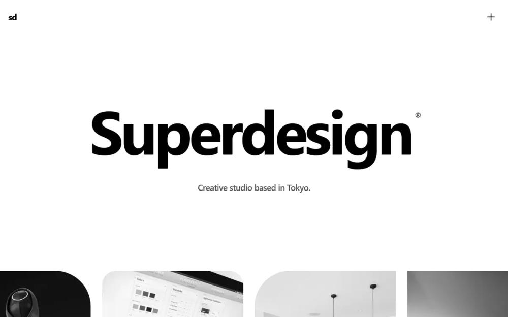 All Prompts
landing pagepagestyle
Bold Editorial Studio Style
Дизайн-система Bold Editorial Studio: крупная типографика, монохром, микро-взаимодействия. Идеально для креативных агентств, портфолио, люксовых брендов.
by Zhou JasonLive Preview
Prompt
# Bold Editorial Studio Style

{
  "summary": "A sophisticated, typography-first creative studio aesthetic featuring a black-and-white color scheme, custom interactive cursor, and smooth, motion-driven layouts.",
  "style": {
    "description": "The style is built on 'Inter' typography with extreme weight and size contrasts. It uses a pure black (#000000) and white (#FFFFFF) palette with neutral gray accents (#525252, #737373) for secondary metadata. Motion is central, utilizing smooth cubic-bezier transitions for reveals and a custom 'difference' blend-mode cursor that scales on interaction. Images are primarily grayscale, transitioning to full color on hover to maintain visual discipline.",
    "prompt": "Apply a Bold Editorial Studio Style. \n- **Color Palette**: Primary background #FFFFFF; Primary text #000000; Secondary text #525252; Accents and borders #000000 at 10% opacity; Footer background #0A0A0A with #FFFFFF text.\n- **Typography**: Primary Font: 'Inter'. \n  - Headlines: font-weight: 700; letter-spacing: -0.05em; line-height: 0.9.\n  - Body: font-weight: 400; letter-spacing: -0.02em; line-height: 1.5.\n  - Mono/Metadata: font-family: 'monospace'; font-size: 14px; text-transform: uppercase; letter-spacing: 0.1em.\n- **Interactions**: \n  - Custom cursor: 32px circle, border: 1px solid black, background: white, mix-blend-mode: difference. Scale by 2.5x on hover. \n  - Image hover: Grayscale (100%) to Grayscale (0%) transition over 700ms with a 1.05x scale transform.\n- **Animations**: \n  - Reveal: Text spans sliding up from translate-y(100%) to (0%) with cubic-bezier(0.16, 1, 0.3, 1) over 1s.\n  - Marquee: Linear infinite scroll at 30s duration, pausing on container hover."
  },
  "layout_and_structure": {
    "description": "The layout follows a spacious, section-based vertical flow. It starts with a massive display hero, followed by a continuous motion marquee, a centered introductory statement, and a balanced two-column project grid. The design concludes with a high-contrast dark footer.",
    "prompts": [
      {
        "part": "Navigation Header",
        "prompt": "Fixed header at the top. Use `mix-blend-mode: difference` for the container to ensure visibility against any background. Left side: lowercase logo 'sd' (font-size: 24px, weight: 700, tracking-tighter). Right side: Menu toggle button using a 'plus' icon. Padding: 24px (6rem)."
      },
      {
        "part": "Hero Section",
        "prompt": "Height: 80vh minimum. Center-aligned. Main headline: font-size: 12vw, weight: 700, tracking-tighter. Implement staggered letter reveal where each character slides up into view. Include a sub-headline: font-size: 24px, color: #525252, margin-top: 32px."
      },
      {
        "part": "Infinite Project Marquee",
        "prompt": "Full-width overflow-hidden section. Items: Vertical cards (aspect-ratio: 5/7). Apply asymmetrical rounded corners to cards (e.g., top-left: 100px, or top-right: 100px + bottom-left: 40px). Animation: Continuous horizontal scroll. Images within should be grayscale by default."
      },
      {
        "part": "Project Grid",
        "prompt": "Two-column grid for desktop, single-column for mobile. Each project item consists of: 1. A 4:3 aspect ratio image container with slight rounding. 2. A hover-triggered overlay (black at 10% opacity). 3. A top-right 'arrow-up-right' icon appearing on hover. 4. Bottom metadata row separated by a 1px #000000/10 border-top, containing a Title (24px), Category, and Year (mono font)."
      },
      {
        "part": "Footer",
        "prompt": "Background: #0A0A0A. Text: #FFFFFF. Four-column grid (on desktop). Column 1-2: Large brand name and short bio. Column 3: 'Socials' list. Column 4: 'Contact' list. Bottom bar: Thin border-top (white at 10% opacity) with copyright and credits in 14px text."
      }
    ]
  },
  "special_ui_components": [
    {
      "component": "Interactive Difference Cursor",
      "description": "A custom circular cursor that follows the mouse with smooth interpolation and changes appearance based on the underlying color.",
      "prompt": "Create a 32px diameter circle `div` with `position: fixed`, `pointer-events: none`, and `z-index: 9999`. Apply `mix-blend-mode: difference` and `background-color: white`. Use `requestAnimationFrame` to interpolate movement (lerp) for a 'lagging' smooth effect. On hover of 'a' or 'button' tags, use a CSS transition to `transform: scale(2.5)`."
    },
    {
      "component": "Asymmetrical Marquee Cards",
      "description": "Image containers within the marquee that use non-uniform border-radii to create an organic, editorial feel.",
      "prompt": "Style project cards with alternating border-radius patterns: Card A: `border-top-left-radius: 100px`. Card B: `border-top-right-radius: 100px; border-bottom-left-radius: 40px`. Card C: `border-radius: 40px`. This breaks the standard grid monotony."
    }
  ],
  "special_notes": "MUST: Maintain a strict black-and-white palette; any color should only come from project photography. MUST: Use smooth easing for all hover states (minimum 500ms). MUST: Hide the default browser cursor (`cursor: none` on body). DO NOT: Use borders heavier than 1px. DO NOT: Use standard system easing; stick to cubic-bezier(0.16, 1, 0.3, 1) for a premium feel."
}