All Prompts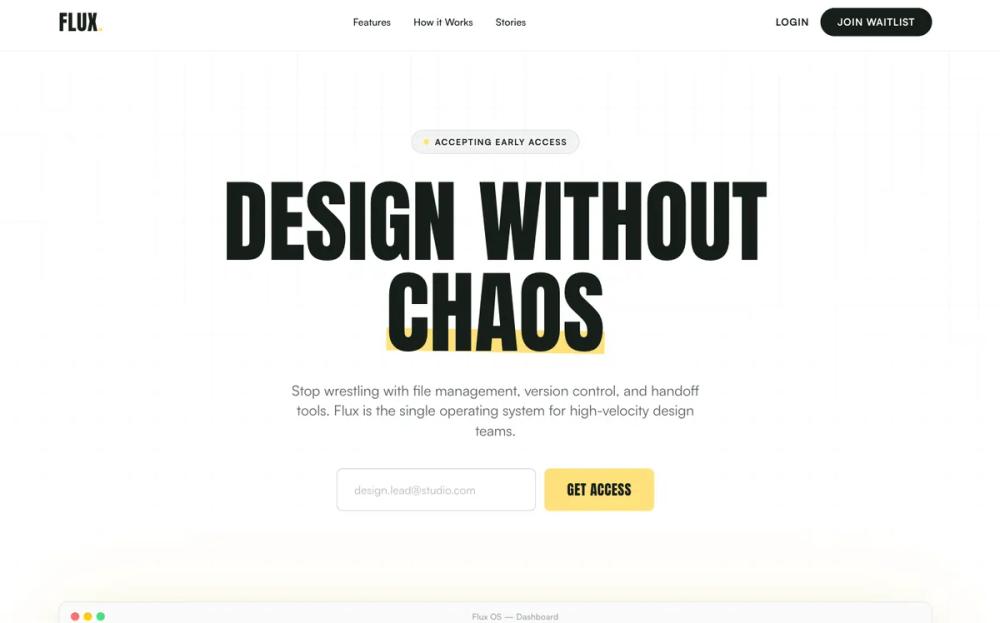 All Prompts
light modeeditorialyellownavysagewaitlistlanding pagesaas landingacid yellow accentstyle
Bold Editorial Style
Дизайн лендинга SaaS в смелом редакционном стиле. Высококонтрастный, с типографикой Anton, золотым и угольным цветами. Идеален для стартапов, финтеха, портфолио.
by Shirley LouLive Preview
Prompt
# Bold Editorial Style

{
  "summary": "Create a bold, modern B2C SaaS landing page with a high-contrast editorial feel. The design uses aggressive display typography (Anton) paired with clean sans-serif body text (Satoshi), employing a color palette of golden yellow highlights against charcoal and white backgrounds. It features a grid-patterned hero section, high-contrast problem/solution blocks, and a bento-style feature grid.",
  "style": {
    "description": "Brutalist-lite SaaS aesthetic. Key elements include massive display fonts (8xl-9xl), a grid-based background (linear-gradient with 40px spacing), and a strategic use of #ffe17c (golden yellow) for highlights and primary CTAs. Typography pairs the heavy weight of 'Anton' with the sophisticated versatility of 'Satoshi'. Colors include #171e19 (charcoal), #272727 (dark gray), #b7c6c2 (sage), and #ffffff (white).",
    "prompt": "Apply a high-contrast design system. Typography: Use 'Anton' for all primary headlines (uppercase, letter-spacing: normal, line-height: 0.9) and 'Satoshi' for body text (weights 400, 500, 700). Color Palette: Backgrounds should alternate between #ffffff and #171e19. Use #ffe17c as the primary accent color for buttons and text-highlights. Highlights: Use 15-degree rotated rectangle overlays in #ffe17c behind key words in headlines. Borders: Use 1px #171e19/10% opacity for light sections and #b7c6c2/10% for dark sections. Grid Background: Implement a background-size: 40px 40px pattern using linear-gradient(to right, #b7c6c220 1px, transparent 1px). Micro-interactions: Cards should have 300ms cubic-bezier(0.4, 0, 0.2, 1) transitions for transforms and shadows."
  },
  "layout_and_structure": {
    "description": "The layout follows a logical conversion funnel: Hero for immediate value prop, social proof for trust, a high-contrast split-section for problem/solution, a flexible bento grid for features, a numerical step-by-step process, and a high-energy final CTA.",
    "prompts": [
      {
        "part": "Navigation",
        "prompt": "Fixed header (h-20) with #ffffff/90% backdrop-blur. Logo on left in 'Anton' (3xl, uppercase) with a yellow period. Center nav links in 'Satoshi' (sm, font-medium). Right side features a text-only 'Login' link and a pill-shaped button (bg-#171e19, text-white, px-6, rounded-full)."
      },
      {
        "part": "Hero Section",
        "prompt": "Centered layout on a grid pattern background. Feature a badge (caps, tracking-widest, text-xs) with a yellow dot indicator. Headline: 'Anton' (text-6xl to 9xl) with a yellow highlight bar behind the final word. Subheadline: 'Satoshi' (text-lg, text-charcoal/70%, max-w-xl). Waitlist form: side-by-side input (border-charcoal/20, px-6, rounded-lg) and a massive 'Anton' button (bg-yellow, text-xl, px-8)."
      },
      {
        "part": "Problem-Solution Contrast",
        "prompt": "Full-width section with two distinct halves. Left half (Problem): bg-#charcoal, text-white, features 'THE OLD WAY' in Anton with muted sage text and red 'x' icons. Right half (Solution): bg-#272727 with a yellow accent border, features 'THE FLUX WAY' in Anton with yellow 'check-circle' icons and crisp white text. Layout uses flex-start vertical alignment."
      },
      {
        "part": "Bento Feature Grid",
        "prompt": "3-column grid layout with auto-rows (400px). Feature 1 & 4 span 2 columns. Cards use #f8f9fa backgrounds or #171e19 for contrast. Include abstract UI elements inside cards (e.g., animated pulse blocks, code snippets in bg-dark, avatar stacks). Card headers use 'Anton' 3xl."
      },
      {
        "part": "How It Works",
        "prompt": "Two-column layout (1:2 ratio). Left column: Sticky 'Anton' title (text-7xl). Right column: Vertical stack of three steps. Each step features a massive 8xl numeral in #ffe17c/20% that changes to full opacity on hover, paired with 'Anton' titles and 'Satoshi' descriptions."
      },
      {
        "part": "Final CTA",
        "prompt": "High-impact section with bg-#ffe17c. Include background decorative elements: massive 'Anton' text overlays with 10% opacity. Centralized stack: Anton headline (8xl, leading-0.9), Satoshi subtext (2xl, max-w-2xl), and a large centered form with input and button (bg-charcoal, shadow-xl, hover:scale-105)."
      }
    ]
  },
  "special_ui_components": [
    {
      "component": "Abstract UI Mockup",
      "description": "A browser-style mockup frame used to showcase software interface without high-fidelity images.",
      "prompt": "Create a container with border-charcoal/10 and shadow-2xl. Header: gray traffic light buttons (red, yellow, green) and centered mockup title. Body: Grid layout (Sidebar, Main Canvas, Properties Panel). Properties panel must include specific controls: font-display titles, mini alignment icons, and a hex color swatch (#FFE17C). Main canvas includes a centered white card with subtle shadows and a floating cursor icon with a user name label."
    },
    {
      "component": "Testimonial High-Contrast Cards",
      "description": "Alternating light and dark review cards with oversized star icons.",
      "prompt": "Grid of 3 cards. Center card: bg-#171e19, text-white, 4px vertical offset (translate-y-4). Side cards: bg-white, border-charcoal/10. Each includes 5 star icons in #ffe17c, Satoshi-medium body text (lg), and an avatar footer. Avatars are 12x12 (48px) with grayscale filters and 'Anton' uppercase names."
    }
  ]
}