All Prompts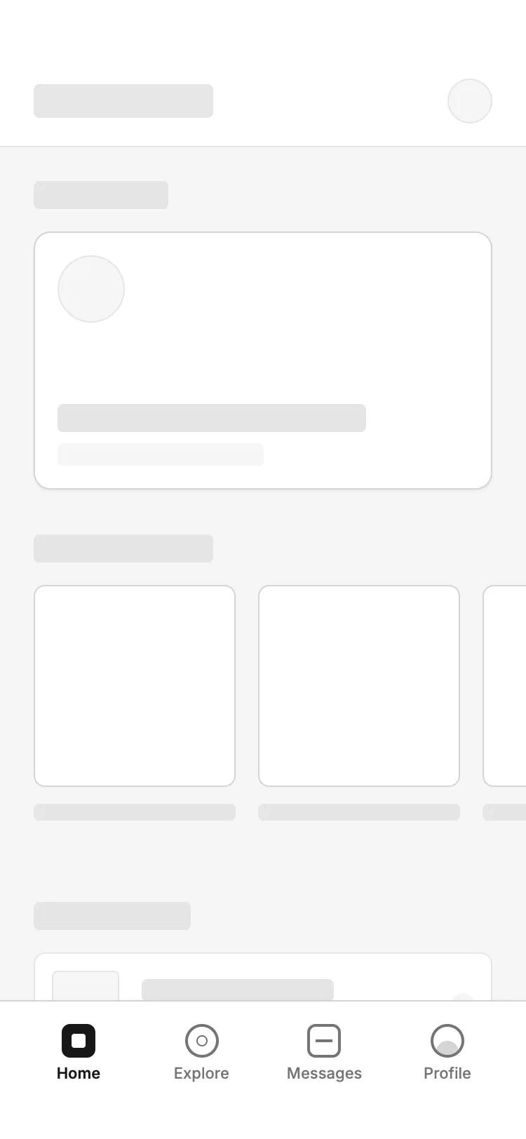 All Prompts
mobile appnavigationlayout
Bottom Tab- Primary Action Navigation
Навигация с нижней вкладкой: центральная кнопка для основного действия (модал/создание), сохраняя контекст страницы. Идеально для мобильных приложений.
by Shirley LouLive Preview
Prompt
# Bottom Tab- Primary Action Navigation

make it interactive

Here is a reference implementation:

~~~html
<!DOCTYPE html>
<html lang="en">
<head>
  <meta charset="UTF-8">
  <meta name="viewport" content="width=device-width, initial-scale=1.0">
  <title>Wireframe Mobile Navigation</title>
  <script src="https://cdn.tailwindcss.com"></script>
  <script src="https://code.iconify.design/iconify-icon/1.0.7/iconify-icon.min.js"></script>
  <meta name="view-transition" content="same-origin">
  <style>
    @import url('https://fonts.googleapis.com/css2?family=Inter:wght@400;500;600&display=swap');

    :root {
      --bg-app: #F5F5F5;
      --bg-surface: #FFFFFF;
      --border-subtle: #E5E5E5;
      --border-strong: #D4D4D4;
      --text-primary: #171717;
      --text-secondary: #737373;
      --text-disabled: #A3A3A3;
    }

    body {
      font-family: 'Inter', sans-serif;
      margin: 0;
    }

    .hide-scrollbar::-webkit-scrollbar {
      display: none;
    }
    .hide-scrollbar {
      -ms-overflow-style: none;
      scrollbar-width: none;
    }

    /* Tab Transition Effect */
    .tab-content {
      animation: fadeIn 0.3s ease-out;
    }
    @keyframes fadeIn {
      from { opacity: 0; transform: translateY(4px); }
      to { opacity: 1; transform: translateY(0); }
    }

    @view-transition {
      navigation: auto;
    }
  </style>
</head>
<body>
  <div class="w-full h-screen bg-[#F5F5F5] flex flex-col text-[#171717] overflow-hidden relative">

    <!-- Header -->
    <header class="pt-14 pb-4 px-6 bg-white border-b border-[#E5E5E5] flex items-center justify-between shrink-0 z-10">
      <div id="header-title" class="h-6 w-32 bg-[#E5E5E5] rounded flex items-center px-2 text-[10px] font-bold text-gray-400 tracking-widest uppercase">HOME</div>
      <div class="h-8 w-8 rounded-full bg-[#F5F5F5] border border-[#E5E5E5] flex items-center justify-center">
        <iconify-icon icon="lucide:bell" class="text-gray-400"></iconify-icon>
      </div>
    </header>

    <!-- Main Content Area -->
    <main class="flex-1 overflow-y-auto hide-scrollbar">

      <!-- Home View -->
      <div id="view-home" class="tab-content p-6 space-y-8">
        <section class="space-y-4">
          <div class="flex justify-between items-end">
            <div class="h-5 w-24 bg-[#E5E5E5] rounded"></div>
            <div class="h-4 w-12 bg-[#F5F5F5] rounded"></div>
          </div>
          <div class="w-full aspect-[16/9] bg-white rounded-xl border border-[#D4D4D4] p-4 flex flex-col justify-between shadow-sm hover:border-gray-400 transition-colors cursor-pointer">
            <div class="w-12 h-12 rounded-full bg-[#F5F5F5] border border-[#E5E5E5]"></div>
            <div class="space-y-2">
              <div class="h-5 w-3/4 bg-[#E5E5E5] rounded"></div>
              <div class="h-4 w-1/2 bg-[#F5F5F5] rounded"></div>
            </div>
          </div>
        </section>

        <section class="space-y-4">
          <div class="h-5 w-32 bg-[#E5E5E5] rounded"></div>
          <div class="flex gap-4 overflow-x-auto hide-scrollbar pb-2 -mx-6 px-6">
            <div class="w-36 flex-shrink-0 space-y-3">
              <div class="w-36 h-36 bg-white rounded-lg border border-[#D4D4D4]"></div>
              <div class="h-3 w-full bg-[#E5E5E5] rounded"></div>
            </div>
            <div class="w-36 flex-shrink-0 space-y-3">
              <div class="w-36 h-36 bg-white rounded-lg border border-[#D4D4D4]"></div>
              <div class="h-3 w-full bg-[#E5E5E5] rounded"></div>
            </div>
          </div>
        </section>
      </div>

      <!-- Explore View (Hidden initially) -->
      <div id="view-explore" class="tab-content hidden p-6 space-y-6">
        <div class="w-full h-12 bg-white border border-[#D4D4D4] rounded-lg flex items-center px-4 gap-3">
          <iconify-icon icon="lucide:search" class="text-gray-400"></iconify-icon>
          <div class="h-4 w-32 bg-[#F5F5F5] rounded"></div>
        </div>
        <div class="grid grid-cols-2 gap-4">
          <div class="aspect-square bg-white border border-[#D4D4D4] rounded-lg"></div>
          <div class="aspect-square bg-white border border-[#D4D4D4] rounded-lg"></div>
          <div class="aspect-square bg-white border border-[#D4D4D4] rounded-lg"></div>
          <div class="aspect-square bg-white border border-[#D4D4D4] rounded-lg"></div>
        </div>
      </div>

      <!-- Messages View (Hidden initially) -->
      <div id="view-messages" class="tab-content hidden p-6 space-y-4">
        <div class="flex items-center gap-4 p-4 bg-white border border-[#E5E5E5] rounded-xl">
          <div class="w-12 h-12 rounded-full bg-[#E5E5E5]"></div>
          <div class="flex-1 space-y-2">
            <div class="h-4 w-1/3 bg-[#E5E5E5] rounded"></div>
            <div class="h-3 w-2/3 bg-[#F5F5F5] rounded"></div>
          </div>
        </div>
        <div class="flex items-center gap-4 p-4 bg-white border border-[#E5E5E5] rounded-xl opacity-60">
          <div class="w-12 h-12 rounded-full bg-[#E5E5E5]"></div>
          <div class="flex-1 space-y-2">
            <div class="h-4 w-1/4 bg-[#E5E5E5] rounded"></div>
            <div class="h-3 w-1/2 bg-[#F5F5F5] rounded"></div>
          </div>
        </div>
      </div>

      <!-- Profile View (Hidden initially) -->
      <div id="view-profile" class="tab-content hidden p-6 flex flex-col items-center">
        <div class="w-24 h-24 rounded-full bg-white border-2 border-[#D4D4D4] flex items-center justify-center mb-6">
          <div class="w-16 h-16 rounded-full bg-[#E5E5E5]"></div>
        </div>
        <div class="h-6 w-32 bg-[#E5E5E5] rounded mb-2"></div>
        <div class="h-4 w-48 bg-[#F5F5F5] rounded mb-8"></div>

        <div class="w-full space-y-3">
          <div class="p-4 bg-white border border-[#E5E5E5] rounded-lg flex justify-between">
            <div class="h-4 w-24 bg-[#E5E5E5] rounded"></div>
            <iconify-icon icon="lucide:chevron-right"></iconify-icon>
          </div>
          <div class="p-4 bg-white border border-[#E5E5E5] rounded-lg flex justify-between">
            <div class="h-4 w-32 bg-[#E5E5E5] rounded"></div>
            <iconify-icon icon="lucide:chevron-right"></iconify-icon>
          </div>
        </div>
      </div>

    </main>

    <!-- Bottom Tab Navigation -->
    <nav class="shrink-0 bg-white border-t border-[#D4D4D4] pb-[34px] pt-2 px-6 shadow-[0_-1px_3px_rgba(0,0,0,0.02)] z-20">
      <div class="h-[56px] flex items-center justify-between">

        <!-- Tab: Home -->
        <button id="nav-home" onclick="switchTab('home')" class="nav-item group flex flex-col items-center justify-center gap-1.5 w-16 h-full cursor-pointer transition-all active:scale-95">
          <div class="icon-container w-6 h-6 bg-[#171717] rounded-md flex items-center justify-center transition-all">
             <div class="w-2.5 h-2.5 bg-white rounded-sm"></div>
          </div>
          <span class="label text-[11px] font-semibold text-[#171717] leading-none">Home</span>
        </button>

        <!-- Tab: Explore -->
        <button id="nav-explore" onclick="switchTab('explore')" class="nav-item group flex flex-col items-center justify-center gap-1.5 w-16 h-full cursor-pointer opacity-40 transition-all active:scale-95">
          <div class="icon-container w-6 h-6 border-2 border-[#171717] rounded-full flex items-center justify-center transition-all">
            <div class="w-2 h-2 border border-[#171717] rounded-full"></div>
          </div>
          <span class="label text-[11px] font-medium text-[#171717] leading-none">Explore</span>
        </button>

        <!-- Tab: Messages -->
        <button id="nav-messages" onclick="switchTab('messages')" class="nav-item group flex flex-col items-center justify-center gap-1.5 w-16 h-full cursor-pointer opacity-40 transition-all active:scale-95">
          <div class="icon-container w-6 h-6 border-2 border-[#171717] rounded-md flex items-center justify-center transition-all">
            <div class="w-3 h-[2px] bg-[#171717]"></div>
          </div>
          <span class="label text-[11px] font-medium text-[#171717] leading-none">Messages</span>
        </button>

        <!-- Tab: Profile -->
        <button id="nav-profile" onclick="switchTab('profile')" class="nav-item group flex flex-col items-center justify-center gap-1.5 w-16 h-full cursor-pointer opacity-40 transition-all active:scale-95">
          <div class="icon-container w-6 h-6 border-2 border-[#171717] rounded-full overflow-hidden relative transition-all">
             <div class="absolute bottom-[-2px] left-1/2 -translate-x-1/2 w-4 h-3 bg-[#171717] rounded-t-full opacity-30"></div>
          </div>
          <span class="label text-[11px] font-medium text-[#171717] leading-none">Profile</span>
        </button>

      </div>
    </nav>

  </div>

  <script>
    function switchTab(tab) {
      // 1. Manage Views
      const views = ['home', 'explore', 'messages', 'profile'];
      views.forEach(v => {
        const viewElement = document.getElementById(`view-${v}`);
        if (v === tab) {
          viewElement.classList.remove('hidden');
        } else {
          viewElement.classList.add('hidden');
        }
      });

      // 2. Manage Nav States
      const navItems = document.querySelectorAll('.nav-item');
      navItems.forEach(item => {
        const itemId = item.id.split('-')[1];
        const iconContainer = item.querySelector('.icon-container');
        const label = item.querySelector('.label');

        if (itemId === tab) {
          item.classList.remove('opacity-40');
          item.classList.add('opacity-100');
          label.classList.replace('font-medium', 'font-semibold');

          // Fill icon for active state (simplified wireframe logic)
          iconContainer.classList.add('bg-[#171717]');
          if (iconContainer.classList.contains('border-2')) {
            iconContainer.classList.remove('border-2', 'border-[#171717]');
          }
          // Specific fix for Profile icon visual
          const profileAvatar = iconContainer.querySelector('div');
          if (tab === 'profile' && profileAvatar) profileAvatar.classList.remove('opacity-30');
        } else {
          item.classList.add('opacity-40');
          item.classList.remove('opacity-100');
          label.classList.replace('font-semibold', 'font-medium');

          // Revert to outline for inactive states
          if (itemId !== 'home') {
            iconContainer.classList.remove('bg-[#171717]');
            iconContainer.classList.add('border-2', 'border-[#171717]');
          } else {
            // Home special case revert
            iconContainer.classList.remove('bg-[#171717]');
            iconContainer.classList.add('border-2', 'border-[#171717]');
            const homeInner = iconContainer.querySelector('div');
            if (homeInner) homeInner.classList.replace('bg-white', 'bg-[#171717]');
          }

          // Revert Profile icon
          const profileAvatar = iconContainer.querySelector('div');
          if (itemId === 'profile' && profileAvatar) profileAvatar.classList.add('opacity-30');
        }
      });

      // 3. Update Header
      const headerTitle = document.getElementById('header-title');
      headerTitle.textContent = tab.toUpperCase();

      // Scroll to top on switch
      document.querySelector('main').scrollTop = 0;
    }
  </script>
</body>
</html>
~~~