All Prompts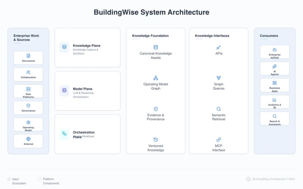 All Prompts
BuildingWise System Architecture - Updated Planes
Дизайн системы архитектуры BuildingWise: чистые тех. диаграммы, модульный поток 4 зон (Sources to Consumers). Стиль Blue SaaS, палитра slate-blue, шрифт Satoshi. Идеально для визуализации систем, whitepapers, SaaS.
by David PiontekLive Preview
Prompt
# BuildingWise System Architecture - Updated Planes

{
  "summary": "A highly structured, professional technical architecture diagram using a modular grid. It features side pillars for data sources and consumers with a centralized multi-layer platform engine. The visual language is defined by soft shadows, subtle borders, and a monochromatic blue-tinted secondary palette.",
  "style": {
    "description": "The style is 'Modern Enterprise Professional'. It relies on the Satoshi font family for clarity. The color palette uses #FAFBFC for the page background, #EAF2FA for peripheral zone backgrounds, and #FFFFFF for primary content cards. Accents are primarily #3B82F6 (Blue), #6366F1 (Indigo), and #06B6D4 (Cyan). Borders are consistent at 1px solid #CBD5E0. Typography focuses on #2D3748 for headings and #4A5568 for labels. Layout uses rounded-xl (12px) and rounded-lg (8px) for structural hierarchy.",
    "prompt": "Create a design with a background of #FAFBFC. Typography must use 'Satoshi' or a similar clean sans-serif. Main headings should be #2D3748, bold, font-size: 14px, leading-tight. Secondary text should be #4A5568, font-size: 10px to 14px. Containers must have 1px solid #CBD5E0 borders and 'shadow-sm' (subtle 0 1px 2px 0 rgba(0, 0, 0, 0.05)). Use specific color accents: Blue (#3B82F6), Indigo (#6366F1), and Cyan (#06B6D4). Structural corner radius is 12px for sections and 8px for internal cards. Include a decorative element: a 2px high, 32px wide horizontal rule in bg-blue-500/20 under section titles. Icons should be consistent in size (approx 18px-20px) and use the accent blue #3B82F6."
  },
  "layout_and_structure": {
    "description": "A horizontal flow layout from left-to-right, divided into four logical zones using a 15% / 70% / 15% width distribution. The central 70% zone is further subdivided into operational layers and functional blocks.",
    "prompts": [
      {
        "part": "Peripheral Pillars (Zones 1 & 4)",
        "prompt": "Design two narrow vertical sidebars (15% width each) with a background of #EAF2FA. Each sidebar is an encapsulated container with a border (#CBD5E0) and 12px radius. Inside, place a header with a title and a subtle blue underline. Below the header, arrange a vertical stack of small white cards (bg-white, border #CBD5E0, radius 8px). Each card contains a centered icon and a bold label (10px). Spacing between cards should be 12px (3 units)."
      },
      {
        "part": "Platform Core (Zone 2 - Operational Planes)",
        "prompt": "In the central area, create a vertical stack of three horizontal cards occupying approx 35% of the inner width. Each card should be white, border #CBD5E0, radius 12px, p-5. The content is horizontally aligned: a colored icon background (blue-50, indigo-50, or cyan-50) containing a themed icon, followed by a bold text label (#2D3748, 14px)."
      },
      {
        "part": "Platform Foundation (Zone 3 - Knowledge Base)",
        "prompt": "Next to the operational planes, create a wide container (65% width) containing two equal-width vertical columns. Each column is a white card (radius 12px, p-6). Inside each column, list 4 items vertically. Each item consists of a centered icon (#3B82F6) above a text label (14px, #4A5568). Distribute the items evenly to fill the vertical height."
      }
    ]
  },
  "special_ui_components": [
    {
      "component": "Accent Icon Box",
      "description": "A small, rounded container for icons within cards.",
      "prompt": "Create a square div (approx 40px) with bg-blue-50 (or relevant tinted background), rounded-lg (8px). Center a Lucide icon inside it with a stroke width of 2px and color matching the background's primary hue (e.g., #3B82F6 for blue-50)."
    },
    {
      "component": "Data Source Card",
      "description": "Miniature cards used for inputs/outputs.",
      "prompt": "A compact white card (bg-white) with 1px solid #CBD5E0 border. Padding is 10px. Layout is a vertical stack: centered icon at top, 10px bold text at bottom. Shadow: shadow-sm."
    }
  ],
  "special_notes": "MUST use 'Satoshi' font for the premium enterprise feel. MUST NOT use vibrant gradients; keep colors flat or very subtly tinted. MUST ensure all internal cards (inner boxes) have a consistent 10px padding for labels. MUST use a 24px (6 units) gap between major layout zones. Stroke-dasharray of 4, 4 should be used for any connecting paths between zones to maintain technical schematic integrity."
}