All Prompts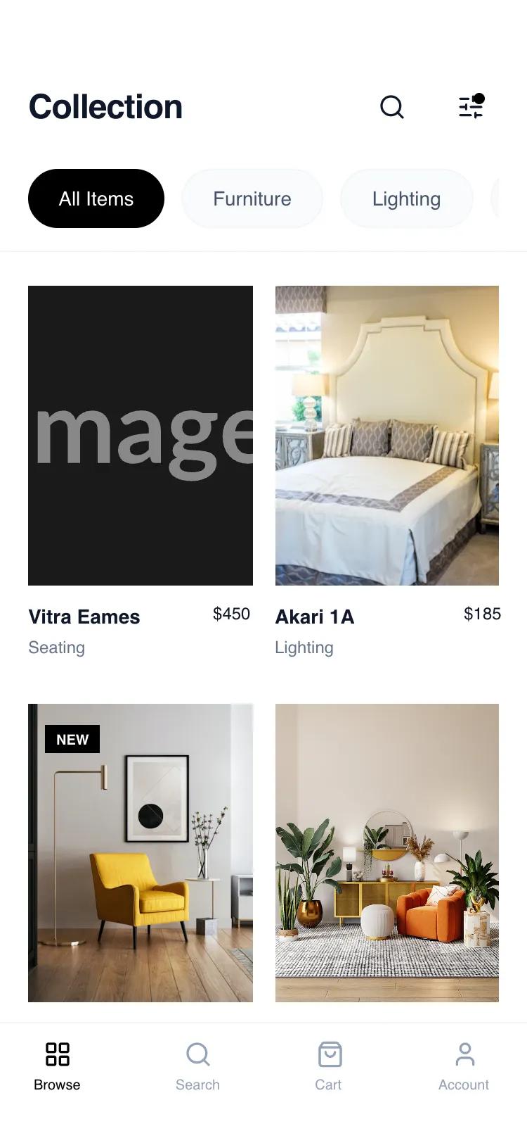 All Prompts
mobile appindexbrowselayout
Card Grid Browse
Адаптивный UI-паттерн Card Grid Browse для мобильных. Создает элегантный вид каталога товаров с акцентом на изображения и навигацию. Идеально для премиум-товаров.
by Shirley LouLive Preview
Prompt
# Card Grid Browse

{
  "summary": "A sophisticated, mobile-first product browsing layout emphasizing whitespace, clean typography, and a stable 2-column grid. The design utilizes a monochrome base with slate-toned neutrals to create a high-end 'boutique' feel, prioritizing product imagery and effortless navigation.",
  "style": {
    "description": "Minimalist editorial style using 'General Sans' for a modern feel. The palette is dominated by pure white (#FFFFFF), slate grays (#F1F5F9, #64748B, #0F172A), and sharp black accents. Animations are subtle, featuring 700ms image transitions and 95% scaling on active touch states. Borders are thin (1px) and used sparingly to define hierarchy without clutter.",
    "prompt": "Create a design with a 'Minimalist Editorial' aesthetic. \n- **Typography**: Primary font 'General Sans'. Use font-weight 600 for headings (24px, -0.025em tracking) and product titles (14px). Use font-weight 400 for categories (12px, #64748B).\n- **Color Palette**: Backgrounds in #FFFFFF; Secondary surfaces in #F8FAFC; Borders in #F1F5F9; Primary text in #0F172A; Accents in #000000.\n- **Shadows & Borders**: Avoid heavy shadows. Use 1px solid borders in #F1F5F9 for headers, footers, and pills.\n- **Interactions**: Implement a `duration-700` ease-out transition on image hover (scale: 105%). Use `active:scale-95` for all clickable buttons and pills for tactile feedback.\n- **Radius**: Large radius (9999px) for category pills and circular icon buttons; sharp corners (0px) for product images to maintain a professional look."
  },
  "layout_and_structure": {
    "description": "A vertical-scrolling mobile layout composed of a sticky header, a scrollable category filter, a fixed-width grid, and a persistent bottom navigation bar.",
    "prompts": [
      {
        "part": "Header and Category Bar",
        "prompt": "Design a sticky top header with 56px top padding (safe area). Include a title 'Collection' at 24px semi-bold left-aligned, and two 40px circular action buttons (Search, Filter) on the right. Below the title, add a horizontally scrollable (hide-scrollbar) container of category pills. Active pill: Black background, White text. Inactive pill: #F8FAFC background, 1px #F1F5F9 border, #64748B text. All pills should have 10px 20px padding and text-sm font-weight 500."
      },
      {
        "part": "Product Grid",
        "prompt": "Construct a 2-column grid with a 16px (gap-4) horizontal gap and 32px (gap-8) vertical gap. Each card should contain a 3:4 aspect ratio image container. Images must use `object-cover`. On hover, images scale 5%. Cards must have a title (text-sm, truncated) and price (text-xs, font-medium) on one line, with a secondary category label (#64748B, text-xs) below."
      },
      {
        "part": "Bottom Navigation",
        "prompt": "Fixed bottom bar at 100% width, #FFFFFF background with a 1px top border (#F1F5F9). Height should accommodate safe area (pb-[34px]). Include 4 equally spaced navigation items consisting of a 20px icon and a 10px font-weight 500 label. Active state: #000000; Inactive state: #94A3B8."
      }
    ]
  },
  "special_ui_components": [
    {
      "component": "Interactive Filter Button",
      "description": "Action icon with a status indicator",
      "prompt": "A 40px circular button with a 'sliders-horizontal' icon. Add a 8px solid black dot (#000000) positioned at top: 10px, right: 10px to indicate active filters."
    },
    {
      "component": "Status Badges",
      "description": "Minimalist overlay labels on images",
      "prompt": "Small rectangular badges positioned top-left of the image container. Text: 10px uppercase bold. 'NEW' badge: Black background/White text. 'SALE' badge: Red background (#EF4444)/White text. Padding: 4px 8px."
    }
  ],
  "special_notes": "MUST: Maintain strict 3:4 aspect ratios for product images. MUST: Use 'General Sans' or a very clean geometric sans-serif to maintain the high-end feel. DO NOT: Use heavy drop shadows or rounded corners on images. DO NOT: Allow the header to obscure content without a backdrop-blur effect (bg-white/95 backdrop-blur-sm)."
}