All Prompts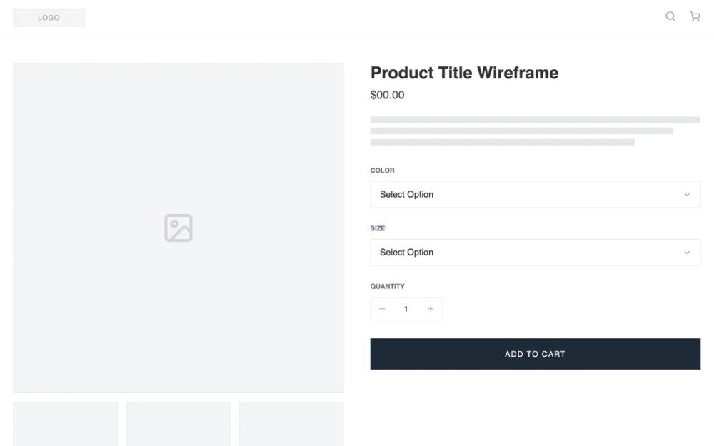 All Prompts
shopifyecommercelayoutproduct pagepdp
Classic Product Page
Классическая страница товара: медиа слева, покупка справа. Удобная навигация, аккордеоны, акцент на юзабилити.
by Shirley LouLive Preview
Prompt
# Classic Product Page

{
  "summary": "A clean, high-fidelity wireframe product detail page design using a monochrome palette. It features a large product image focus, structured meta-information, interactive variant selectors, and functional accordion details for logistical information.",
  "style": {
    "description": "Typography: 'Public Sans' (weights 300, 400, 600). Palette: White (#ffffff), Light Gray (#f3f4f6), Border Gray (#e5e7eb), Dark Primary (#1f2937), and Soft Text (#333333). Aesthetic: Pure grayscale, no decorations, emphasis on spacing (gap-12, py-12) and 1px borders for structure.",
    "prompt": "Apply a strict grayscale wireframe aesthetic. Use 'Public Sans' as the primary typeface. Primary colors: Background #ffffff, placeholder boxes #f3f4f6 with 1px border #e5e7eb. Text colors: Main text #333333, secondary labels #6b7280. Primary action button should be dark gray (#1f2937) with uppercase tracking-widest text. Spacing should follow a modular scale (4px, 8px, 16px, 24px, 32px, 48px). Animations: Smooth opacity transitions (200ms) on icons and buttons, and a 180-degree rotation on accordion chevrons using ease-in-out."
  },
  "layout_and_structure": {
    "description": "The layout is a single-page responsive PDP starting with a thin utility header, moving into a 50/50 split product section, followed by full-width utility accordions and a related products grid.",
    "prompts": [
      {
        "part": "Header",
        "prompt": "Design a slim header (height: 64px) with a 1px border-bottom (#e5e7eb). Place a logo placeholder (128x32px box) on the far left. On the right, include two icons (Search and Shopping Cart) with a 24px gap. Ensure a max-width of 1280px (7xl) with 24px horizontal padding."
      },
      {
        "part": "Product Media Section",
        "prompt": "Left column of the 2-column grid. Features a large aspect-square container (#f3f4f6) for the main product image. Below it, place a grid of three smaller aspect-square thumbnails with a 16px gap. All boxes must have a 1px border (#e5e7eb)."
      },
      {
        "part": "Product Info Section",
        "prompt": "Right column of the 2-column grid. Stacked vertically: 1. Title (text-3xl, font-semibold). 2. Price (text-xl, color #4b5563). 3. Description (three horizontal gray bars of varying widths: 100%, 92%, 80%). 4. Variant Selectors: Two vertical stacks with 8px labels (uppercase, text-xs) above 48px tall select dropdowns. 5. Quantity Selector: 128px wide border box with minus/plus icons surrounding a center-aligned value. 6. CTA: 56px tall full-width button with background #1f2937 and white text."
      },
      {
        "part": "Accordions",
        "prompt": "Full-width section below the hero. Three vertical accordion items (Product Details, Shipping, Returns) separated by 1px borders. Each header should have an uppercase tracking-widest label and a chevron-down icon. On expand, reveal placeholder text blocks (#e5e7eb) with 16px vertical spacing."
      },
      {
        "part": "Related Products",
        "prompt": "Grid section with 96px top margin. Title centered, uppercase, tracking-widest. Four-column grid (md:grid-cols-4) with a 24px gap. Each card contains an aspect-square placeholder box and two short text blocks below. Add a hover effect where an icon becomes visible in the placeholder box."
      }
    ]
  },
  "special_ui_components": [
    {
      "component": "Wireframe Text Block",
      "description": "Simulated text for layout purposes",
      "prompt": "Create a div with a fixed height (e.g., 12px) and a light gray background (#e5e7eb). Set border-radius to 2px. Width should be variable (e.g., 100%, 90%, 75%) to mimic natural paragraph flow."
    },
    {
      "component": "Quantity Adjuster",
      "description": "Functional numeric input between +/- buttons",
      "prompt": "A 128px x 40px flex container with a 1px border (#e5e7eb). Left: 40px square button with a minus icon. Center: 48px width input field, text-center, no border. Right: 40px square button with a plus icon. Hover states on buttons should transition text color to black."
    }
  ],
  "special_notes": "MUST maintain strict grayscale; do not use any colors outside of the specified hex codes. MUST use 'Public Sans' to maintain the clean, technical look. MUST ensure all placeholder icons (lucide:image, lucide:search, etc.) are consistently sized and colored #9ca3af."
}