All Prompts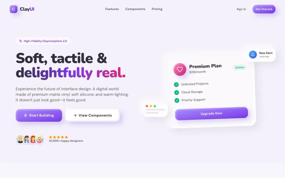 All Prompts
style
Clay UI
Clay UI: система дизайна в стиле Claymorphism. Создавайте реалистичные 3D-элементы интерфейса для ваших проектов.
by Zhou JasonLive Preview
Prompt
# Clay UI

<design-system>

# High-Fidelity Claymorphism Design System

## Design Philosophy

**Core Concept: Digital Clay**

This design system is not merely a "soft UI"—it is a high-fidelity simulation of a tangible, physical world constructed from **premium digital clay**. Every element on the screen should evoke the sensation of holding a high-end, matte-finish vinyl toy or a soft, air-filled silicone object. It rejects the flatness of modern minimalism in favor of volume, weight, and tactility.

**The "High-Fidelity" Difference**:

Unlike early 2020s "Neumorphism" (which felt like extruded plastic) or basic "Claymorphism" (which often feels like flat vector art), **High-Fidelity Claymorphism** relies on complex, multi-layered lighting simulation using 4-layer shadow stacks. It renders objects that feel dense, substantial, and interactive—not hollow decorations.

- **Materiality**: Think of soft-touch matte silicone, marshmallow-like foam, or high-quality injection-molded plastic with a premium finish. Surfaces absorb light rather than reflecting it sharply, creating a warm, inviting aesthetic.

- **Lighting**: The "world" is lit by a soft, diffused overhead light source positioned top-left, creating deep ambient occlusion shadows below objects and gentle specular highlights on their upper ridges. This creates the illusion of physical depth.

- **Shadow Architecture**: Every element uses carefully crafted multi-layer shadows:

~~~
- \*\*Outer shadows\*\*: Soft, colored drop shadows that define distance from the surface

- \*\*Highlight shadows\*\*: Top-left highlights that simulate light reflection

- \*\*Inner shadows\*\*: Subtle colored reflections and rim lights that add dimensionality

- \*\*Active states\*\*: Pressed elements use inset shadows to simulate physical depression
~~~

**The Sensory Vibe**:

- **Playful & Optimistic**: The interface radiates joy through "candy store" colors (vivid violets, hot pinks, sky blues, emerald greens, amber oranges) and bouncy, organic motion. It feels safe, welcoming, and unpretentious—like a premium toy store display.

- **Tactile & Responsive**: Elements don't just change color when interacted with—they physically react with exaggerated realism. Buttons actively "squish" (scale-[0.92] + shadow-clayPressed) and compress under the cursor. Cards lift and float towards the user (-translate-y-2 with enhanced shadows). Every interaction provides satisfying visual feedback.

- **Friendly & Safe**: There are **zero sharp corners** in this universe. Every edge is aggressively rounded `rounded-[20px]` minimum, up to `rounded-[60px]` for large containers), subconsciously signaling safety and approachability to the user. The design language speaks "friendly" and "accessible" without words.

- **Premium Craft**: Despite the playfulness, this aesthetic maintains a sense of quality through careful attention to detail: consistent border radii, precise shadow layering, harmonious color relationships, and smooth micro-interactions.

**The "Clay" Physics Engine**:

1. **Convexity (The Bulge)**: Primary interactive elements (Buttons, Stat orbs, Feature cards) bulge OUT towards the user with `shadow-clayButton` or `shadow-clayCard`. They capture light on their top-left edge and cast soft colored shadows below, creating the illusion of floating above the surface.

2. **Concavity (The Press)**: Secondary surfaces (Input fields, Active button states, FAQ panels when open) are pressed INTO the clay surface with `shadow-clayPressed`. They cast internal shadows on their top edge and catch light on their bottom lip, making them feel recessed.

3. **Buoyancy (The Float)**: The interface exists in a zero-gravity environment with high air resistance. Background blobs drift slowly (8-12s animations with translateY and rotate). Cards hover effortlessly with hover states that amplify the float effect. Nothing feels statically "stuck" to the grid—everything breathes and moves subtly.

4. **Micro-Physics**: Hover states consistently lift elements upward `hover:-translate-y-1` to `-translate-y-2`) while enhancing their shadows, simulating the element floating closer to the viewer. Active/pressed states do the opposite—compressing downward with reduced shadows.

---

## Design Token System

### Colors (The "Candy Shop" Palette)

**Background**:

- **Canvas**: `#F4F1FA` (Very pale, cool lavender-white). This provides a cleaner, more modern base than warm beige. Never use pure white—the slight tint creates warmth.

**Foreground**:

- **Text (Primary)**: `#332F3A` (Soft Charcoal). High contrast (passing WCAG AA) but softer than black for a friendlier feel.

- **Muted (Secondary)**: `#635F69` (Dark Lavender-Gray). Crucial for readability against light backgrounds. Use for body text, labels, and secondary information. Never go lighter than this value.

**Accents (Vibrant & Saturated)**:

- **Primary Accent**: `#7C3AED` (Vivid Violet). The hero color used for primary CTAs, links, and brand emphasis.

- **Secondary Accent**: `#DB2777` (Hot Pink). Used in gradients and for secondary emphasis.

- **Tertiary**: `#0EA5E9` (Sky Blue). For informational elements and background blobs.

- **Success/Benefits**: `#10B981` (Emerald Green). For checkmarks and positive indicators.

- **Warning**: `#F59E0B` (Amber). For alerts and star ratings.

**Gradient Strategy**:

- **Primary Buttons**: `bg-gradient-to-br from-[#A78BFA] to-[#7C3AED]` (lighter violet to primary violet). This creates depth and prevents overly dark buttons.

- **Icon Orbs**: `bg-gradient-to-br` from light pastel (400) to saturated hue (600) with varied colors for visual interest (e.g., `from-blue-400 to-blue-600`, `from-purple-400 to-purple-600`, `from-pink-400 to-pink-600`).

- **Text Highlights**: Use multi-stop gradients for hero text `clay-text-gradient`): `from-clay-foreground 20%, to-clay-accent 60%, to-clay-accent-alt`. Keep gradient text large (text-5xl+) for readability.

- **Background Blobs**: Semi-transparent accent colors with 10% opacity and blur-3xl for soft ambient lighting.

### Typography

**Font Selection**:

- **Headings**: **Nunito** (Google Fonts, Weights: 700/800/900). The rounded terminals perfectly complement the soft clay aesthetic. Apply via inline styles: `style={{ fontFamily: "Nunito, sans-serif" }}` for all headings, stat numbers, and emphasis text.

- **Body**: **DM Sans** (Google Fonts, Weights: 400/500/700). Geometric, clean, and highly readable. Applied globally via body font-family.

**Hierarchy (Mobile-First with Progressive Enhancement)**:

- **Hero Headline**: `text-5xl sm:text-6xl md:text-7xl lg:text-8xl`, Black weight (font-black), tight tracking (tracking-tight), line-height 1.1. Always use Nunito.

- **Section Titles**: `text-3xl sm:text-4xl md:text-5xl`, Extrabold (font-extrabold) or Black. Always use Nunito.

- **Card Titles**: `text-xl` to `text-2xl` (larger for hero cards: `text-3xl`), Bold (font-bold) to Extrabold. Use Nunito.

- **Body Text**: `text-base` to `text-lg`, Medium weight (font-medium), relaxed leading (leading-relaxed). Use DM Sans.

- **Small Text**: `text-sm` to `text-xs`, Medium to Bold weight. Use for labels, metadata, uppercase tracking-wide treatments.

**Typography Best Practices**:

- Always pair Nunito headings with DM Sans body for optimal hierarchy.

- Use `font-black` (900 weight) for maximum impact on large headings and numbers.

- Ensure line-height is generous: `leading-relaxed` (1.625) for body, `leading-[1.1]` for tight display headings.

- Limit line length to 60-75 characters with max-w-2xl to max-w-3xl containers for optimal readability.

- Use `tracking-tight` on large headings to maintain visual density, `tracking-wide` or `tracking-widest` on small caps/labels.

### Shapes & Radii

**The "Super-Rounded" Rule** (Absolute Values Only):

- **Large Containers/Hero Sections**: `rounded-[48px]` to `rounded-[60px]`

- **Standard Cards**: `rounded-[32px]` (the default for most cards)

- **Medium Elements** (Benefits pills, Blog cards): `rounded-[24px]`

- **Buttons & Inputs**: `rounded-[20px]` or `rounded-2xl`

- **Icon Containers**: `rounded-2xl` (16px) for square icons, `rounded-full` for circular

- **Small Badges**: `rounded-lg` (8px) minimum, `rounded-full` preferred

- **Stat Orbs**: `rounded-full` (perfect circles)

**Critical Rules**:

- Never use `rounded-md` (4px) or `rounded-sm`. They appear too sharp and generic for this aesthetic.

- Maintain consistency: if a card uses `rounded-[32px]`, its nested image should use `rounded-[24px]` (8px less) to create visual hierarchy.

- On mobile, you may reduce radii slightly (e.g., `rounded-[32px] sm:rounded-[40px]`) to maximize screen real estate while maintaining the soft aesthetic.

### Shadows (The Engine of Clay)

This system uses a **High-Fidelity Shadow Stack** to simulate complex lighting.

**1. Deep Clay (Surface)**:

For the main background elements or large containers.

~~~css

box-shadow:

30px 30px 60px #cdc6d9, /* Deep, soft ambient occlusion */

-30px -30px 60px #ffffff, /* Top-left ambient light */

inset 10px 10px 20px rgba(139, 92, 246, 0.05), /* Subtle color reflection */

inset -10px -10px 20px rgba(255, 255, 255, 0.8); /* Surface specularity */
~~~

**2. Clay Card (Floating)**:

For standard content cards.

~~~css

box-shadow:

16px 16px 32px rgba(160, 150, 180, 0.2), /* Soft purple-gray drop shadow */

-10px -10px 24px rgba(255, 255, 255, 0.9), /* Strong top-left highlight */

inset 6px 6px 12px rgba(139, 92, 246, 0.03), /* Inner colored bounce light */

inset -6px -6px 12px rgba(255, 255, 255, 1); /* Inner rim light */
~~~

**3. Clay Button (High Convexity)**:

For clickable elements.

~~~css

box-shadow:

12px 12px 24px rgba(139, 92, 246, 0.3), /* Strong colored drop shadow */

-8px -8px 16px rgba(255, 255, 255, 0.4), /* Top-left highlight */

inset 4px 4px 8px rgba(255, 255, 255, 0.4), /* Inner rim */

inset -4px -4px 8px rgba(0, 0, 0, 0.1); /* Bottom-right shading */
~~~

**4. Clay Pressed (Recessed)**:

For inputs and active states.

~~~css

box-shadow:

inset 10px 10px 20px #d9d4e3, /* Deep inner shadow top-left */

inset -10px -10px 20px #ffffff; /* Inner highlight bottom-right */
~~~

---

## Component Architecture

### 1. The Universal Card `Card`)

- **Base Styles**: `relative overflow-hidden rounded-[32px] bg-clay-cardBg p-8 text-clay-foreground shadow-clayCard backdrop-blur-xl`

- **Interactive States**:

~~~
\*   Default: `shadow-clayCard` (4-layer shadow with soft depth)

\*   Hover: `hover:-translate-y-2 hover:shadow-[enhanced]` (lifted with stronger shadow)

\*   Transition: `transition-all duration-500` (smooth, premium feel)
~~~

- **Structure**:

~~~
\*   Outer wrapper handles positioning, overflow, shadows

\*   \*\*Inner Content Wrapper\*\*: `<div className="relative z-10 flex h-full flex-col">{children}</div>` to support absolute positioned decorative elements
~~~

- **Decorations**: Use absolute positioned panels with negative margins `-bottom-8 -left-8 -right-8`) to create "peeking" UI elements that emerge from card bottoms

- **Variants**:

~~~
\*   Glass effect: `bg-white/60` to `bg-white/80`

\*   Solid: `bg-white`

\*   Feature hero card: `md:col-span-2 md:row-span-2` with larger internal padding
~~~

### 2. The Clay Button `Button`)

- **Base Shape**: `rounded-[20px]` with chunky height `h-14` default, `h-16` for lg)

- **Base Styles**: `inline-flex items-center justify-center font-bold tracking-wide transition-all duration-200`

- **Variants**:

~~~
\*   \*\*Primary/Default\*\*: `bg-gradient-to-br from-[#A78BFA] to-[#7C3AED] text-white shadow-clayButton hover:shadow-clayButtonHover`

\*   \*\*Secondary\*\*: `bg-white text-clay-foreground shadow-clayButton`

\*   \*\*Outline\*\*: `border-2 border-clay-accent/20 bg-transparent text-clay-accent hover:border-clay-accent hover:bg-clay-accent/5`

\*   \*\*Ghost\*\*: `text-clay-foreground hover:bg-clay-accent/10 hover:text-clay-accent`
~~~

- **Interactive States**:

~~~
\*   Hover: `hover:-translate-y-1` (lift up 4px) + Enhanced shadow

\*   Active: `active:scale-[0.92] active:shadow-clayPressed` (pronounced squish effect)

\*   Focus: `focus-visible:ring-4 focus-visible:ring-clay-accent/30 focus-visible:ring-offset-2`
~~~

- **Sizing**: Use `size` prop: `sm` (h-11), `default` (h-14), `lg` (h-16)

### 3. The Recessed Input `Input`)

- **Base Shape**: `rounded-2xl` with generous height `h-16`

- **Base Styles**: `flex w-full border-0 bg-[#EFEBF5] px-6 py-4 text-clay-foreground text-lg shadow-clayPressed`

- **States**:

~~~
\*   Default: Recessed with `shadow-clayPressed` (inset shadows)

\*   Focus: `focus:bg-white focus:ring-4 focus:ring-clay-accent/20` (transforms to raised white surface)

\*   Placeholder: `placeholder:text-clay-muted`
~~~

- **Accessibility**: `transition-all duration-200` for smooth state changes

### 4. Floating 3D Blobs (Background)

**Never use a flat background.** Always include 3-4 large, animated blobs.

- **Container**: `<div className="pointer-events-none fixed inset-0 overflow-hidden -z-10">`

- **Individual Blobs**:

~~~
\*   Classes: `absolute h-[60vh] w-[60vh] rounded-full blur-3xl`

\*   Colors: Accent colors with `/10` opacity (e.g., `bg-[#8B5CF6]/10`, `bg-[#EC4899]/10`, `bg-[#0EA5E9]/10`)

\*   Positioning: Negative margins to bleed off edges `-top-[10%] -left-[10%]`, `-right-[10%] top-[20%]`)

\*   Animation: `clay-blob` or `clay-blob-alt` with staggered `animation-delay-2000` or `animation-delay-4000`
~~~

- **Purpose**: Creates ambient colored lighting that shows through glass-morphic cards

---

## Animation System

**1. Clay Float** `clay-float`**)**:

Simulates zero-gravity drift for background blobs. 8 second duration.

~~~css

@keyframes clay-float {

0%, 100% { transform: translateY(0) rotate(0deg); }

50% { transform: translateY(-20px) rotate(2deg); }

}
~~~

**2. Clay Float Delayed** `clay-float-delayed`**)**:

Alternative animation with opposite rotation. 10 second duration.

~~~css

@keyframes clay-float-delayed {

0%, 100% { transform: translateY(0) rotate(0deg); }

50% { transform: translateY(-15px) rotate(-2deg); }

}
~~~

**3. Clay Float Slow** `clay-float-slow`**)**:

For hero decorative elements that orbit the headline. 12 second duration with more pronounced movement.

~~~css

@keyframes clay-float-slow {

0%, 100% { transform: translateY(0) rotate(0deg); }

50% { transform: translateY(-30px) rotate(5deg); }

}
~~~

**4. Clay Breathe** `clay-breathe`**)**:

Simulates an object inflating/deflating slightly. 6 second duration. Used on stat orbs.

~~~css

@keyframes clay-breathe {

0%, 100% { transform: scale(1); }

50% { transform: scale(1.02); }

}
~~~

**5. Hover Lift**:

Standard interactive elements should lift upward on hover:

- Cards: `hover:-translate-y-2` (8px) with enhanced shadow

- Benefits pills: `hover:-translate-y-1` (4px)

- Testimonials: `hover:-translate-y-2` (8px)

- Blog posts: `hover:-translate-y-3` (12px) for dramatic effect

- Buttons: `hover:-translate-y-1` (4px) with shadow enhancement

**6. Active Press**:

Buttons use `active:scale-[0.92]` combined with `active:shadow-clayPressed` to simulate a physical squish when clicked. Duration should be fast (200ms) for immediate feedback.

**7. Scale Transforms**:

- Stat orbs: `hover:scale-110` (10% growth)

- How It Works circles: `group-hover:scale-110` with 300ms duration

- Pricing cards (non-highlighted): `hover:scale-105` (5% subtle growth)

- Featured card in Bento grid: `hover:scale-[1.02]` (minimal growth due to large size)

**8. Animation Delays**:

Use staggered animations for visual rhythm:

- `.animation-delay-2000` (2s delay)

- `.animation-delay-4000` (4s delay)

**9. Reduced Motion**:

Always include `@media (prefers-reduced-motion: reduce)` to disable all animations for accessibility.

---

## Layout Patterns

**1. Masonry / Bento Grid**:

- Don't use uniform grids. Mix `col-span-1` with `col-span-2` or `row-span-2` cards.

- Use `hover:scale-[1.02]` on large grid items for a tactile feel.

**2. Split Layouts**:

- Use 50/50 splits for "Product" or "Benefits" sections.

*One side text, one side* *Abstract 3D Composition** (nested clay shapes, not just an image).

**3. Overlapping Elements**:

*Allow elements to break their containers (e.g., a "Popular" badge floating* above* a pricing card).

- Use negative margins to pull decorative elements to the edges.

---

## Responsive Strategy

**Mobile-First Approach with Progressive Enhancement**

The Clay design system maintains its playful, tactile personality across all screen sizes while adapting layouts and sizing for optimal mobile experience.

**Typography Scaling**:

- Hero headlines: `text-5xl → sm:text-6xl → md:text-7xl → lg:text-8xl`

- Section titles: `text-3xl → sm:text-4xl → md:text-5xl`

- Body text: `text-base → sm:text-lg → md:text-xl` where appropriate

- Always maintain `leading-relaxed` and proper line length constraints

**Layout Transformations**:

- **Navigation**: Compact on mobile `h-16 rounded-[32px] px-4`) → Larger on desktop `sm:h-20 sm:rounded-[40px] sm:px-8`). Hide non-essential nav items on mobile.

- **Hero**: Stack CTAs vertically `flex-col gap-6`) → Horizontal on desktop `sm:flex-row`)

- **Stats**: 2-column grid on mobile `grid-cols-2 gap-6`) → 4 columns on desktop `md:grid-cols-4 gap-8`)

- **Features**: Single column → Bento layout with spans on desktop `md:grid-cols-2 lg:grid-cols-3` with hero card `md:col-span-2 md:row-span-2`)

- **Benefits/Product Detail**: Stack vertically on mobile → Side-by-side split on desktop `lg:grid-cols-2`)

- **Pricing**: Stack cards on mobile → 3 columns on desktop `md:grid-cols-3`). Scale effect for highlighted card only applies on desktop `md:scale-110`)

**Component Adjustments**:

- **Cards**: Reduce padding on mobile `p-6 sm:p-8`)

- **Border Radii**: Maintain generous radii even on mobile (never less than `rounded-[20px]`)

- **Buttons**: Full width on mobile `w-full sm:w-auto`) for primary CTAs

- **Decorative Elements**: Hide some floating shapes on mobile `hidden lg:block`)

- **Shadows**: Keep full shadow stacks—they're essential to the aesthetic

**Touch Targets**:

- All interactive elements meet 44px minimum tap target (buttons are `h-14+`)

- Increase spacing in mobile navigation for easier tapping

- Ensure accordion FAQ items have adequate vertical spacing

**Performance**:

- Animations still run on mobile but respect `prefers-reduced-motion`

- Blur effects `backdrop-blur-xl`) remain—they're critical to the glass-clay aesthetic

- Background blobs scale with viewport units `vh`) so they adapt naturally

**What NOT to Change on Mobile**:

- Don't flatten the design—keep the shadows and depth

- Don't reduce border radii to generic values

- Don't remove the candy-store colors or make them muted

- Don't disable all animations (only simplify if performance issues arise)

---

## Dos and Don'ts

- **DO** use pronounced "Squish" animations on click `active:scale-[0.92]` combined with `shadow-clayPressed`).

- **DO** use varying border radii within components (e.g., `rounded-[48px]` for outer container, `rounded-[32px]` for card, `rounded-[24px]` for inner image).

- **DO** use "Glass-Clay" hybrid (semi-transparent white `bg-white/60` to `/80` + `backdrop-blur-xl`) for cards to reveal background blobs.

- **DO** use multi-layer shadow stacks (4 shadows minimum) to achieve high-fidelity depth.

- **DO** apply Nunito font family explicitly to all headings, numbers, and labels via inline styles.

- **DO** use vibrant gradient backgrounds for icon containers with varied colors (blue, purple, pink, green, cyan, amber).

- **DON'T** use gray text lighter than `#635F69`. This is the minimum for accessibility against light backgrounds.

- **DON'T** use sharp corners anywhere. Minimum radius is `rounded-[20px]`, never `rounded-md` or `rounded-lg`.

- **DON'T** use flat colors for backgrounds. Always include animated blobs or subtle gradients.

- **DON'T** use gradient text for font sizes smaller than `text-5xl` (readability risk).

- **DON'T** make buttons too small. Minimum height is `h-11` (44px) for accessibility.

- **DON'T** skip the hover lift effect on interactive elements—it's core to the tactile feel.

---

## Implementation Checklist

- [ ] **Background**: Canvas `#F4F1FA` + Animated Blobs.

- [ ] **Shadows**: 4-layer box-shadows defined in CSS.

- [ ] **Typography**: Nunito Black (Headings) + DM Sans (Body).

- [ ] **Buttons**: Gradient, rounded-2xl, click-squish.

- [ ] **Cards**: White/60%, backdrop-blur, rounded-3xl.

- [ ] **Text**: High contrast charcoal/slate, no light grays.

</design-system>