All Prompts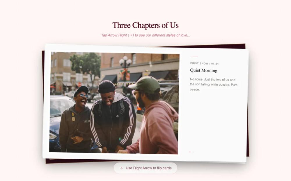 All Prompts
Clean Horizontal Memory Layout
Чистый горизонтальный макет для демонстрации воспоминаний: стек полярных фото, интерактивные истории, винтажный стиль. Идеально для личных вех, свадеб, юбилеев.
by Abhinav KharbandaLive Preview
Prompt
# Clean Horizontal Memory Layout

{
  "summary": "An interactive, multi-stage storytelling design that transitions from a physical-feeling polaroid gallery to sequential text reveals and a final call-to-action. It utilizes subtle vintage effects like film grain and radial dot backgrounds to evoke a 'scrapbook' or 'memory box' feel.",
  "style": {
    "description": "The style is 'Modern Vintage Romantic.' It uses a light cream background (#fffaf5) contrasted with deep rose accents (#be123c). Typography is a mix of high-contrast serif for headings, clean sans-serif for UI, and handwriting script for personal notes. Subtle animations include 3D-like card exits and grain overlays.",
    "prompt": "Create a vintage-inspired design system. Colors: Background #fffaf5 (cream), Primary Accent #be123c (rose), Meta text #94a3b8 (slate-gray). Typography: Use 'Zodiak' for elegant serif titles, 'Satoshi' for clean body text, and 'Kalam' (weights 300, 400, 700) for all handwriting/personal elements. UI Effects: Include a fixed-position film grain overlay (opacity 0.12) and a radial dot grid background (#be123c, 0.5px dots, 40px spacing). Polaroid Style: Pure white cards (#ffffff) with 1.25rem padding, 3.5rem bottom margin, and deep soft shadows (0 20px 50px rgba(0,0,0,0.12)). Images should have a nostalgic filter: contrast(1.05) sepia(0.2) saturate(0.9). Transitions: Use cubic-bezier(0.4, 0, 0.2, 1) for all layout movements and cubic-bezier(0.2, 0.8, 0.2, 1) for text entrances."
  },
  "layout_and_structure": {
    "description": "A vertical sequence of distinct stages (Gallery -> Messages -> Final CTA). The gallery uses a stacked layout where the active element occupies the top layer.",
    "prompts": [
      {
        "part": "Page Container",
        "prompt": "Full-height (min-h-screen) centered container using a cream background (#fffaf5). Apply a subtle radial dot grid and a grain overlay across the entire viewport. Max width of content should be 7xl (1280px) with 3rem horizontal padding."
      },
      {
        "part": "Interactive Polaroid Gallery",
        "prompt": "Design a centralized section where polaroids are stacked on top of each other. The wrapper for each card should be a horizontal flex container (flex-row) with a 6rem gap. On the left side, place a 380px x 460px white polaroid card. On the right side, place a text 'story' block (max-width 420px) vertically centered with the card. The story text should only be visible for the top-most card (opacity 1, transform translateX(0)), while others are hidden (opacity 0, translateX(30px)). When 'flipping' a card, animate it moving to translateX(-150%) with a rotate(-10deg) and opacity 0."
      },
      {
        "part": "Sequential Message Reveal",
        "prompt": "A centered vertical stack of text elements. Each paragraph should be large serif font (text-3xl, #4c0519), appearing one after another. Use a fade-in-up animation: opacity 0 to 1 and translateY(20px) to 0 with a 1s duration. This section should have a max-width of 2xl for readability."
      },
      {
        "part": "The Final Proposal Section",
        "prompt": "A high-impact centered layout. Feature a massive serif title (text-8xl) with an italic handwriting span. Below the title, provide two primary buttons. The 'Yes' button should be a rounded-full rose (#be123c) button with a large shadow. The 'No' button should be a muted stone color (#e7e5e4). Include a hidden success state overlay that appears on click, featuring a pulsing heart icon and a large 'Forever Yours' title."
      }
    ]
  },
  "special_ui_components": [
    {
      "component": "The Evasive Button",
      "description": "A button designed to be unclickable by moving away from the cursor.",
      "prompt": "Style a button with stone-200 background and stone-500 text. On hover, calculate a random X and Y coordinate within the viewport (maintaining a 100px padding from edges) and set the button's position to 'fixed' with those coordinates. Add a 0.2s ease-out transition to the movement for a smooth but quick 'escape' feel."
    },
    {
      "component": "Film-Grain Overlay",
      "description": "A full-screen texture to give the UI a vintage feel.",
      "prompt": "Create a fixed 100vw/100vh div with z-index 100. Use a repeating transparent film-grain pattern background. Set opacity to 0.12 and 'pointer-events: none' so it doesn't interfere with user interaction."
    },
    {
      "component": "Polaroid Card with Meta Text",
      "description": "A container that mimics a physical polaroid photo.",
      "prompt": "Width: 380px, Height: 460px. Background: #ffffff. Padding: 1.25rem at top/left/right, 3.5rem at bottom. Inside, a square aspect-ratio container for the image. Below the image, centered in the large bottom white space, add a meta-text label using 'Kalam' font, slate-400 color, and 0.875rem font size. Apply a rotation between -2deg and 2deg to the entire wrapper to simulate a messy stack."
    }
  ],
  "special_notes": "MUST: Maintain the flex-row relationship between the card and its associated story text. The text MUST NOT wrap beneath the card. MUST: Apply the sepia/contrast filter to all gallery images for visual consistency. DO NOT: Use standard scroll bars; this is a step-driven experience controlled by keyboard or UI triggers. MUST: Implement the evasive 'No' button logic where it moves to a random fixed position on mouse-over to prevent selection."
}